PBS 69 of X: Navbars (Bootstrap)
In the previous instalment we learned how to use Navs for creating navigation bars and learned how to use Drop-downs to add expandable menus to our Navs. In this instalment we’ll meet Bootstrap’s ultimate navigation component, the Navbar. This is a powerful component designed to act as the menubar at the top of websites or web apps.
You can download this instalment’s ZIP file here. or here on GitHub.
Matching Podcast Episode 578
Listen along to this instalment on episode 578 of the Chit Chat Across the Pond Podcast
You can also Download the MP3
PBS 68 Challenge Solution
The challenge set at the end of the previous instalment was quite straightforward: update either your recipe or mine to make use of a tabbed content region.
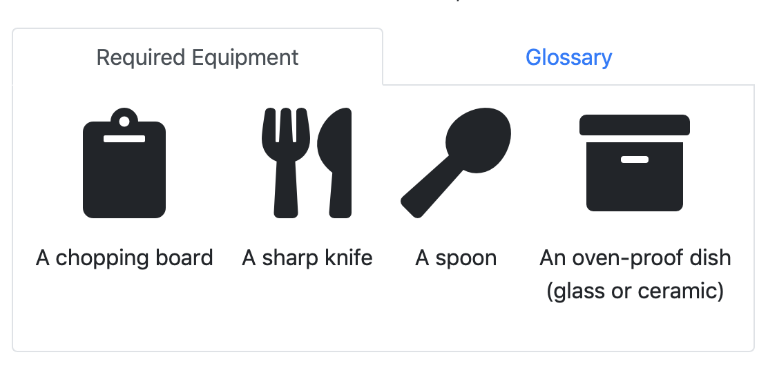
My recipe used the grid layout to position the list of required equipment and the glossary next to each other on larger screens and underneath each other on smaller screens. The structure of the code was essentially the following:
<div class="row">
  <section class="col-12 col-lg-6">
    <!-- Required Equipment here -->
  </section>
  <section class="col">
    <!-- Glossary Here -->
  </section>
</div>
I restructured it to replace the two cols with a single col containing two tabbed panes. The structure became:
<div class="row">
  <div class="col">
    <nav class="nav nav-tabs nav-justified" role="tablist">
      <a class="nav-item nav-link active" id="equipment_tab" data-toggle="tab" href="#equipment_pane" role="tab" aria-controls="equipment_pane" aria-selected="true">Required Equipment</a>
      <a class="nav-item nav-link" id="glossary_tab" data-toggle="tab" href="#glossary_pane" role="tab" aria-controls="glossary_pane" aria-selected="false">Glossary</a>
    </nav>

    <div class="tab-content border border-top-0 rounded-bottom px-3">
      <section class="tab-pane active" id="equipment_pane" role="tabpanel" aria-labelledby="equipment-tab">
        <!-- Required Equipment here -->
      </section>
      <section class="tab-pane" id="glossary_pane" role="tabpanel" aria-labelledby="glossary-tab">
        <!-- Glossary Here -->
      </section>
    </div>
  </div>
</div>
I still have a single row, but instead of that row containing two cols, it now contains just one col. That single col now contains a nav that will act as the tabs controlling the tabbed panes, and a collection of panes that will be tabbed between, one for each section.
The result looks like so:
You’ll find the full code for my sample solution in the folder pbs68-challenge-solution in this instalment’s ZIP file or here on GitHub.
The Bootstrap Navbar
The Navbar is a Bootstrap component designed to act as the main menu for a website or web app. Basically, that ever-present navigation bar at the top of so many websites these days is either an actual Bootstrap Navbar, or an example of the kind of thing Bootstrap Navbars are designed to do.
As well as containing links like any other Nav, Navbars are designed to also accommodate some branding, can contain non-link text, and are even designed to accommodate inline forms.
Navbar Basics
Regardless of how much fancy content you add, all Navbars share the same basic structure, and must follow the same basic rules.
Navbars are entirely contained within a tag of your choosing that must be given the class .navbar. You could use any tag, but to aid accessibility, you should generally use the <nav> tag. If you use any other tag, be sure to mark the tag as a navigation by giving it the ARIA role navigation, i.e. add the attribute role="navigation" to the tag.
When it comes to styling Navbars, Bootstrap only styles the foreground elements, leaving the choice of background to you. You can use CSS to specify any arbitrary background colour or image you like, or you can use one of Bootstrap’s colour utilities, e.g. .bg-primary. There’s a foreground style for use against light backgrounds (.navbar-light), and one for use against dark backgrounds (.navbar-dark). Every Navbar should have one of these two classes.
Navbars will expand to fill their containing tag, so unless you enclose them within a container of some sort, they will take up the full width of the page.
Navbars have two distinct modes of operation: an expanded mode intended for use on larger screens, and a collapsed mode for use on smaller screens. As with everything else Bootstrap, Navbars are mobile-first, and default to the collapsed mode. If you only give a Navbar the classes .navbar and .navbar-light or .navbar-dark it will remain in the collapsed mode at all breakpoints.
The exact breakpoint that’s appropriate for switching from collapsed mode to expanded mode will entirely depend on the Navbar’s content. So Bootstrap leaves it up to the developer to specify when to expand with the .navbar-expand-BREAKPOINT classes. For example, a Navbar that should use the expanded mode for medium screens and up should be given the class .navbar-expand-md. Finally, if you want your Nav never to use the collapsed mode, you can give it the class .navbar-expand.
The expanded mode is the easiest to understand, so let’s start there. In this mode all the elements that make up the Navbar appear next to each other left-aligned on a single row.
In the collapsed mode, some of the Navbar’s elements will be hidden by default, represented by an icon which will be left-aligned. The remaining nonhidden elements will still appear horizontally, but will be right-aligned. When a user clicks or taps on the icon, the Navbar will expand vertically. All the hidden elements will appear one under the other stacked vertically below the originally visible part of the Navbar. Clicking or tapping on the icon again will hide the additional elements again.
Officially the button for showing/hiding the elements is known as the Toggler. You’ll see it referred to as such in the CSS class names and the documentation, but when web designers are talking amongst themselves, they’ll refer to it by its colloquial name — the hamburger button. The reason for this is that the most commonly used icon for buttons which hide and show menus on the web is three horizontal parallel lines, which, with enough imagination, look like two halves of a bun with a meat patty between them. Bootstrap Navbars use this icon by default. I want to be clear, neither the concept of having menus show and hide on small screens, nor the choice of default icon are in any way Bootstrap-specific (nor indeed is the colloquial name for the icon).
So, to summarise, all Navbars will have the class .navbar, one of the classes .navbar-light or .navbar-dark, and one of .navbar-expand-sm, .navbar-expand-md, .navbar-expand-lg, .navbar-expand-xl, or .navbar-expand.
I’ve repeatedly referred to a Navbar as having elements within it, so what elements are available, and which, if any, are required?
All Navbars will contain some or all the following:
- A so-called hamburger button (or Navbar toggler in Bootstrap jargon) to provide access to the Navbar’s content on screens small enough to collapse the bar. A Navbar should only have one toggler. It must have the class
.navbar-toggler. - A site title and/or logo (referred to as the brand in Bootstrap jargon). A Navbar should only have one brand. It must have the class
.navbar-brand. - A nav containing links, and perhaps links within Drop-downs. A Navbar can contain as many or as few Navs as you like, but they must all have the class
.navbar-nav. - Text regions. Navbars can have as many or as few text regions as you like, but they must all have the class
.navbar-text. - Inline Forms. Navbars can contain as many or as few forms as you like, but they must all have the class
.form-inline. - An optional grouping of the above elements defining the part of the Navbar that should collapse into the hamburger button on small screens. The grouping must have both the classes
.collapse&.navbar-collapse.
Navbars can only contain the elements in the list above, and the collapse grouping can only contain the other elements in the list. In other words, .navbars can only contain a .navbar-toggler, a .navbar-brand, zero or more .navbar-navs, zero or more .navbar-texts, zero or more .inline-forms, and a .collapse.navbar-collapse. The .collapse.navbar-collapse can only contain a .navbar-brand, zero or more .navbar-navs, zero or more .navbar-texts & zero or more .inline-forms.
The Navbar Hamburger
The simplest Navbar component is the so-called hamburger button (or Navbar toggler) used to show and hide the collapsed section of the Navbar on small screens. It will always have the following form:
<button class="navbar-toggler" type="button" data-toggle="collapse" data-target="#COLLAPSIBLE_REGION_ID" aria-controls="COLLAPSIBLE_REGION_ID" aria-expanded="false" aria-label="Toggle navigation">
  <span class="navbar-toggler-icon"></span>
</button>
All you have to do is replace COLLAPSIBLE_REGION_ID with the actual ID of the collapsible section (.collapse.navbar-collapse) of your Navbar.
A Basic Collapsing Navbar
Below is the code for a Navbar that will collapse for breakpoints smaller than medium and that contains just a single Nav consisting of two links, and a drop-down containing three additional links. You’ll find this example as the first Navbar in pbs69a.html in this instalment’s ZIP file or here on GitHub.
Resize the window to see the Navbar collapse into just a hamburger button at small sizes. Click the Hamburger to hide and show the Nav items on small screens.
<nav class="navbar navbar-expand-md navbar-dark bg-dark" id="navbar1">
  <!-- The 'hamburger' -->
  <button class="navbar-toggler" type="button" data-toggle="collapse" data-target="#navbar1_content" aria-controls="navbar1_content" aria-expanded="false" aria-label="Toggle navigation">
    <span class="navbar-toggler-icon"></span>
  </button>

  <!-- The main body of the bar (will collapse into hamburger) -->
  <div id="navbar1_content" class="collapse navbar-collapse">
    <ul class="navbar-nav">
      <li class="nav-item">
        <a class="nav-link" href="http://flickr.com/bbusschots" target="_blank" rel="noopener">Photography</a>
      </li>
      <li class="nav-item">
        <a class="nav-link" href="https://www.maynoothuniversity.ie/people/bart-busschots" target="_blank">Day Job</a>
      </li>
      <li class="nav-item dropdown">
        <a class="nav-link dropdown-toggle" href="#" id="podcastingDropdown" role="button" data-toggle="dropdown" aria-haspopup="true" aria-expanded="false">Podcasting</a>
        <div class="dropdown-menu" aria-labelledby="podcastingDropdown">
          <a class="dropdown-item" href="http://www.lets-talk.ie" target="_blank" rel="noopener">Let's Talk Apple/Photo</a>
          <a class="dropdown-item" href="http://www.bartb.ie/ttt" target="_blank" rel="noopener">Taming the Terminal</a>
          <a class="dropdown-item" href="http://www.bartb.ie/pbs" target="_blank" rel="noopener">Programming by Stealth</a>
        </div>
      </li>
    </ul>
  </div>
</nav>
As you can see, the entire Navbar is contained within a <nav> tag with the classes .navbar (to turn it into a Navbar), .navbar-expand-md (to signify that it should collapse for all breakpoints below medium), and .navbar-dark.bg-dark (to use the dark style).
The first child element within the Navbar is the hamburger button which specifies that the element with the ID #navbar1_content should be hidden and shown as the Navbar collapses and expands.
The second element is the collapsible region of the Navbar, a <div> with id="navbar1_content". This collapsible region contains just one element, a Nav. Apart from the fact that it has the additional class .navbar-nav, this Nav is completely standard, just as described in the previous instalment.
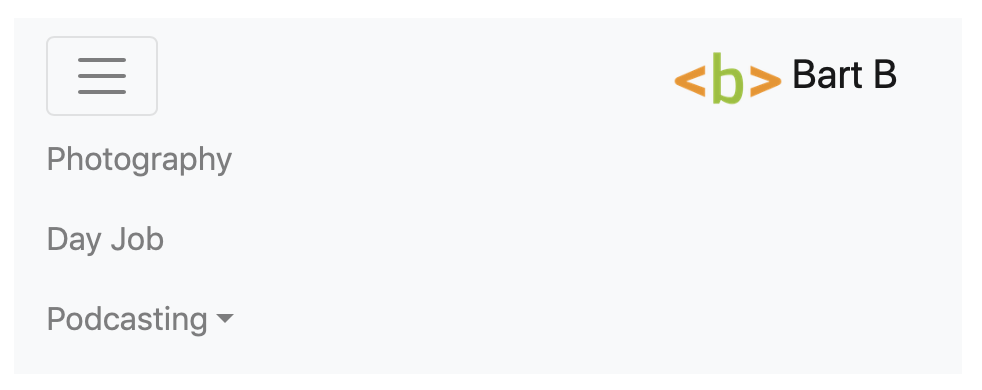
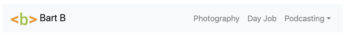
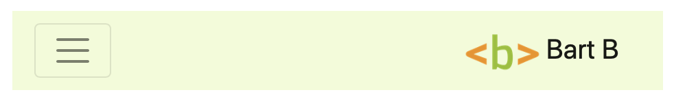
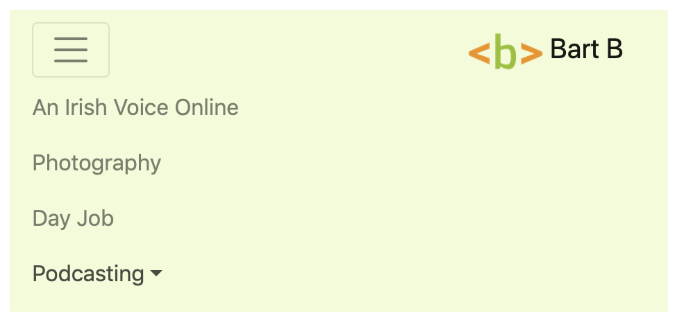
This is what the Navbar looks like unexpanded in collapsed mode:

This is what it looks like expanded in collapsed mode:

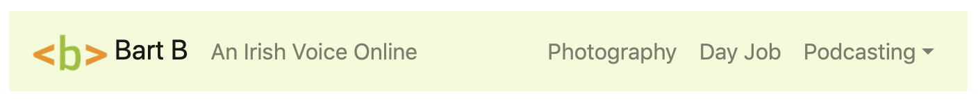
And finally, this is what it looks like in expanded mode:

Branding Navbars
Because one of their primary roles is as a site-wide navigation bar, most Navbars contain a brand of some kind, either an image, or some text, or both.
You can use any tag to contain the brand as long as you give it the class .nav-brand, but the Bootstrap documentation warns that using tags other than <a> may require the use of additional utility classes to get the spacing to look right. Another good reason for using the <a> tag is that it’s extremely common to use the brand section of Navbars as links to a site’s front page.
Generally speaking, a Bootstrap brand really is as simple as a single <a> tag with the class .navbar-brand containing an image and/or some text. For example, here’s the code for the brand in the second example Navbar in pbs69a.html in this instalment’s ZIP file or here on GitHub:
<a class="navbar-brand" href="http://www.bartbusschots.ie" target="_blank" rel="noopener">
  <img src="BartAvatar.png" alt="Bart's Avatar" style="height: 1.5em" src="./BartAvatar.png" >
  Bart B.
</a>

Note that I chose to use the light style (.navbar-light) in conjunction with the light background (.bg-light) from Bootstrap’s colour utilities for this Navbar.
Also note that, because I placed the brand outside of the collapsing region (.collapse.navbar-collapse), it remains visible on small screens. In fact, Bootstrap has done more than just leave it visible. It has also right-aligned it in the collapsed view so it acts as a nice counterpoint to the hamburger button.
Finally, notice that the Nav now appears to be right-aligned, separating it nicely from the brand and tagline. Everything is still actually left aligned. It just looks like the Nav isn’t because its left margin has been expanded to take up all available space. How? By simply adding the spacing utility class .ml-auto to it. The reason for this approach over others like perhaps floating some of the content is that this works without any undesired side effects in both expanded and collapsed modes.
Navbar Text
To add some text into a Navbar, simply wrap it in a tag of your choosing and give that tag the class .navbar-text. You can of course use any tag, but <span> is generally used.
As an example, the third Navbar in pbs69a.html contains a tag line (‘An Irish Voice Online’) which has been added to the front of the collapsing part of the Navbar. The collapsible part of the Navbar is now structured as follows:
<div id="navbar3_content" class="collapse navbar-collapse">
  <!-- The Tagline -->
  <span class="navbar-text">An Irish Voice Online</span>

  <!-- The Nav -->
  <ul class="navbar-nav ml-auto">
    <!-- ... -->
  </ul>
</div>
The tagline really is as simple as a <span> with the class .navbar-text.
Forms
Inline forms can be added directly into a Navbar or into the section of the Navbar that collapses. There is no Navbar-specific markup needed. Simply add the form as we learned in instalment 64. Because these are totally normal inline forms, you can use all the fancy elements we’ve seen before like input groups (instalment 65) and button groups (instalment 63).
As an example, let’s add a search form to our Navbar:
<nav class="navbar navbar-expand-md navbar-dark" style="background-color: #86b50d;" id="navbar4">
  <!-- The 'hamburger' -->
  <!-- ... --->

  <!-- The Brand -->
  <!-- ... --->

  <!-- The main body of the bar (will collapse into hamburger) -->
  <div id="navbar4_content" class="collapse navbar-collapse">
    <!-- The Tagline -->
    <span class="navbar-text d-md-none d-lg-inline">An Irish Voice Online</span>

    <!-- The Nav -->
    <!-- ... -->

    <!-- The Search Form -->
    <span role="form" class="form-inline">
      <span class="input-group input-group-sm">
        <input type="text" class="form-control" placeholder="Search Site" aria-label="search text">
        <span class="input-group-append">
          <button class="btn btn-secondary">
            <i class="fa fa-search" aria-hidden="true"></i>
            <span class="sr-only">Search Site</span>
          </button>
        </span>
      </span>
    </span>
  </div>
</nav>
This is the fourth sample Navbar in pbs69a.html.

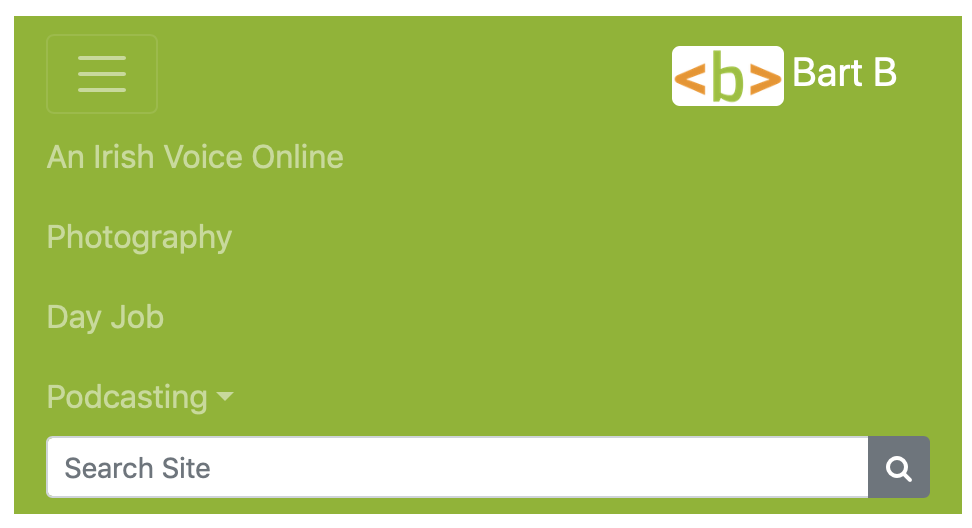

Note that, in order to get the Navbar to look good at all breakpoints, I had to make a choice. At the medium breakpoint there was not enough room to contain everything in an expanded Navbar. So I had to choose to keep the Navbar collapsed for the medium breakpoint, or to hide something. I chose to hide the tagline for just the medium breakpoint by giving it the additional classes .d-md-none and .d-lg-inline.

A Note on Positioning Navbars
The sample Navbars in pbs69a.html all appear inline within the page, but on real world websites they would usually be positioned at the top of the page using one of the Bootstrap positioning utilities, usually .fixed-top or .sticky-top.
A Challenge
Build a Navbar for use on your personal web page.
Final Thoughts
We’ve looked at all the Bootstrap components I want to cover except for one, the modal dialogue. So that’s what we’ll cover in the next instalment. At that stage we’ll be one step closer to finishing our first pass through the highlights of Bootstrap 4. We’ll then go on to look at a few of the JavaScript plugins included with Bootstrap. We’ve seen some of these in action within components like Alerts, Drop-downs, and Navbars, but they are worth looking at in a little more detail. That will then set things up for one final big Bootstrap adventure — creating our own customised version of Bootstrap itself, allowing us to define our own colours etc.