PBS 64 of X: Form Layouts (Bootstrap)
In the previous few instalments we’ve been learning about Bootstrap forms. We first learned how to include standard HTML form controls like text areas, text boxes, checkboxes, radio buttons, and drop-downs into the default form layout. Then we learned about buttons and button groups. Now it’s time to learn about three alternative form layouts — inline forms, horizontal forms, and grid-based forms.
You can download this instalment’s ZIP file here or here on GitHub.
Matching Podcast Episode 566
Listen along to this instalment on episode 566 of the Chit Chat Across the Pond Podcast
You can also Download the MP3
Before we start, please note that all the examples in this instalment are contained in the file pbs64a.html in the instalment’s ZIP. If you open that file in a browser window, you can see what each of the forms looks like at different breakpoints.
Inline forms
When you have small forms that need very little information from the user, it often makes sense to collapse the entire form into a single line. This is what inline forms were designed to facilitate. A classic example might be a login form which needs only two text boxes and a button.
Bootstrap implements inline forms using flexbox. You can use any of the flexbox-related utility classes with inline form element. You can also use Bootstrap’s sizing utility classes as needed. Bootstrap’s documentation is also very clear that, while you generally don’t want to show labels within inline forms, you really should add them to support accessibility tools. So the recommendation to use sr-only utility class to hide them.
One final point to note is that inline forms become regular forms at the smallest breakpoint and below. This makes sense because, on tiny screens, there just isn’t any room to inline even two form elements.
When creating inline forms the markup is simpler than when creating regular forms. You wrap the inline form within an element that has the class form-inline, then you just add the form elements and labels directly within that container, giving each form element the class form-control as normal. The element you give the class form-inline to becomes a flex container, and each element within it a flex item. You don’t use form-groups within inline forms.
Let’s have a look at a simple example:
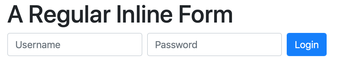
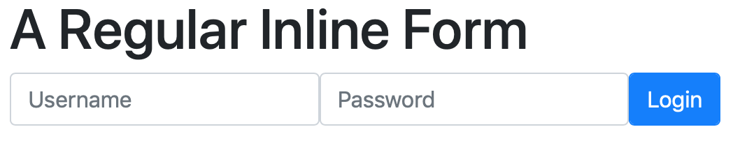
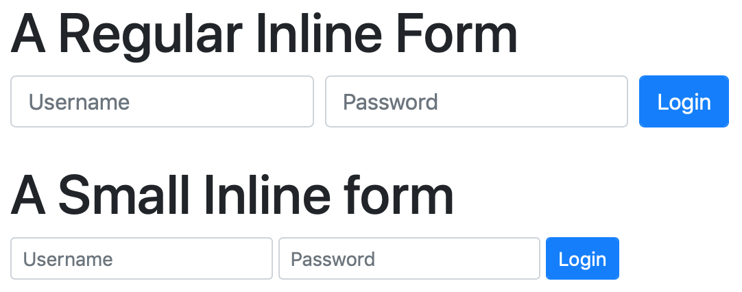
<h1>A Regular Inline Form</h1>
<p class="form-inline">
  <label for="uname_tb" class="sr-only">Username</label>
  <input type="text" id="uname_tb" class="form-control mr-sm-2 mb-2" placeholder="Username">
  <label for="passwd_tb" class="sr-only">Password</label>
  <input type="password" id="password_tb" class="form-control mr-sm-2 mb-2" placeholder="Password">
  <button class="btn btn-primary form-control mb-2">Login</button>
</p>
When the viewport is larger than the first breakpoint, we get an inline form:
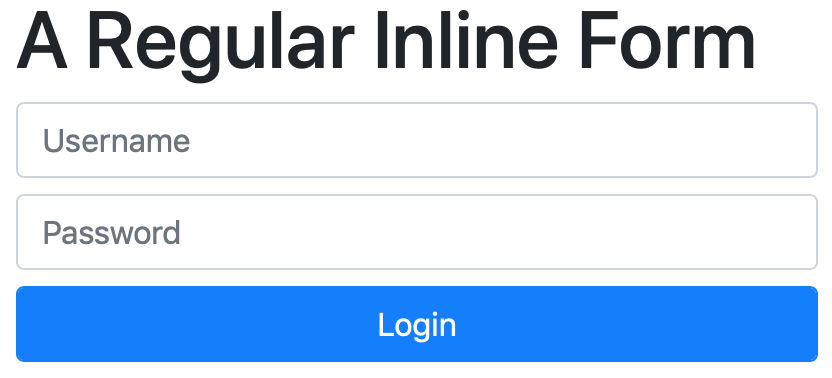
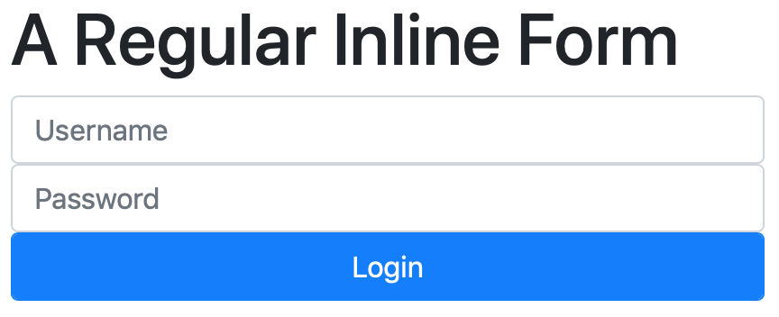
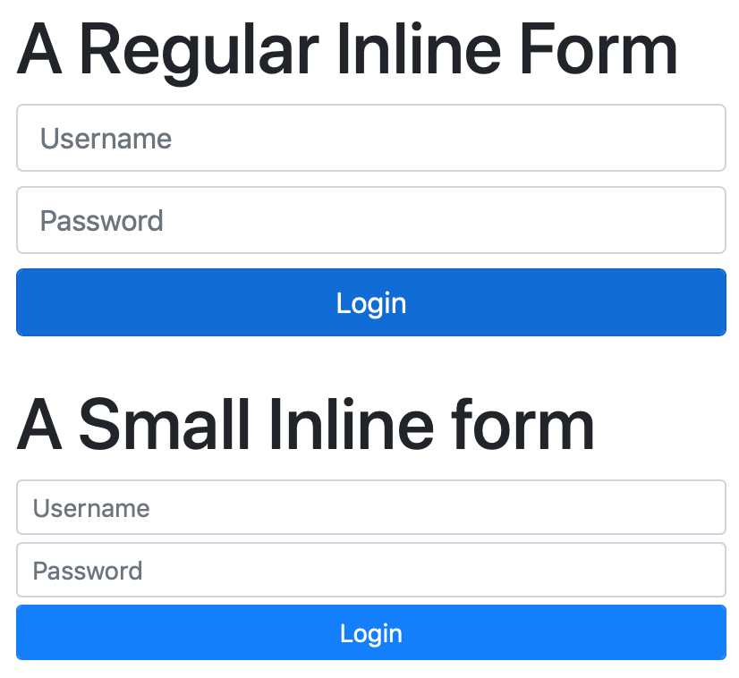
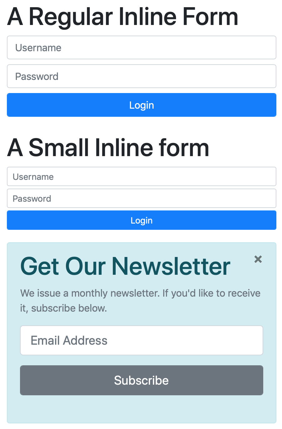
However, when we shrink the viewport down the form elements stack:
I want to draw your attention to a few key points in this code. Firstly, note the use of the sr-only utility class to hide the labels from everything but assistive devices.
The second thing I want to draw your attention to is the use of the sizing utility classes mr-sm-2 and mb-2. The first adds a small right margin at all breakpoints above the very smallest. That is, whenever the form is not stacked, a small right margin is added to stop the elements touching off each other. The mb-2 ensures that, when the form is stacked, there is vertical space between the elements. Removing these classes results in a very ugly form indeed!
Form Sizes
This seems like the opportune time to mention that form elements, like buttons, come in three sizes, small, regular, and large. To make a form element small, add the class form-control-sm in addition to form-control. You can use the class form-control-lg to make form elements large. Note that these classes are designed to be used alongside small and large buttons (btn-sm and btn-lg).
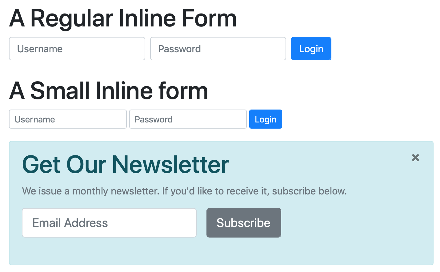
Small forms work particularly well with inline forms, allowing you to make much more subtle forms. A classic example might be a small admin login form on a blog:
<h1>A Small Inline form</h1>
<p class="form-inline">
  <label for="uname_sm_tb" class="sr-only">Username</label>
  <input type="text" id="uname_sm_tb" class="form-control form-control-sm mr-sm-1 mb-1" placeholder="Username">
  <label for="passwd_sm_tb" class="sr-only">Password</label>
  <input type="password" id="password_sm_tb" class="form-control form-control-sm mr-sm-1 mb-1" placeholder="Password">
  <button class="btn btn-primary btn-sm form-control mb-1">Login</button>
</p>
Note the change to smaller margins with the replacement of mr-sm-2 with mr-sm-1 and mb-2 with mb-1.
Similarly, you could use a large form to encourage users to subscribe to a news letter within an alert:
<div class="alert alert-info">
<button type="button" class="close" data-dismiss="alert" aria-label="Close">
<span aria-hidden="true">×</span>
</button>
<h1 class="alert-heading">Get Our Newsletter</h1>
<p class="form-text text-muted">We issue a monthly newsletter. If you'd like to receive it, subscribe below.</p>
<p class="form-inline">
<label for="email_tb" class="sr-only">Email Address</label>
<input type="email" id="email_tb" class="form-control form-control-lg mr-sm-3 mb-3" placeholder="Email Address">
<button class="btn btn-secondary btn-lg mb-3 form-control">Subscribe</button>
</p>
</div>
Horizontal Forms
Another very popular alternative to the default vertically stacked forms are horizontal forms, where the labels appear to the left of the form elements.
In structure, horizontal forms are very similar to regular forms. You must use form groups (wrappers with the class form-group), but you treat those form groups as a special kind of row by adding the class form-row, and then divide the contents of those special rows into columns using the usual bootstrap grid classes. You should use the label as the first column within each row, and to get its vertical alignment correct, give it the additional class col-form-label.
So, what you end up with is a wrapper with the classes form-group and form-row, containing a <label> with a col class (e.g. col-sm-3) and the class col-form-label. After the <label>, you add one or more wrappers with a col class into which you add your form elements.
Unlike inline forms, horizontal forms will not collapse down to stacked forms at small breakpoints automatically. If you want that behaviour, you’ll need to make use of the usual grid classes and breakpoints to achieve it.
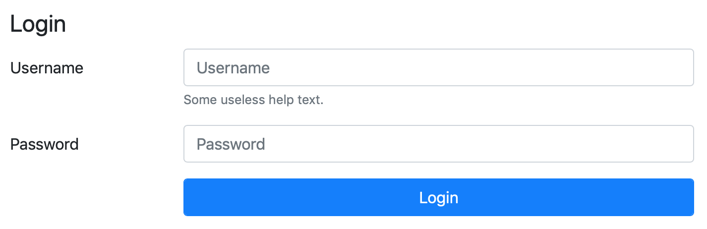
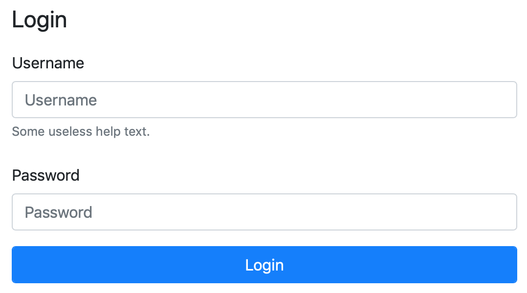
As a simple example, the following login form is horizontal for all but the smallest breakpoint, then it collapses into a stacked form:
<fieldset role="form" aria-labelledby="login_hr_fm_desc">
  <legend id="login_hr_fm_desc">Login</legend>
  <div class="form-group form-row">
    <label for="username_hr_tb" class="col-sm-3 col-form-label">Username</label>
    <div class="col">
      <input type="text" class="form-control" id="username_hr_tb" placeholder="Username">
      <small class="form-text text-muted">Some useless help text.</small>
    </div>
  </div>
  <div class="form-group form-row">
    <label for="password_hr_tb" class="col-sm-3 col-form-label">Password</label>
    <div class="col">
      <input type="password" class="form-control" id="password_hr_tb" placeholder="Password">
    </div>
  </div>
  <div class="form-row">
    <div class="col offset-sm-3">
      <button class="form-control btn btn-primary">Login</button>
    </div>
  </div>
</fieldset>
I do want to draw your attention to one subtle detail in this form that makes use of a Bootstrap grid feature we’ve not seen before — the offset-sm-3 class on the <div> acting as a col for the button. This is an example of Bootstrap’s offsetting classes, which you can read more about in the Bootstrap docs. What it means is that at breakpoints from small up the column for the button will be shifted to the right by three grid columns.
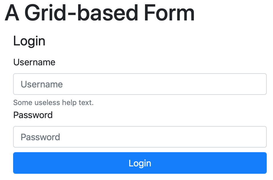
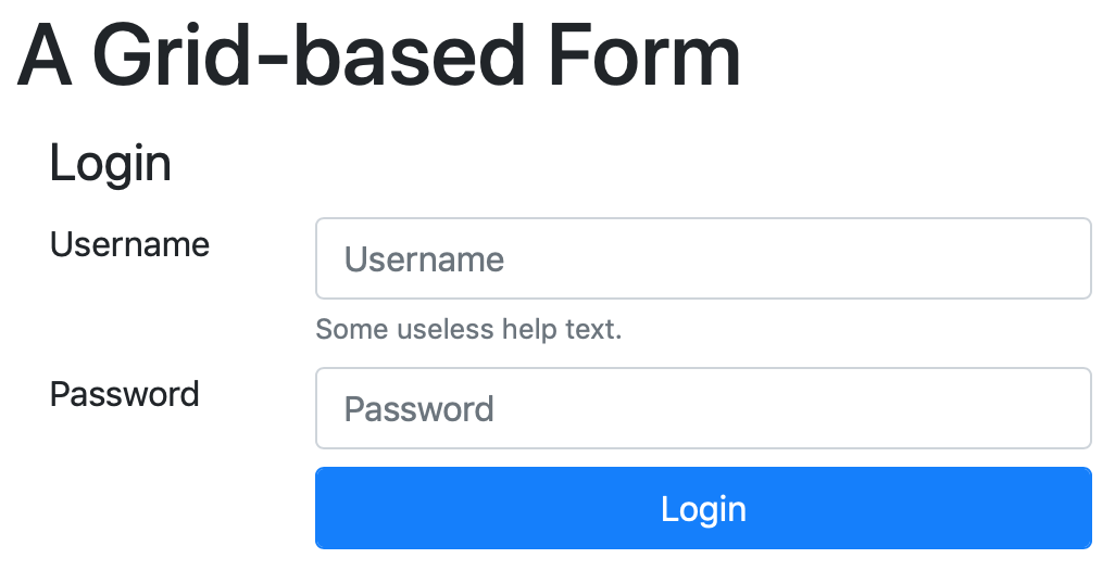
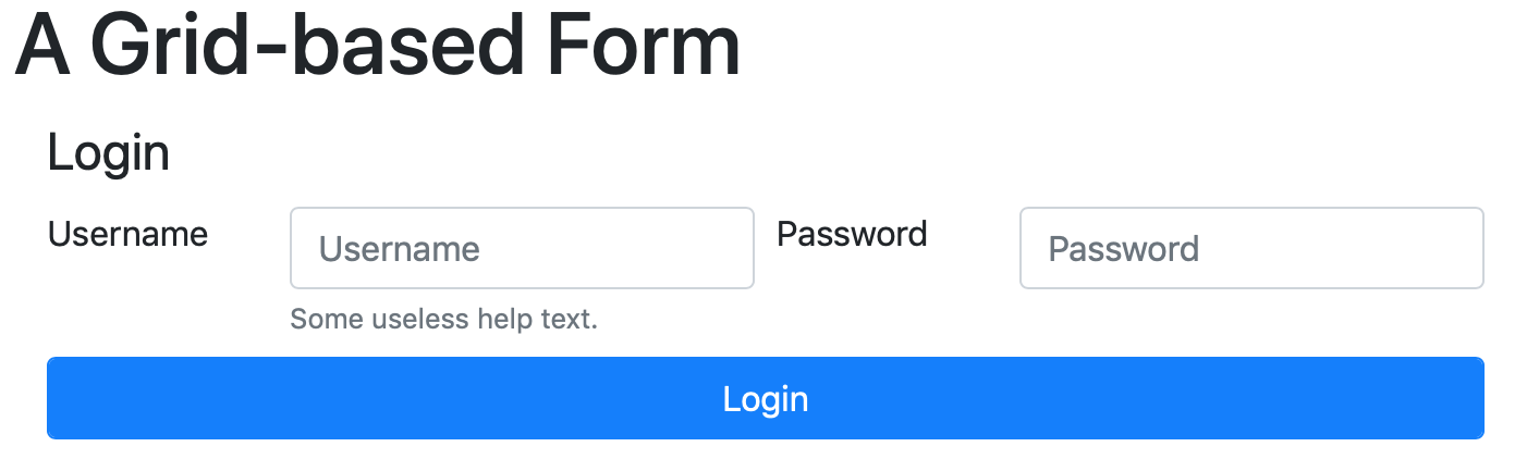
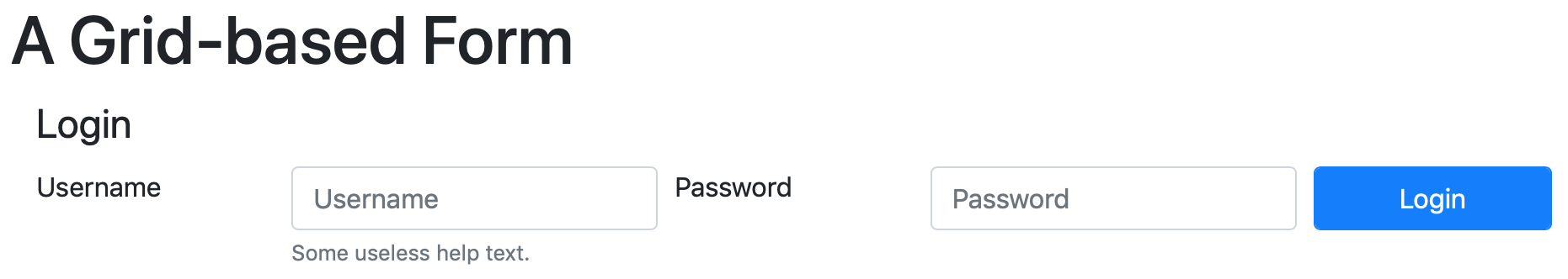
Grid-based Forms
Finally, you can use a regular Bootstrap grid to lay out your form. The markup here is almost identical to a regular grid layout, but with the option to use narrower gutters between columns by replacing row with form-row.
To illustrate this point, the following grid-based form has three different behaviours — at the smallest breakpoint it stacks, then it becomes a horizontal form, then it becomes a two-line form, and finally, a single-line form:
<fieldset class="container-fluid" role="form" aria-labelledby="login_gd_fm_desc">
  <legend id="login_gd_fm_desc" class="form-row"><span class="col">Login</span></legend>
  <div class="form-row align-items-start">
    <label for="username_hr_tb" class="col-12 col-sm-3 col-md-2 col-lg-2">Username</label>
    <div class="col-12 col-sm-9 col-md-4 col-lg-3">
      <input type="text" class="form-control" id="username_hr_tb" placeholder="Username">
      <small class="form-text text-muted">Some useless help text.</small>
    </div>
    <label for="password_hr_tb" class="col-12 col-sm-3 mt-sm-2 col-md-2 mt-md-0 col-lg-2">Password</label>
    <div class="col-12 col-sm-9 mt-sm-2 col-md-4 mt-md-0 col-lg-3">
      <input type="password" class="form-control" id="password_hr_tb" placeholder="Password">
    </div>
    <div class="col-12 mt-2 offset-sm-3 col-sm-9 offset-md-0 col-md-12 col-lg-2 mt-lg-0">
      <button class="form-control btn btn-primary">Login</button>
    </div>
  </div>
</fieldset>
Challenge
Rather than working with an empty page for this challenge, we’ll use the final version of the recipe we built as part of the earlier Bootstrap-related challenges. You can either use the final version of your own recipe as your starting point for this challenge, or the final version of mine, which I’ve included in the instalment’s ZIP.
Whichever recipe you choose to use as your starting point, add the following:
-
A footer containing a small inline form to allow an imaginary admin to log in.
The form should provide a text box for the username, a password field, and a login button.
When the user clicks the login button, they should get a message letting them know that the form is just a dummy form, and that it’s impossible to actually log in.
-
A form for sharing the recipe with a friend. This form should allow the user to enter the following information:
- Sender name and email address
- Recipient name and email address
- A message
- A Send Button
When the user submits the form, it should let them know the form doesn’t actually do anything.
When you’re finished, your entire recipe page, including these two new forms, should be well behaved, readable, and usable at all breakpoints.
Final Thoughts
We’re nearing the end of our first look at forms in Bootstrap 4. This is by no means a comprehensive guide to every single form-related feature in Bootstrap, far from it, but we will have a nice overview by the time we’re done.
To date we’ve learned how to take input from users, lay out our forms, and work with buttons. In the next instalment we’ll learn how to create richer inputs using Bootstrap’s Input Group component, and in the instalment after that, we’ll round things out with an introduction to Bootstrap’s form validation features.