PBS 63 of X: Buttons (Bootstrap)
In this instalment we’ll continue our exploration of forms in Bootstrap, but we’ll zoom right in to just a single form control — the button. In many ways buttons are the single most important form element because they generally act as the trigger for the action the form has been building up to. If you have a form for composing an email, it will be a button that sends the email. If you have a form for entering payment details, it will be a button that confirms your payment and finishes the transaction. If you’re just using a form to log in, it’s a button that submits your credentials to the server. In short, buttons make forms go, so they’re worth spending a little time on.
Having looked at basic form inputs in the previous instalment, and then buttons in this instalment, we’ll be ready to look at the different options Bootstrap provides for laying out forms beyond the default stacked layout we’ve seen to date.
You can Download this instalment’s ZIP file here or here on GitHub.
Matching Podcast Episode 564
Listen along to this instalment on episode 564 of the Chit Chat Across the Pond Podcast
You can also Download the MP3
PBS 62 Challenge Solution
The challenge set at the end of the previous instalment was to improve upon the alert generator form we’ve been working on over the past few instalments. You could use your solution to the previous challenge as your starting point, or you could use my sample solution instead.
The first part of the challenge was to transform the form into a properly marked up Bootstrap form complete with all the appropriate ARIA attributes to make the form accessible. There was very little to do here, and it was all simple by-the-book markup, so I don’t think there’s any need to dwell on it. This is the form I ended up with at this point in the challenge:
<fieldset class="col form" role="form" aria-labelledby="create_fm_desc">
  <legend id="create_fm_desc">Create Alerts</legend>

  <form action="javascript:void(0);" id="create_fm">

  <div class="form-group">
    <label for="alert_text_tb">Alert Text</label>
    <input type="text" class="form-control" id="alert_text_tb" placeholder="The text for your alert">
  </div>

  <div class="form-group">
    <label for="alert_style_sel">Alert Style</label>
    <select class="form-control" id="alert_style_sel">
      <option value="primary">Primary</option>
      <option value="secondary">Secondary</option>
      <option value="info" selected>Informational</option>
      <option value="success">Success</option>
      <option value="warning">Warning</option>
      <option value="danger">Danger</option>
      <option value="light">Light</option>
      <option value="dark">Dark</option>
    </select>
  </div>

  <div class="form-group">
    <button class="btn btn-primary form-control" id="alert_btn">
      Add Alert
      <span class="badge badge-light" id="counter_badge"></span>
    </button>
  </div>

  <div class="form-group">
    <button class="btn btn-danger form-control" id="close_btn">Close All Alerts</button>
  </div>
  </form>
</fieldset>
The next instruction was to convert the text box to a text area and relabel it to Alert Body. Again, this is simple by-the-book markup, but there was one possible stumbling block — because I chose to use a different ID for the text area than the one I had used for the text box, I had to do a find-and-replace in the entire file to update every occurrence of the ID, both in the HTML markup and the JavaScript event handlers. This is my updated form group:
<div class="form-group">
  <label for="alert_body_ta">Alert Body</label>
  <textarea class="form-control" id="alert_body_ta" placeholder="The text for the body of your alert" rows=5></textarea>
</div>
The third part of the challenge was to add a new form group with an appropriately labeled text box for adding a title to the alerts, and to update the event handler to render the alert with the title and body from the text box and text area.
The markup is by the book:
<div class="form-group">
  <label for="alert_title_tb">Alert Title</label>
  <input type="text" class="form-control" id="alert_title_tb" placeholder="The title for your alert">
</div>
Updating the click handler for the create button is also quite straightforward. We use the same jQuery functions used in our starting code to query the document for the values from the form, build an alert from those values, and inject the newly created alert into the document. We just call those same functions more often to query the form for two values rather than one:
$('#alert_btn').click(function(){
// build an empty alert
const $a = $('<div>').addClass(`alert alert-${$('#alert_style_sel').val()}`);
// build and inject the title
const $title = $('<h4>').addClass('alert-heading');
$title.text($('#alert_title_tb').val() || "A sample Alert");
$a.append($title);
// build and inject the body
$body = $('<p>').text($('#alert_body_ta').val() || "Enter text in the text area!");
$a.append($body);
// inject a dismiss button
$a.prepend($('<button type="button" class="close" data-dismiss="alert" aria-label="Close"><span aria-hidden="true">×</span></button>'));
// tell Bootstrap to treat our new alert as an alert
$a.alert();
// add a listener to the alert's closed event to update the counter
$a.on('closed.bs.alert', function(){
updateCounter();
});
// inject it into the page
$('#insert_here').append($a);
// update the counter
updateCounter();
});
The next part of the challenge was to add a checkbox to the form to allow the user to choose whether or not the generated alert would have a close button or not, and to update the event handlers appropriately.
The markup for this checkbox was again, by the book:
<div class="form-group form-check">
  <input type="checkbox" id="add_close_btn_cb" class="form-check-input" value=1 checked>
  <label for="add_close_btn_cb" class="form-check-label">Add a close button to the alert.</label>
</div>
The JavaScript is also quite straightforward. Basically, I use jQuery’s $() function to
query the document for the checkbox, then use jQuery’s .prop() function to test whether or not the checkbox has the checked property. I can then use that value in if() statement wrapped around the code for injecting the close button:
$('#alert_btn').click(function(){
// build an empty alert
const $a = $('<div>').addClass(`alert alert-${$('#alert_style_sel').val()}`);
// build and inject the title
const $title = $('<h4>').addClass('alert-heading');
$title.text($('#alert_title_tb').val() || "A sample Alert");
$a.append($title);
// build and inject the body
$body = $('<p>').text($('#alert_body_ta').val() || "Enter text in the text area!");
$a.append($body);
// inject a dismiss button if required
if($('#add_close_btn_cb').prop('checked')){
$a.prepend($('<button type="button" class="close" data-dismiss="alert" aria-label="Close"><span aria-hidden="true">×</span></button>'));
}
// tell Bootstrap to treat our new alert as an alert
$a.alert();
// add a listener to the alert's closed event to update the counter
$a.on('closed.bs.alert', function(){
updateCounter();
});
// inject it into the page
$('#insert_here').append($a);
// update the counter
updateCounter();
});
The next part of the challenge was to add a group of radio buttons to allow the user to choose an icon for the alert. The choice of what type of icons to use was yours. I chose to use Font Awesome glyph icons as described in instalment 29. This involved importing the Font Awesome 4 CSS in the <head> section, and then the following form markup would work:
<div class="form-group" role="radiogroup" aria-labelledby="alert_icon_lbl">
  <label id="alert_icon_lbl">Alert Icon</label><br>
  <div class="form-check form-check-inline">
    <input type="radio" name="alert_icon_rb" id="alert_icon_rb_exclamation" value="fa-exclamation-triangle" class="form-check-input">
    <label for="alert_icon_rb_exclamation" class="form-check-label"><i class="fa fa-exclamation-triangle" aria-hidden></i><span class="sr-only">Exclamation Triangle</span></label>
  </div>
  <div class="form-check form-check-inline">
    <input type="radio" name="alert_icon_rb" id="alert_icon_rb_question" value="fa-exclamation-triangle" class="form-check-input">
    <label for="alert_icon_rb_question" class="form-check-label"><i class="fa fa-question-circle" aria-hidden></i><span class="sr-only">Question Mark</span></label>
  </div>
  <div class="form-check form-check-inline">
    <input type="radio" name="alert_icon_rb" id="alert_icon_rb_info" value="fa-info-circle" class="form-check-input" checked>
    <label for="alert_icon_rb_info" class="form-check-label"><i class="fa fa-info-circle" aria-hidden></i><span class="sr-only">Information Icon</span></label>
  </div>
  <div class="form-check form-check-inline">
    <input type="radio" name="alert_icon_rb" id="alert_icon_rb_check" value="fa-check-circle" class="form-check-input">
    <label for="alert_icon_rb_check" class="form-check-label"><i class="fa fa-check-circle" aria-hidden></i><span class="sr-only">Check/Tick</span></label>
  </div>
</div>
Note that I chose to use an inline button group.
Next the click handler for the button to create alerts needed to be updated to read the chosen icon from the radio group, and to create and insert the appropriate icon.
Reading the value from a radio group is something we haven’t done in a while. So let’s remind ourselves how we do that with jQuery. What we need to do is query the document for the one member of the radio group that is selected, and then read out its value. Let’s break that down — first we’ll need all inputs with the name alert_icon_rb. The CSS selector for that is:
input[name=alert_icon_rb]
We don’t want all the members of the radio group though, just the one that’s checked. So we need to add the :checked pseudo-class to the selector:
input[name=alert_icon_rb]:checked
Combining that CSS selector with jQuery’s $() and .val() functions, we can get the value of the checked radio button with:
$('input[name=alert_icon_rb]:checked').val()
Putting it all together, my click handler now looks like this:
$('#alert_btn').click(function(){
// build an empty alert
const $a = $('<div>').addClass(`alert alert-${$('#alert_style_sel').val()}`);
// build the title
const $title = $('<h4>').addClass('alert-heading');
$title.text($('#alert_title_tb').val() || "A sample Alert");
// inject the icon into the title
const $icon = $('<i aria-hidden>').addClass('fa mr-2');
$icon.addClass($('input[name=alert_icon_rb]:checked').val());
$title.prepend($icon);
// inject the title with icon into the alert
$a.append($title);
// build and inject the body
$body = $('<p>').text($('#alert_body_ta').val() || "Enter text in the text area!");
$a.append($body);
// inject a dismiss button if required
if($('#add_close_btn_cb').prop('checked')){
$a.prepend($('<button type="button" class="close" data-dismiss="alert" aria-label="Close"><span aria-hidden="true">×</span></button>'));
}
// tell Bootstrap to treat our new alert as an alert
$a.alert();
// add a listener to the alert's closed event to update the counter
$a.on('closed.bs.alert', function(){
updateCounter();
});
// inject it into the page
$('#insert_here').append($a);
// update the counter
updateCounter();
});
The penultimate part of the challenge was to have the form reset to its default state when the alert is created. The easiest way to do this is to call the form’s .reset() function as the last line in the click handler. I gave my form the ID create_fm, so I can get a reference to a jQuery object representing the form with $('#create_fm'). This gets me a jQuery object, not the form’s raw object in the DOM. But, I need the DOM object because .reset() is a DOM function, not a jQuery function. I can do that with jQuery’s .get() function. Putting it all together the very end of my click handler now becomes:
// reset the form
$('#create_fm').get(0).reset();
Finally, for extra credit, was the conversion of the two buttons into a single full-width button group. Anyone who got this working deserves double-extra-credit, because it was actually more difficult than I realised. In Bootstrap version 3 there was a special type of button group for full-width collections of buttons, but that was removed in Bootstrap 4. It is still possible though, but not obvious. Without the help of Google & Stack Overflow, I doubt I’d ever have found the relevant section in the migration documentation.
Despite being hard to find, the final answer is very simple. Wrap the two buttons in a <div> with the class btn-group to combine the two buttons into a nice single grouped button, then turn that button group into a flex box by adding the class d-flex and set both buttons to want to be full-width by adding the class w-100 to each:
<div class="form-group">
  <div class="btn-group d-flex" role="group">
    <button class="btn btn-primary w-100" id="alert_btn">
      Add Alert
      <span class="badge badge-light" id="counter_badge"></span>
    </button>
    <button class="btn btn-danger w-100" id="close_btn">Close All Alerts</button>
  </div>
</div>
You’ll find my full sample solution in the ZIP file as pbs62-challengeSolution.html.
Bootstrap Buttons
In pure HTML there are two ways to produce a button — there’s the old way, an <input> with type=button, type=submit, or type=reset. Then there’s the new <button> tag. Note that, when you’re writing HTML 5, you should avoid the old <input> approach and use the new <button> tag instead.
So, while HTML itself already takes an unusually broad view of what a button can be, Bootstrap takes things even further, allowing just about any element to be rendered as a button. However, the whole raison d’être for buttons is to trigger an action. So semantically it makes sense to confine your use of the Bootstrap button classes to what I’ll term action elements, generally <button>, <input>, and <a>.
Note that all the code snippets below can be found in the file pbs63a.html in the ZIP file.
Button Basics
To render something as an opinionated Bootstrap button, you need to apply two classes, btn, and an appropriate style class.
There are the style classes you would expect to give you the eight default filled button colours: btn-primary, btn-secondary, btn-info, btn-success, btn-warning, btn-danger, btn-light, and btn-dark.
If you’d prefer an outlined as opposed to a filled button, there are also eight classes for those: btn-outline-primary … btn-outline-dark.
Then there is one final more unusual option, btn-link to give you a button that doesn’t look like a button at all! (More on that later.)
Varying Button Sizes
Bootstrap buttons don’t need to be their default (quite large) size. They come in miniature and extra large too! To make a button of any style smaller, add the class btn-sm, and to make any button larger, add btn-lg.
Links as Buttons and Buttons as Links
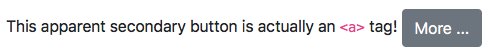
Using Bootstrap’s button classes we can render any link as a button by giving it the class btn plus one of the regular style variants:
This apparent secondary button is actually an <code><a></code> tag!
<a class="btn btn-secondary" href="http://getbootstrap.com/docs/4.1/components/buttons/" taget="_blank" rel="noopener">More ...</a>
But, we can also render any button as a link by giving it the classes btn and btn-link:
This apparent link is actually a <code><button></code> tag!
<button class="btn btn-link" id="btn_as_link">More ...</button>

Button Groups & Toolbars
While HTML doesn’t support combining multiple buttons into a single UI element, Bootstrap does. It calls this new UI element a Button Group.
Creating a basic button group is very straightforward. Just wrap your buttons in a containing tag (usually a <div>), and give that wrapper the class btn-group. To support screen readers you should also add role=group to the wrapping tag. If there is a sensible label you can give the group as a whole, you can also add aria-label="your label" (or if there is some descriptive text elsewhere in the page, give it an ID and link to it with aria-labelledby="the_label_id").
Button groups are most often used within the UI of a web app, but you can use them anywhere. You could use them for social media sharing links:
Basic share links as a button group:
<span class="btn-group" role="group" aria-label="share">
  <a class="btn btn-secondary" href="javascript:void(0);">Twitter</a>
  <a class="btn btn-secondary" href="javascript:void(0);">Facebook</a>
  <a class="btn btn-secondary" href="javascript:void(0);">Google+</a>
</span>

Button Group Sizes
Most conveniently, you can resize all the buttons in a button group at once by applying btn-group-sm or btn-group-lg to the wrapping element.
Combining button groups with some kind of icon sent, like glyph icons, and sizing them appropriately, you can do very nice things like this:
Share links with glyph icons as a small button group:
<span class="btn-group btn-group-sm" role="group" aria-label="share">
  <a class="btn btn-secondary" href="javascript:void(0);">
    <i class="fa fa-twitter" aria-hidden></i>
    <span class="sr-only">Twitter</span>
  </a>
  <a class="btn btn-secondary" href="javascript:void(0);">
    <i class="fa fa-facebook" aria-hidden></i>
    <span class="sr-only">Facebook</span>
  </a>
  <a class="btn btn-secondary" href="javascript:void(0);">
    <i class="fa fa-google-plus" aria-hidden></i>
    <span class="sr-only">Google+</span>
  </a>
</span>

Button Groups as Form Controls
As we saw with the bonus credit part of the challenge, using a button group as a form control is not as straightforward as you might expect. It’s not difficult, it’s just unusual, and IMO, not obvious.
As a reminder, this is how to do it:
<div class="form-group">
  <div class="btn-group d-flex" role="group">
    <button class="btn btn-primary w-100" id="alert_btn">
      Add Alert
      <span class="badge badge-light" id="counter_badge"></span>
    </button>
    <button class="btn btn-danger w-100" id="close_btn">Close All Alerts</button>
  </div>
</div>
So what’s going on here?
Firstly, to get the button group to expand to the full width of the form, we are converting it into a flex box by adding the Bootstrap utility class d-flex. Each item within the button group has now become a flex icon, but it will still retain its default width. How do we force each button to expand? We use Bootstrap’s sizing utility classes. For a two-button button group we could give each button the class w-50, and it would work. However that’s not a good general solution because there is no w-33 for 3-button button group, let alone a w-20 for a five-button group, etc. The solution is to make use of the fact that flexboxes squash content to make it fit. Perhaps counterintuitively, we set the width of each button within the group to 100% with w-100. This won’t make each button actually be the full width. It will just make it try and the flex box will constrain the buttons onto a single row. Since they all want to be the same size, the buttons will be equally divided across the flex box.
Button Toolbars
A button group is a group of buttons, so what would you call a group of button groups? A Button Toolbar! As their name suggests, Bootstrap Button Toolbars are very much designed to be used within web app UIs rather than within regular web pages.
To create a button toolbar, simply wrap your button groups in another tag (also usually a <div>), and give the wrapper the class btn-toolbar. To facilitate accessibility, you should also give the wrapper role=toolbar, and consider labelling it with aria-label="your label" (or linking to another label with aria-labelledby="the_label_id"). Finally, to add the desired amount of spacing between button group, use the Bootstrap spacing utilities, e.g. mr-2 to add a small right margin.
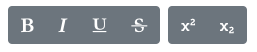
As a contrived example, here’s the code for a simple text-formatting button toolbar:
<div class="btn-toolbar" role="toolbar" aria-label="format">
 <div class="btn-group mr-2" role="group" aria-label="font style">
   <button class="btn btn-secondary">
     <i class="fa fa-bold" aria-hidden></i>
     <span class="sr-only">Bold</span>
   </button>
   <button class="btn btn-secondary">
     <i class="fa fa-italic" aria-hidden></i>
     <span class="sr-only">Italic</span>
   </button>
   <button class="btn btn-secondary">
     <i class="fa fa-underline" aria-hidden></i>
     <span class="sr-only">Underline</span>
   </button>
   <button class="btn btn-secondary">
      <i class="fa fa-strikethrough" aria-hidden></i>
      <span class="sr-only">Strikethrough</span>
    </button>
  </div>
  <div class="btn-group" role="group" aria-label="baseline">
    <button class="btn btn-secondary">
      <i class="fa fa-superscript" aria-hidden></i>
      <span class="sr-only">Superscript</span>
    </button>
    <button class="btn btn-secondary">
      <i class="fa fa-subscript" aria-hidden></i>
      <span class="sr-only">Subscript</span>
    </button>
  </div>
</div>
Final Thoughts
We’ve now covered the basics of Bootstrap forms — we can collect textual data from users with text boxes and text areas, we can collect selections from users with drop-downs, checkboxes, and radio buttons, and we can trigger actions with buttons. When it comes to laying out our forms, we’ve just scratched the surface though — having only seen Bootstrap’s default simplistic stacked layout. That will change next time when we explore some of the other form layout options Bootstrap provides.