PBS 62 of X: A Basic Form (Bootstrap)
So far in our exploration of Bootstrap 4 we’ve focused on the kinds of features that are useful when building web pages designed to communicate information — news sites, blogs, corporate websites, etc. There is of course much more out there in the universe of websites, and one of the biggest categories we’ve totally ignored is web apps! All web apps need the ability for the user to interact with them. In other words, all web apps need web forms, and we’ve totally ignored those in our explorations of Bootstrap to date! It’s about time we rectified that. So in this instalment we’ll dip our toes in the ocean of form-related Bootstrap features.
One of the reasons I’ve delayed diving into Bootstrap forms is that it’s almost impossible to know where to begin. Bootstrap provides so many form-related features and options, it’s almost overwhelming!
We’ll start our exploration of forms very simply, but bear in mind that what we’ll see today is just the tip of the proverbial iceberg.
You can Download this instalment’s ZIP file here or here on GitHub.
Matching Podcast Episode 563
Listen along to this instalment on episode 563 of the Chit Chat Across the Pond Podcast
You can also Download the MP3
PBS 61 Challenge Solutions
Challenge 1
The first challenge was very straightforward: replace the heading in the recipe you’ve been building up over the past few challenges with a Bootstrap Jumbotron.
This is the last challenge relating to the recipe. You’ll find my full final responsive recipe page in the pbs61-challenge1-solution folder in this instalment’s ZIP file. I’m including just the code for the heading below:
<header class="container-fluid">
<div class="jumbotron">
<h1 class="display-4">Roasted Cucumber <small class="text-muted">with Red Onion & Dill</small></h1>
<h2 class="sr-only">Description</h2>
<p class="lead">An unusual roasted vegetable dish that's refreshingly tangy and will pair well with fish.</p>
</div>
</header>
Challenge 2
The second challenge was a little more challenging — using your own solution or mine to the second challenge from instalment 60 as your starting point, add a counter showing the number of alerts currently displayed as a Bootstrap badge within the button for adding alerts.
In terms of updates to the HTML markup there was only one very small change needed — an empty tag within the button to act as the badge:
<button class="btn btn-primary" id="alert_btn">
  Add Alert
  <span class="badge badge-light" id="counter_badge"></span>
</button>
Something to notice is that an empty Bootstrap badge is invisible. This is very convenient. It means you don’t have to explicitly hide badges with no information to display, just empty them and they vanish until you add some content into them.
The next step is to write a JavaScript function to calculate the number of alerts currently displayed, and to insert that value into the badge.
The first step to building up this function is to figure out how many alerts there are:
const numAlerts = $('#insert_here .alert').length;
This code passes jQuery’s $() function a CSS selector so it queries the document for all elements with the class alert contained within the element with the ID insert_here. This will produce a single jQuery object representing all the alerts. To get the number, simply get that object’s .length property.
I decided that, rather than writing zero into the badge, I would bank the badge if there were no alerts, and write the number if there were:
if(numAlerts > 0){
  $('#counter_badge').text(numAlerts);
}else{
  $('#counter_badge').empty();
}
Note that in both cases, I use jQuery’s $() function with a CSS selector for the element with the ID counter_badge to get a jQuery object representing the badge. Then I either use jQuery’s .text() function to write new text into the badge, or jQuery’s .empty() function to empty the badge.
Putting it all together produces the following function:
function updateCounter(){
  // get the latest count
  const numAlerts = $('#insert_here .alert').length;

  // either write the count, or empty the badge if there are no alerts
  if(numAlerts > 0){
    $('#counter_badge').text(numAlerts);
  }else{
    $('#counter_badge').empty();
  }
}
Now that we have a function, we need to call it each time an event which could indicate a change to the number of alerts happens.
The most obvious time the number of alerts changes is when a new alert is added. So a call to updateCounter() needs to be added as the last line of the click handler.
The other event is the closing of an alert. There is a small subtlety here. Bootstrap provides two very similar events relating the closing of buttons: close.bs.alert and closed.bs.alert. What’s the difference? One is called before the animation to remove the alert starts, and the other is called when it has finished and the alert has been destroyed. If you attach your call to updateCounter() to the first handler, it will still see the closing alert as existing. Your count will be wrong. You must use the second event: closed.bs.alert.
You need to add a listener for this event to the alert as you build it. So this code too needs to go inside the click handler for the button add an alert. This function now looks like this:
$('#alert_btn').click(function(){
// build an alert
const $a = $('<div>').text($('#alert_text_tb').val() || "A sample Alert — enter text in the text box!");
$a.addClass(`alert alert-${$('#alert_style_sel').val()}`);
// inject a dismiss button
$a.prepend($('<button type="button" class="close" data-dismiss="alert" aria-label="Close"><span aria-hidden="true">×</span></button>'));
// tell Bootstrap to treat our new alert as an alert
$a.alert();
// add a listener to the alert's closed event to update the counter
$a.on('closed.bs.alert', function(){
updateCounter();
});
// inject it into the page
$('#insert_here').append($a);
// update the counter
updateCounter();
});
That’s it, there are no more events — we’re listening for the creation of new alerts, and the closing of existing alerts by any means.
You’ll find my full solution as pbs61-challenge2-solution.html in this instalment’s ZIP.
Introducing Bootstrap Forms
Bootstrap provides a lot of very nice features for making great looking HTML forms. Simply by using Bootstrap there are some basic non-default styles applied to form elements, but you need to opt in to the more dramatic and opinionated options Bootstrap provides. In fact, Bootstrap offers so many form-related features and options that it’s very hard to know where to begin, and in what order to introduce things.
After many changes of mind, I’ve decided to start with a basic form containing some of the most commonly used form elements, and then to build from there.
Before we get stuck in I want to start with some general advice around using forms with Bootstrap:
- Think of your forms as collections of little molecules, each of which is there to get one piece of information from the users. These molecules are made up of smaller parts clumped together to form a logical whole, specifically labels, form elements, and help text.
- Always label your form elements with a
<label>tag. If you don’t want the label to be visible, still add it, but hide it from all but assistive devices with Bootstrap’s.sr-onlyutility class. - Always use the correct
typewith<input>tags. If you want the user to enter a URL, use<input type="url">, if you want an email address, use<input type="email">and so on. Some of Bootstrap’s more advanced features assume semantically correct markup, so if you don’t meet that assumption, you’re likely to run into problems.
A Basic Bootstrap Form (Illustrated Example)
Rather than try explain the basic concepts in the abstract, let’s build a simple form that contains the most commonly used form elements and look at how it hangs together.
When I say simple, what do I mean? I mean that there are not subsections in the form, that there is no custom layout, and that it only uses commonly used native HTML form elements. You’ll find the code for this example in the ZIP file for this instalment as pbs62a.html, and this is what the form looks like in a browser:
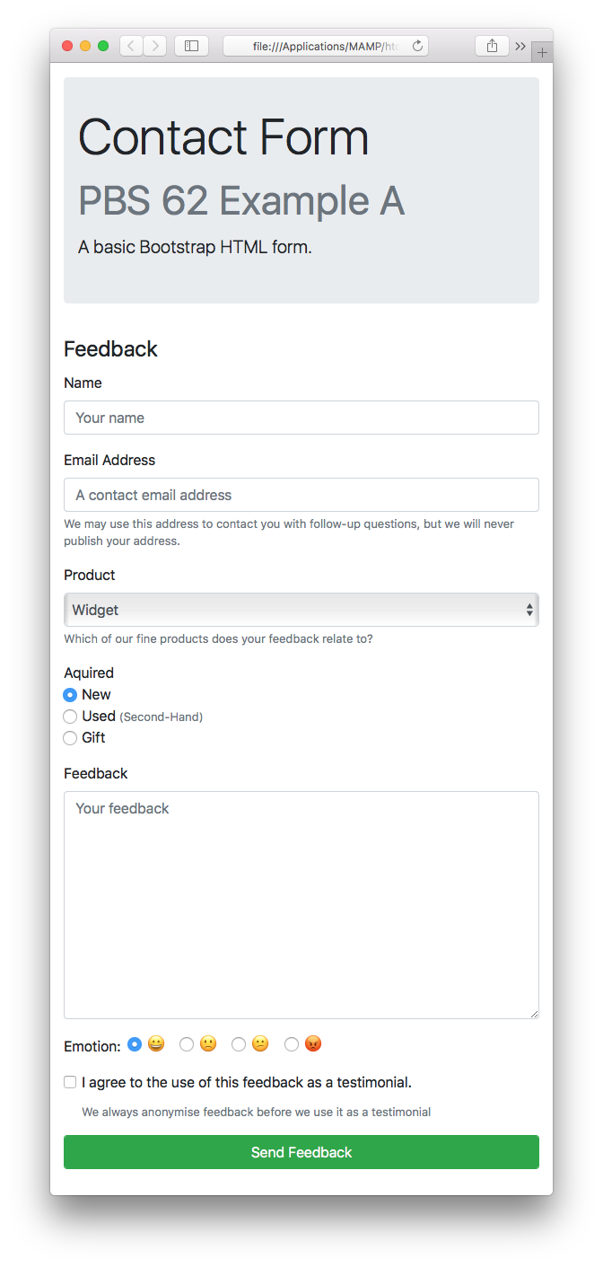
As you can see, Bootstrap defaults to vertical stacks of full-width form elements with their labels above. We’ll be sticking with that default today, but know that it’s just a default. Bootstrap gives you so many more choices and options when it comes to laying out forms!
With that said, let’s dive into the code to see how this form works.
The Form’s Container
When building a form in Bootstrap it should be entirely wrapped within a containing tag of your choice, and that tag needs to be given the class form.
It’s not compulsory, but the Bootstrap documentation recommends the use of the <fieldset> and <legend> tags and their matching ARIA role and aria-labeledby attributes.
In our example the form takes up an entire column in the grid layout, so the container contains the form class as well as the grid classes:
<main class="container">
  <div class="row justify-content-center">
    <fieldset class="col col-md-8 col-lg-6 form" role="form" aria-labelledby="feedback_fm_desc">
      <legend id="feedback_fm_desc">Feedback</legend>

      <form action="javascript:void(0);" id="feedback_fm">

      <!-- FORM UI GOES HERE -->

      </form>
    </fieldset>
  </div>
</main>
The Importance of Form Groups
The UI to extract a single piece of information from the user rarely consists of just a single HTML tag. Instead, the needed UI generally consists of one or more HTML form elements, a label, and perhaps some help text. This is where the Bootstrap CSS class form-group comes in. When building forms with Bootstrap, you wrap the UI for each piece of information you’re trying to extract in a block-level tag (usually <div>), and give that wrapper the class form-group. The markup for the email address field is a perfect example, containing a label, a text box, and some help text:
<div class="form-group">
  <label for="email_tb">Email Address</label>
  <input type="email" class="form-control" id="email_tb" placeholder="A contact email address" aria-describedby="email_tb_desc">
  <small id="email_tb_desc" class="form-text text-muted">We may use this address to contact you with follow-up questions, but we will never publish your address.</small>
</div>
As well as marking the entire collection of tags as a form group, Bootstrap also requires that block-level help text be given the class form-text, and that HTML form elements, or controls, be given the class form-control.
Notice the use of an aria-describedby attribute to link the help text to the relevant HTML form element.
Also, you don’t have to use text-muted for help text, but the Bootstrap documentation suggests you do. I agree with that suggestion because IMO it makes the form easier to read.
Finally, note that you can add inline help text too. You don’t need to give such text any special class, but it is suggested you also give it text-muted for clarity. We’ll see an example of this a little later.
So, the key point is that the UI for a single piece of information gets encapsulated in something with the class form-group, the HTML form elements that make up the functional part of the UI get the class form-control, and any related block-level help text gets the class form-text.
Checkboxes and Radio Buttons
Text fields, text areas, selects, and buttons all work fine within regular form groups, but checkboxes and radio buttons are a special case, and they need some extra markup to be displayed nicely.
Bootstrap does not distinguish between checkboxes and radio buttons. You should use the same Bootstrap classes with both. Specifically, every individual checkbox and radio button, along with its matching label, should be enclosed within a containing element, and that containing element should be given the class form-check. Furthermore, each checkbox and radio button should be given the class form-check-input, and the label for each checkbox or radio button the class form-check-label.
When your form group contains just a single checkbox, like a typical I agree checkbox, the form group and the container for the checkbox may be the same HTML element. So you apply both the classes form-group and form-check to the one tag. A good example of this is the testimonial checkbox on our sample form:
<div class="form-group form-check">
  <input type="checkbox" id="testimonial_cb" class="form-check-input" value="ok" aria-describedby="testimonial_cb_desc">
  <label for="testimonial_cb" class="form-check-label">I agree to the use of this feedback as a testimonial.</label>
  <small id="testimonial_cb_desc" class="form-text text-muted">We always anonymise feedback before we use it as a testimonial</small>
</div>
Often times a form group requires more than one checkbox or radio button. In those situations Bootstrap defaults to stacking the checkboxes/radio buttons and their matching labels vertically.
In this situation each checkbox/radio button along with its matching label, and perhaps some inline help text, should be contained within a separate element, (usually a <div>), and that container should be given the class form-check.
A good example of this (including some inline help text), is the Acquired radio group in our sample form:
<div class="form-group" role="radiogroup" aria-labeledby="acquired_rad_desc">
  <label id="acquired_rad_desc" class="form-check-label">Acquired</label>
  <div class="form-check">
    <input type="radio" name="acquired" value="new" id="acquired_rad_new" class="form-check-input" checked>
    <label for="acquired_rad_new" class="form-check-label">New</label>
  </div>
  <div class="form-check">
    <input type="radio" name="acquired" value="used" id="acquired_rad_used" class="form-check-input">
    <label for="acquired_rad_used" class="form-check-label">Used</label> <small class="text-muted">(Second-Hand)</small>
  </div>
  <div class="form-check">
    <input type="radio" name="acquired" value="gift" id="acquired_rad_gift" class="form-check-input">
    <label for="acquired_rad_gift" class="form-check-label">Gift</label>
  </div>
</div>
From an accessibility point of view you should give the containing tag the role radiogroup. You should add a label that describes the collection of values overall and attach it to the radio group as a whole with the aria-labelledby attribute.
While having the radio buttons stacked is a sensible default, it’s not always the most suitable solution. For that reason Bootstrap also supports inline radio groups. To make a collection of radio buttons inline, add the class form-check-inline to the container for each radio button, i.e. give the containers both the classes form-check and form-check-inline.
You can see an example of an inline radio group with the emotions form group in our example form:
<div class="form-group" role="radiogroup" aria-labelledby="emotion_rad_desc">
  <label id="emotion_rad_desc" class="form-check-label mr-1">Emotion:</label>
  <div class="form-check form-check-inline">
    <input type="radio" name="emotion" value="happy" id="emotion_rad_happy" class="form-check-input" checked>
    <label for="emotion_rad_happy" class="form-check-label">😀<span class="sr-only">Happy</span></label>
  </div>
  <div class="form-check form-check-inline">
    <input type="radio" name="emotion" value="sad" id="emotion_rad_sad" class="form-check-input">
    <label for="emotion_rad_sad" class="form-check-label">🙁<span class="sr-only">Sad</span></label>
  </div>
  <div class="form-check form-check-inline">
    <input type="radio" name="emotion" value="confused" id="emotion_rad_confused" class="form-check-input">
    <label for="emotion_rad_confused" class="form-check-label">😕<span class="sr-only">Confused</span></label>
  </div>
  <div class="form-check form-check-inline">
    <input type="radio" name="emotion" value="angry" id="emotion_rad_angry" class="form-check-input">
    <label for="emotion_rad_angry" class="form-check-label">😡<span class="sr-only">Angry</span></label>
  </div>
</div>
Also note the use of Bootstrap’s .sr-only utility CSS class to provide more descriptive labels for each checkbox for screen readers.
A Challenge
Using your alert generator or mine (i.e. a solution to the second part of the previous instalment’s challenge) as your starting point, update it as follows:
- Update the form to convert it to a basic Bootstrap form like the example above.
- Convert the text box to a text area and relabel it as “Alert Body”.
- Add a text box (with matching label) above the text area and label it “Alert Title”. Update the JavaScript so generated alerts have a heading with the text from the text box, and a body with the text from the text area.
- Add a labeled checkbox to the form to allow the user to choose whether or not the alerts will have a close button. Update the JavaScript code so it obeys the checkbox.
- Add a series of radio buttons to allow users to choose between a few different icons of your choice that will be prefixed to the alert title. You can use images, emoji, or glyphicons depending on your preference. Update the JavaScript so it obeys the user’s choice.
- Update the JavaScript so it resets the form after creating an alert.
- For some optional bonus extra credit, read the documentation on Bootstrap Button Groups and see if you can figure out how to convert the two buttons into a single full-width button group.
Final Thoughts
In this instalment we’ve really just dipped our toes into the ocean of form-related features Bootstrap has to offer us. In upcoming instalments we’ll learn how to do much more complex form layouts, how to do cool things with buttons, how to combine multiple basic HTML form inputs into single powerful UI elements, and so much more.