PBS 70 of X: Modals & Toasts (Bootstrap)
In this instalment we’ll continue our recent focus on Bootstrap components primarily intended for use in web apps rather than on web pages. We’ll look at a pair of components designed to notify of something — modal dialogue boxes, and so-called toast notifications.
Different notifications require a different UI, hence there being two components, Modal, and Toast. However, both are quite similar in the sense that you will most probably be triggering them via JavaScript. Unlike the other components we’ve seen so far, these will not be visible to the user when the page loads. They’ll make their presence felt at some later time in response to some kind of event.
You can download this instalment’s ZIP file here or here on GitHub.
Matching Podcast Episode 580
Listen along to this instalment on episode 580 of the Chit Chat Across the Pond Podcast
You can also Download the MP3
Not all Notifications are the Same
When I look at the components Bootstrap offers, I see three distinct components for notifications, the first we’ve seen before, the Alert. The other two, the Modal and the Toast, will be our focus in this instalment. Before we get stuck into the technical details, I want to focus on the bigger question: why three? And how do I choose between them?
Alerts are designed to draw a user’s attention to something that’s known at the moment the page loads. A classic example would be those dismissible notices we see everywhere these days drawing our attention to cookie and privacy policies. Another might be a warning of scheduled maintenance at some future date and time. Finally, you’ll also see alerts used when a web app moves the users from one UI to another. A great example would be a webmail interface that navigates users to a full-page interface for composing and sending emails, and then navigates them back to their inbox when they hit send. When the inbox loads, it might contain an alert at the top of the page to let you know your email was successfully sent.
The key thing to remember is that Alerts were designed for delivering information when the page or interface loads, not at some random later time.
As its name suggests, the Bootstrap Modal component provides an implementation of a so-called modal dialogue. By definition, a modal dialogue is something that takes over the full screen and prevents you interacting with any part of the app/page other than that dialogue. They are, by design, very disruptive and intrusive. They are designed for situations where things can’t continue until the user deals with some event, perhaps by simply confirming that they’ve received some information, or by choosing some kind of response. Basically, modals are for communicating important things that the user must be forced to see, confirm, or choose.
In terms of notifications, modals are quite the sledge hammer, hence the need for a more subtle type of notification. That’s where Bootstrap’s Toast component comes in. These notifications are inspired by push notifications on smart phones and are designed to appear, stay for some amount of time, and then disappear.
So, in summary, if you know what needs to be communicated at the point in time that the page/interface loads, an Alert is probably the best fit. If you need to respond to an event after the page/interface loads you’ll probably need a Modal or a Toast. If you absolutely need the user to interact with your notification there and then, use a Modal; otherwise, use a Toast.
The Demo Page
Because both Modals and Toasts need to be triggered by some kind of event, my traditional practice of including a demo page (pbs70b.html) with a bunch of simple example code snippets in the instalment’s ZIP file won’t work. Instead, the ZIP file or here on GitHub contains a demo page with two web forms for generating alerts — one for creating Modals and one for creating Toasts. We’ll work through that page’s code later in the instalment, but for now, you can use it to see both Modals and Toasts in action for yourself.
I’ve also made a copy of this demo available online at https://bartb.ie/pbsdemos/pbs70/pbs70b.html.
Modals
Unlike every other Bootstrap component we’ve used so far, Modals are completely invisible when the page loads! They’re also unusual in another way — there can only ever be one Modal visible at a time. When you think about it, that makes sense, since a modal takes over the entire visible area of the page, how can two things take 100% of the view simultaneously?
You can choose to take three approaches with Modals. You can code every modal your interface will ever display into your HTML, and then hide and show the appropriate one on response to events. You can also code one empty modal into your HTML and then use JavaScript to populate that Modal with the appropriate message and then show the dialogue. Finally, you omit the modal from your HTML entirely, and use JavaScript to build each Modal from scratch in your event handler code.
Because you can only have one Modal at a time, and because the markup for Modals is quite involved, I generally use the middle option – code an empty Modal into my document, and then use jQuery in my event handlers to populate and show that Modal when needed.
The Simplest Modal
In my experience, I almost exclusively want to trigger Modals with JavaScript, but there is one scenario where I can see a use for triggering a Modal using jQuery’s data-toggle attribute on a button — to show/hide a lengthy piece of text (like perhaps a privacy policy) in a way that doesn’t waste too much screen real estate.
Let’s use that example scenario to learn how to build modals.
Firstly, Bootstrap’s documentation strongly recommends Modals be added to the top level of the page, i.e., contained directly within the <body> tag.
A modal consists of many parts. So the markup has a lot of tags in it, and a lot of different classes. All that complex markup must be contained within a tag of your choosing with the class .modal. You’ll generally see <div> tags used for this purpose. The tag with the class .modal must contain exactly one tag of your choosing with the class .modal-dialog. Again, you could use any tag, but people generally use <div>s. Next, the tag with the class .modal-dialog must contain a single tag with the class .modal-content. Again, that could be anything, but is usually a <div>. The tag with the class .modal-content must contain a tag with the class .modal-header, and another with the class .modal-body, and can contain a third with the class .modal-footer. Again, you can use any tag you like for those three, but people usually use <div>s. Finally, the .modal-header should contain some heading text wrapped in an line tag with the class .modal-title.
Even before we complicate things a little more by adding the needed ARIA markup for supporting accessibility, we already have a complex structure, a .modal containing a .modal-dialog containing a .modal-content containing a .modal-header, .modal-body, and perhaps a .modal-footer with the .modal-header containing a .modal-title.
To make all this ARIA-compliant, we need to do three additional things — we need to make sure tab navigation is pulled to the modal by adding tabindex="-1" to the tag with the class .modal. We need to give the appropriate ARIA roles to the parts that make up the Modal by adding role="dialog" to the tag with the class .modal, and role="document" to the one with the class .modal-content.
Next, we’ll need to provide at least one button for closing the dialogue. It’s considered best practice to provide a close button in the top-right corner of the header, and also a regular button with a sane label like ‘OK’ or ‘I Agree’ in the footer. The former can be done using the identical code we’ve already seen in dismissible Alerts:
<button type="button" class="close" data-dismiss="modal" aria-label="Close">
<span aria-hidden="true">×</span>
</button>
The latter can be done by giving any button of your choosing the data attribute data-dismiss="modal", e.g.:
<button type="button" class="btn btn-primary" data-dismiss="modal">OK</button>
Putting all that together we get markup of the following form:
<div class="modal" id="demo_mdl" tabindex="-1" role="dialog" aria-labelledby="modal_title">
<div class="modal-dialog modal-xl" role="document">
<div class="modal-content">
<div class="modal-header">
<h1 class="h5 modal-title" id="modal_title">Privacy Policy</h1>
<button type="button" class="close" data-dismiss="modal" aria-label="Close">
<span aria-hidden="true">×</span>
</button>
</div>
<div class="modal-body">
<p>... content here ...</p>
</div>
<div class="modal-footer">
<button type="button" class="btn btn-primary" data-dismiss="modal">OK</button>
</div>
</div>
</div>
</div>
Next, we need to trigger a Modal from a button. We can do that using Bootstrap’s Toggle plugin. Simply create a button and give it the data attributes data-toggle="modal", and data-target="#THE_ID_OF_THE_MODAL" (with the appropriate ID as the value). We can trigger our above modal with the button below:
<button type="button" class="btn btn-sm btn-secondary ml-3" data-toggle="modal" data-target="#demo_mdl">
  Our Privacy Policy
</button>
You can see this modal in action in pbs70a.html in this instalment’s ZIP or here on GitHub.
Dismissing Modals
Modals can be dismissed by clicking on a Bootstrap Close Button component somewhere within the Modal (usually in the header), by clicking a regular button with the appropriate data attributes, usually in the footer, by clicking anywhere on the semi-transparent overlay covering the remainder of the page, and by pressing the escape key.
It is possible to prevent some of these behaviours, but we’re not going to cover that in this series, see the Options section of the documentation for details.
Triggering Modals with JavaScript
As we’ve seen, you can trigger a modal without having to write any JavaScript using Bootstrap’s Toggle plugin, but that’s not the most common use case for Modals. Instead, Modals are usually triggered via an event handler.
As with other Bootstrap components, the Bootstrap JavaScript contains a jQuery plugin for controlling Modals. This plugin has the same name as the component, i.e. modal, and provides two particularly important actions, show, and hide. As with all jQuery plugins, you invoke the Bootstrap Modal jQuery plugin by calling the function with the plugins name on a jQuery object and passing the action as a string as the first argument.
For example, you can paste the following into a JavaScript console on pbs70a.html to show the Modal:
$('#demo_mdl').modal('show');
You can hide it again by entering:
$('#demo_mdl').modal('hide');
If your markup contains a fully completed modal ready to show, then this is all you need, but the approach I recommend is to have a single blank Modal in your markup and then edit its contents with jQuery before showing it. This is how the Modals generated with the form in pbs70b.html are implemented.
At the top of the <body> you’ll find the markup for the blank Modal:
<div class="modal" id="demo_mdl" tabindex="-1" role="dialog" aria-labelledby="modal_title">
<div class="modal-dialog modal-xl" role="document">
<div class="modal-content">
<div class="modal-header">
<h1 class="h5 modal-title" id="modal_title">Modal title</h1>
<button type="button" class="close" data-dismiss="modal" aria-label="Close">
<span aria-hidden="true">×</span>
</button>
</div>
<div class="modal-body">
<p>Modal body text goes here.</p>
</div>
<div class="modal-footer">
<button type="button" class="btn btn-primary" data-dismiss="modal">OK</button>
</div>
</div>
</div>
</div>
The event handler for the form simply uses jQuery to insert the needed text and CSS classes to alter this Modal as requested, then shows it.
To see how this is done, you can enter the lines below into the JavaScript console on pbs70b.html.
First, let’s get a reference to the entire Modal for convenience:
const $modal = $('#demo_mdl');
Next, let’s edit the title text:
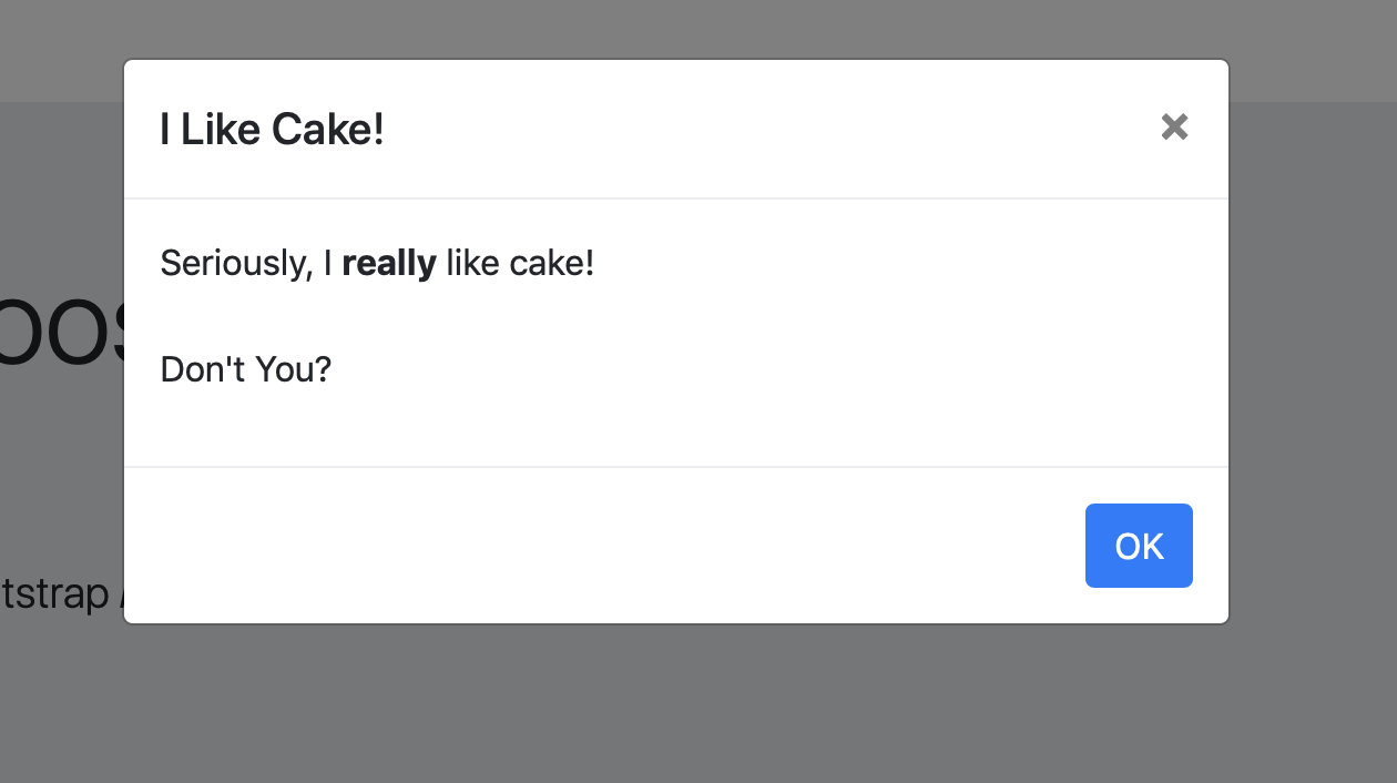
$('.modal-title', $modal).text('I Like Cake!');
Breaking this down, we first use the jQuery’s $() function to get a reference to the element with the class .modal-title contained within our modal (stored in the variable $modal). We then set that element’s text content to ‘I Like Cake!’ using jQuery’s .text() function.
Similarly, let’s edit the body text:
$('.modal-body p', $modal).html("Seriously, I <strong>really</strong> like cake!<br><br>Don't You?");
Again, breaking this down we use the $() function to get a reference to the paragraph within the element with the class .modal-body contained within the modal. This time we set its HTML contents using jQuery’s .html() function.
Finally, we can show our masterpiece with:
$modal.modal('show');
Customising Modals
Unlike Alerts, Modals don’t come in different styles. If you want to change the colours, you’ll need to use the regular Bootstrap utilities like bg-success and text-primary etc., or raw CSS.
Bootstrap does give you some control over how your modals look and behave though. We won’t go into an exhaustive list here, but I do want to highlight some.
Vertical Alignment
By default, Bootstrap Modals appear near the top of the window. If you would prefer them vertically centred, simply add the class .modal-dialog-centered to the tag with the class .modal-dialog.
You can use the radio buttons in the Modal generator form in pbs70b.html to see the what the different alignments look like.
Width
The exact width a Modal will have depends on its content and the current width of the window. You can influence the sizing by requesting Bootstrap keep the dialogue smaller than default, larger than default, or much larger than default. You do this by adding one of the classes .modal-sm, .modal-lg, or .modal-xl to the element with the class .modal-dialog.
You can use the Width drop-down in the Modal generator form in pbs70b.html to see what the different widths look like.
Bootstrap Toast Notifications
While it is possible to use Bootstrap Toast components in the same way we use Modals above, that’s generally not the best approach because you can, and usually will, have the possibility of multiple Toasts being displayed at the same time. Toasts have been specifically designed to support multiple notifications being visible at the same time. If you set things up correctly, they’ll even stack nicely by default.
Get a Toast Rack!
For Toast notifications to work properly, you really do need to wrap them in a container of some kind. That container could be any tag, and you can position it anywhere you like within your page. Officially this container has no name, but I like to refer to it as my ‘toast rack’. I also like my Toasts to appear in the top-right of the window above all other content. So I generally position my toast rack as fixed with a top and right of 10px.
Regardless of where you position your toast rack, you need to add some ARIA attributes to support screen readers. You need to tell the screen reader to watch the toast rack for changes, and to automatically read those changes out as they happen. You do this by adding the attribute aria-live. This attribute can have one of two values, "polite", or "assertive". Unless you’re using Toast to deliver error messages, you should use "polite". I would argue that Toasts are the wrong tool for error messages. That’s what Modals are for; so I always use "polite".
Putting it all together, this is the toast rack from pbs70b.html:
<div id="toast_rack" aria-live="polite" class="position-fixed" style="z-index: 999; top: 10px; right: 10px;"></div>
Notice I’ve used a <div>, and given it an ID (toast_rack). We’ll be using that ID later when appending our toasts to our toast rack. Also notice I’ve positioned the toast rack relative to the window, not the page (using the Bootstrap utility class position-fixed). Then I used raw CSS to position the rack 10 pixels in from the top right, and with a very high z-index so it will definitely be above all the other things on the page.
Creating Toasts
If I was going for the approach of pre-adding every possible Toast to the HTML and then showing the appropriate one as needed, I would add the code for all those Toasts into the toast rack. Similarly, if I was using a single blank toast and altering and showing it in the way we did for our Modal above, I would add the code for that blank Toast into the toast rack. I don’t find either of those to be good approaches in reality, because you rarely know every possible message you might need. You usually want the ability to have multiple Toasts visible at once, which you can’t do if you only have one in your markup!
That’s why I create my Toasts from scratch as needed using jQuery.
Thankfully the markup for creating Toasts is much simpler than the markup for creating Modals, though it does still have quite a few moving parts.
Things start nice and simple with a single tag of your choice with the class .toast. As with Modals, people usually use <div>s. This tag must then contain two tags of your choice, the first with the class .toast-header and the second with the class .toast-body. Again, these could be any tag you like, but <div>s are the norm.
To support accessibility, each tag with the class .toast should be given the ARIA attribute role="status" or role="alert" depending on the toast rack’s aria-live value. If you set aria-live="polite", use "status". If you set aria-live="assertive", use "alert".
Next, you need to tell the screen reader to treat the whole Toast as a single unit. You do that by adding aria-atomic="true" to the tag with the class .toast.
The documentation also suggests adding a button for dismissing the Toast within the Toast’s heading using jQuery’s Close Button component, something like:
<button type="button" class="close" data-dismiss="toast" aria-label="Close">
<span aria-hidden="true">×</span>
</button>
I like to have the close button on the right of the header. The easiest way to do this is to put the header text in a <strong> tag with a right margin set to take all available space by giving it the Bootstrap utility class mr-auto, and then adding the close button after that. Putting it all together, this is the structure I recommend for Toasts:
<div class="toast" aria-role="status" aria-atomic="true">
<div class="toast-header">
<strong class="mr-auto">My Heading Text</strong>
<button type="button" class="close" data-dismiss="toast" aria-label="Close">
<span aria-hidden="true">×</span>
</button>
</div>
<div class="toast-body">
My Toast Content
</div>
</div>
While this markup is not particularly complex, the jQuery code needed to build it up is quite long. I would generally create a function named something like showToast() that takes two arguments, the heading text and the body text, and then call that function as and when I need to show a Toast.
As with Modals, Bootstrap provides a jQuery plugin for managing Toasts, named toast. Because we are building our Toasts from scratch, we always have to initialise them manually using the plugin. Even if we didn’t, the Toast component is one of the few that does not auto-initialise. So you’d always have to enable the plugin on each Toast, even if you added your Toast markup into your HTML.
You initialise a toast by using jQuery’s $() function to get a reference to it, and then calling the .toast() plugin function with a plain object of options as the only argument. The most important option is delay, the amount of time in milliseconds the Toast will stay on screen before hiding. The default is very short, 500, i.e. half a second. You’ll find the full list of possible options and their default values in the documentation.
To give you some idea of what the jQuery code to build the above markup might look like, you can enter the following into the JavaScript Console on pbs70b.html.
First, we need to create an empty toast with the needed class and ARIA attributes:
const $toast = $('<div>').addClass('toast').attr('role', 'status').attr('aria-atomic', true);
Next we need to build a title with the appropriate classes and containing the title text and the dismiss button:
const $title = $('<div>').addClass('toast-header');
$title.append($('<strong>').addClass('mr-auto').text('My Toast!'));
const $dismiss = $('<button>').attr('type', 'button');
$dismiss.addClass('close').data('dismiss', 'toast').attr('aria-label', 'Close');
$dismiss.append($('<span>').attr('aria-hidden', true).html('×'));
$title.append($dismiss);
We can now add the title into the toast:
$toast.append($title);
Now we need to build a body with the appropriate class and our content:
const $body = $('<div>').addClass('toast-body').text('My Toast Body');
We can now add the body into our toast:
$toast.append($body);
That’s all the markup built, so we can add the completed toast into the toast rack:
$('#toast_rack').append($toast);
At this stage the markup is in the DOM, but the jQuery plugin has not been initialised on the tag. Let’s do that now, being sure to replace the default half-second visibility with a more sane three seconds:
$toast.toast({delay: 3000});
We could show the Toast now, but there is one more thing we should do before we go ahead with that final step.
While Toasts hide themselves automatically, they remain in the DOM. If your app is going to use a lot of Toasts, the DOM will become ever more cluttered with more and more invisible Toasts. We really should clean up after ourselves! We can do that by adding an event handler. Specifically, we want to respond to the event that the Bootstrap Toast plugin emits when a Toast finishes hiding itself: hidden.bs.toast. What is it that we want to do when this event fires? We want to delete the Toast from the DOM. We can do that with jQuery’s .remove() function. Putting all that together we get the following event handler:
$toast.on('hidden.bs.toast', function(){ $(this).remove(); });
And now, at last, we can show our Toast:
$toast.toast('show');
You can see a real world example in pbs70b.html where the code reads the values for the title and body from the text box and text area in the form.
Aside — Reminder: Don’t Reinvent the Wheel!
If you look at the source code for pbs70b.html, you’ll notice I made use of two additional open source libraries. Rather than writing my own random glop generator, I made use of a nice simple open source one published to GitHub named lorem-ipsum-js.
Similarly, rather than writing my own code for converting text to so-called title case, I made use of the existing open source library to-title-case which is also published on GitHub.
Finally, rather than downloading those two libraries and including them in the ZIP file, I linked to them directly on GitHub using the great free CDN jsDelivr.
A Challenge
The challenge is to create a simple timer web app. The user gets to enter an amount of minutes and a message that will be displayed when the time is up. When they start the timer, they’ll get a Toast notification every minute updating them on how long is left, and at the end, a Modal with their message.
Your web app should be built around a form with the following three elements:
- A control of your choice allowing the user to enter a whole number greater than or equal to one labeled ‘Minutes’.
- A text area labeled ‘Message’.
- A button labeled “Go”
To avoid having to deal with the complexity of multiple timers running at once, your click handler for the Go button should disable the form. Your code that executes when the timer finishes should re-enable the form so the user can go again at that stage.
When the user enters the number 4 and the message “boogers!” and then hits go, the following should happen:
- The moment they hit the Go button, the form should be disabled
- One minute after the Go button is pressed, a Toast should appear with the message “3 minutes remaining”
- Two minutes after the Go button is pressed, a Toast should appear with the message “2 minutes remaining”
- Three minutes after the Go button is pressed, a Toast should appear with the message “1 minute remaining”
- Four minutes after the Go button is pressed, a Modal should appear with the message “Boo!”
- When the user dismisses the Modal in any way, the form should re-enable so the user can set a new timer and start it
Documentation you may find useful:
For bonus credit, pass the appropriate options when creating the toasts so they don’t automatically hide themselves, and add an event handler to the showing of the modal to hide all the toasts.
Final Thoughts
We’re nearing the end of our first run through Bootstrap’s components, but there are a few more I want to cover before we move on. In the next instalment I’ll focus on a few more useful Components for building web apps, specifically Spinners, Tooltips, and Popovers. Then, I want to cover one of the most generic components of all, the Card. This component is as useful as it is generic, and you’ll probably find yourself using them an awful lot, and in a myriad of different ways.