PBS 9 of X: More CSS Positioning (CSS)
In the previous instalment we learned how to group multiple HTML tags together to define regions within a page, and then how to move those regions around by floating them, or positioning them explicitly. We’ll start this instalment with a little revision – there was a lot to digest last time! While revisiting the layout from last time, we’ll also look at some of its limitations. Then we’ll move on to look at the CSS display property, how it can be used to alter layouts, and, how we can use it to improve on our demo layout.
Matching Podcast Episode 426
Listen Along: Chit Chat Across the Pond Episode 426
You can also Download the MP3
A Little Revision
Because there was a lot to absorb last time, I thought it would be a good idea to revisit the concepts from last time in a more practical way. To that end I’ve created a little web app for demonstrating CSS positioning. You can download the code here or here on GitHub and run it on your own local server, or you can run the tool from my web server here.
You can use the tool to experiment with the different CSS properties we worked with last time. There are instructions included to recreate the two-column layout from the demo at the end of the last instalment.
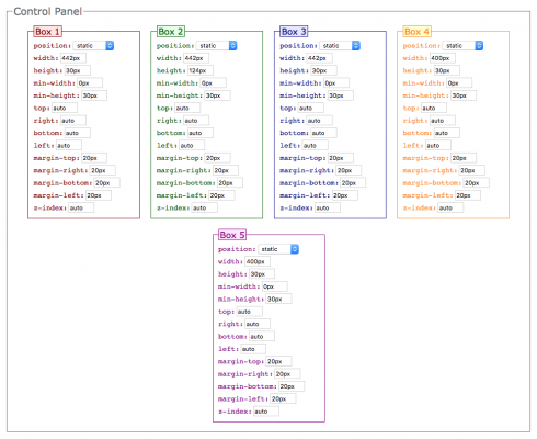
Once you have the layout created following the instructions – try expanding the size of the main content region by setting the height of box 4 to 300px. No problems there, the footer moves down, and all is well. Now, let’s see what happens when we make the sidebar longer than the content by setting the height of box 5 to 500px. Uh oh – it breaks our layout! Because box 5 is positioned absolute, it has been lifted out of the normal flow of the document. It is not actually contained within the green box anymore – it is hovering in front of it. So as it expands, it just continues on, obscuring part of the footer. This tells us that our layout has a limitation – it only works on sites where the content is longer than the sidebar.
Also – it should be noted that this little web app is entirely written in HTML, CSS, and JavaScript. So, by the time we finish this series, you should have the skills needed to build something like this yourself. If you’re curious, you can get a sneak peak of what’s to come and see what JavaScript looks like.
The CSS display Property
We have already encountered the concept of block-level tags and inline tags; and we have mentioned that there are a few tags that behave a little oddly. We’ve learned that headings and paragraphs are block-level tags, that emphasis is an inline tag, and that images are an example of a tag that behaves neither exactly like an inline tag or a block-level tag.
That is a simplification that omits one important point – headings are block-level tags by default, and emphasis tags inline tags by default. Using the display CSS property, we can override these defaults.
We’ve also hinted that, while most tags default to block or inline, there are some oddballs. Well, those oddball tags have display values other than block or inline. We’ll look at some of those other possible values for display. This is not an exhaustive list of all possible values for the display property though, just the ones you’ll need most often.
display: block
Setting the display property to block will cause any HTML element to be displayed as a block-level tag, no matter what its default behaviour is. That is to say, it will start to behave in the same way as paragraphs do. The display property of block-level tags like <h1>, <p> and <blockquote> default to this value.
display: inline
Setting the display property to inline will cause any HTML element to be displayed like an inline tag. The display property of inline tags like <strong>, <em>, and <code> default to this value.
display: none
Any element with its display property set to none will not be displayed on the page at all – it will in effect be poofed out of existence!
display: inline-block
Although we haven’t been explicit about it, we have already encountered a tag that has a default display value of inline-block – the <img> tag. An inline block element will behave like a letter within some text, though perhaps like a very very large letter!
As an example, let’s imagine we want to make a modern-day version of an Egyptian cartouche – a group of pictograms surrounded by a rounded border that should never be split across multiple lines. Rather than using a series of ancient pictograms, we will use a two-by-two grid of images of modern emoji. (If you’re not familiar with cartouches, this Wikipedia page might be of interest to you.)
The HTML markup is simply a <span> with the class cartouche containing four image tags, with a line break (<br />) after the second image. Unfortunately, to avoid extra space appearing between the images within the cartouche, there can’t be any white space between the relevant HTML tags, and that includes newline characters. You can obviously do this by putting the entire contents of the cartouche span onto a single line, but it will be very very long, and not easy to read. To get around this, two interesting ‘hacks’ are often used. The first technique is to insert a line break just before closing each tag. That way the empty space is not between the HTML tags:
<span class="cartouche"
  ><img src="contrib/twemoji/16x16/1f4f7.png" alt="Camera"
  /><img src="contrib/twemoji/16x16/1f6b4.png" alt="Mountain Bike" /><br
  /><img src="contrib/twemoji/16x16/1f427.png" alt="Linux Penguin"
  /><img src="contrib/twemoji/16x16/1f52d.png" alt="Telescope"
/></span>
If you find that too ugly, the other approach you’ll often see is to insert the line breaks inside HTML comments like so:
<span class="cartouche"><!--
  --><img src="contrib/twemoji/16x16/1f4f7.png" alt="Camera" /><!--
  --><img src="contrib/twemoji/16x16/1f6b4.png" alt="Mountain Bike" /><br /><!--
  --><img src="contrib/twemoji/16x16/1f427.png" alt="Linux Penguin" /><!--
  --><img src="contrib/twemoji/16x16/1f52d.png" alt="Telescope" /><!--
--></span>
Regardless of how you choose to indent your HTML code, you’ll need to apply the same CSS to transform the <span> into a cartouche. First, we set its display property to inline-block, and then style the box appropriately to make it look nice. The full CSS for the cartouche is shown below:
span.cartouche{
  display: inline-block;
  padding: 1px;
  background-color: Lightblue;
  border: 1px solid DimGrey;
  border-radius: 10px;
  vertical-align: middle;
  margin: 1px;
}
span.cartouche img{
  margin: 1px;
  width: 16px;
  height: 16px;
}
This is what it looks like when used within a paragraph of text:
You can control the vertical alignment of any item that is displayed as inline-block, including images. The relevant CSS property is vertical-align, and it can have the following values:
baseline- This is the default value – the bottom of the inline block is aligned with the font’s baseline – that is, the imaginary line the letters sit on. Note that letters like p and q punch through the baseline (and are hence known as descenders in typography circles).
sub&super- Align the inline block as if it were subscript or superscript text.
top&bottom- The top or bottom of the inline block are aligned with the highest or lowest item on the line – whether that item be text or another inline block element.
text-top&text-bottom- The top of the inline block is aligned with the top of the text or the bottom with the bottom of the text.
middle- After
baseline, this is probably the value you’ll need most often: the middle of the inline block is aligned with the middle of the text. The example cartouche above has itsvertical-alignset tomiddle. - A dimension, e.g.
4pxor-3em - If an inline block’s
vertical-alignis set to a dimension, it will be shifted by that amount relative to the baseline. If the value is positive it will be shifted up, and if negative, down. - A percentage, e.g.
25% - Raises or lowers the inline block by a percentage of the line height. Positive percentages shift the inline block up, and negative percentages shift it down.
Displaying items as inline-block can be used to make a line of fixed-width items behave nicely as the page resizes. You can see this in action in the CSS Playground web app used earlier in the instalment. The main form headed with the legend Control Panel contains sub-forms with legends indicating the box they control. The main form has its display set to block, and its text-align set to center. The mini forms each have their display set to inline-block, their text-align set to left, their width set to 185px, and their height allowed to default to auto. In this case, the tags for the forms intentionally do have some white space between them (a line break), so in effect, each form behaves like a 1-letter word. As the window is resized, the containing form grows and shrinks as you would expect for a block-level element. The mini forms behave like words, and move nicely onto multiple lines as needed.
display: flex
A new concept known as flex boxes was added to CSS 3 to help make layouts more robust. You can build nice layouts with a combination of floats and positioned boxes, but all such layouts have shortcomings, as we saw at the start of this instalment.
This instalment’s demo recreates the same two-column layout using a CSS 3 flex box, and the resulting layout is much more robust. It looks the same, but behaves just as nicely, regardless of which column is the tallest.
Flex boxes are very powerful, and hence, very complex. It would take us two or even three entire instalments to cover every detail of flex boxes. We’re not going to do that – instead, we’ll just look at the basics, and link out to some helpful resources should you find yourself needing to control more aspects of your flex boxes.
To use flex box, you need a containing element to hold the boxes that will be flexibly sized. This is known as a flex container. Any box can be turned into a flex container by setting its display property to flex. All direct children of this container are now flex items.
Flex containers either behave as rows or columns. The default is to behave as a row, and that is the only behaviour we’ll look at in this instalment. The CSS property for controlling the direction is flex-direction. Its default value is row.
What makes flex items inside a horizontal flex container different to normal inline or inline-block boxes is that they all stretch to be the height of the tallest box. This is exactly the behaviour we want for typical web layouts.
The order in which the boxes appear in the row does not have to be the same as the order they appear in the code. So, as with positioned layouts, we can place the sidebar below the main content in HTML code, and still have it displayed as the first item in the layout row.
As their name suggests, flex boxes, and the items within them, are designed to grow and shrink as pages are resized, and they can do so in very clever ways. In our example layout, we would like the sidebar to always be 200 pixels wide, and for the main content region to do all the shrinking and growing as the window is resized.
You control how a flex item shrinks and grows using the flex CSS property. To fix an item’s width, as we want to do with our sidebar, set flex to none, and set an explicit width on the item. To allow an item shrink and grow, set flex to 1. If you have multiple flex items within the same flex container that you want to have shrink and grow, but to have be different widths, you can use the flex property to define a ratio. If you have two flexible flex items, and you want one to be twice as big as the other, set flex to 1 on the small one, and flex to 2 on the big one.
This is actually a gross simplification of the flex property. In reality, flex is a shorthand CSS property for three underlying properties that give very granular control over the way flex items behave. We’re not going to dig into this complexity in this instalment.
The order property can be used to change where in the row different flex items appear. In our example we will set order to 1 on the sidebar, and to 2 on the main content region. That way the sidebar is on the left and the main content on the right.
More Information on Flex Box:
- A detailed and very visual tutorial on flex box
- Documentation on all the flex-related properties
- A nice course on flex box from Lynda.com
Demo
The code for the demo can be downloaded here or here on GitHub. Extract the files and save them to a folder called pbs9 in your web server’s document root, and remember to start your server. You should then be able to see the demo at http://localhost/pbs9/. For completeness, the code for the two most important files is included below:
<!DOCTYPE HTML>
<html>
<head>
<meta http-equiv="Content-Type" content="text/html; charset=utf-8" />
<link rel="stylesheet" type="text/css" href="style.css">
<title>PBS 9 - Demo</title>
</head>
<body>
<header>
<h1>PBS 9 - Demo</h1>
<h2>Part of the Programming by Stealth Series by Bart Busschots</h2>
</header>
<div id="central_region">
<main>
<article>
<h1><code>display: inline-block</code> Demo</h1>
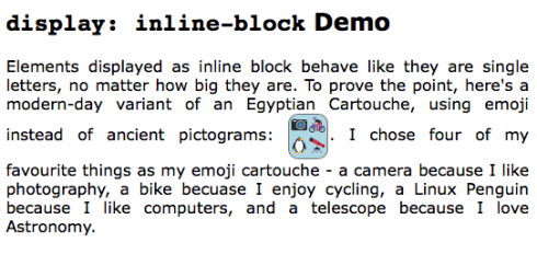
<p>Elements displayed as inline block behave like they are single letters,
no matter how big they are. To prove the point, here's a modern-day variant
of an Egyptian Cartouche, using emoji instead of ancient pictograms:
<span class="cartouche"><img src="contrib/twemoji/16x16/1f4f7.png" alt="Camera" /><img src="contrib/twemoji/16x16/1f6b4.png" alt="Mountain Bike" /><br /><img src="contrib/twemoji/16x16/1f427.png" alt="Linux Penguin" /><img src="contrib/twemoji/16x16/1f52d.png" alt="Telescope" /></span>.
I chose four of my favourite things as my emoji cartouche - a camera because
I like photography, a bike becuase I enjoy cycling, a Linux Penguin because
I like computers, and a telescope because I love Astronomy.</p>
</article>
<article>
<h1>Flex Box Demo</h1>
<p>The layout of the central region of this page is done using flex box -
the side bar is one flex item, and main content is another.</p>
<p>While flex box is very useful for layouts, it's just as useful for
smaller elements on a page. For example, below are three nicely re-sizing
boxes containing podcast suggestions as a flex box:</p>
<div id="podcast_tips">
<figure class="podcast">
<p><a href="http://www.podfeet.com/blog/category/nosillacast/" target="_blank"><img alt="NosillaCast Logo" src="podcastLogos/NosillaCast.png" class="podcast_logo" /></a></p>
<h1>The NosillaCast</h1>
<h2>By Allison Sheridan</h2>
<p>A Technology Geek Podcast with an eeeeever so slight Macintosh bias</p>
</figure>
<figure class="podcast">
<p><a href="http://www.podfeet.com/blog/category/ccatp/" target="_blank"><img alt="CCATP Logo" src="podcastLogos/CCATP.png" class="podcast_logo" /></a></p>
<h1>Chit Chat Across the Pond</h1>
<h2>By Allison Sheridan</h2>
<p>A a weekly interview show about all things tech.</p>
</figure>
<figure class="podcast">
<p><a href="http://www.lets-talk.ie/apple" target="_blank"><img alt="Let's Talk Apple Logo" src="podcastLogos/LTA.png" class="podcast_logo" /></a></p>
<h1>Let's Talk Apple</h1>
<h2>By Bart Busschots</h2>
<p>A monthly Apple news show that takes the broader view.</p>
</figure>
</div>
</article>
</main>
<div id="sidebar">
<!-- The About the Author box -->
<div id="about_author">
<h1>The Author</h1>
<div id="author_card">
<img src="avatar.png" alt="Avatar" />
<span id="author_name">Bart Busschots</span><br />
<a href="http://www.bartb.ie/">www.bartb.ie</a>
</div>
</div>
<!-- The useful links navigation area -->
<nav>
<h1>Useful Links</h1>
<ul>
<li>Pograming By Stealth Series</li>
<li>Chit Chat Across the Pond Podcast</li>
<li>W3Schools CSS Reference</li>
</ul>
</nav>
</div> <!-- End of side bar -->
</div> <!-- End of central section of page -->
<footer>
All Content by Bart Busschots - released under CC-NC-By License
</footer>
</body>
</html>
/*
Styles for PBS7 Demo
*/

/* Set the default text style for the whole page */
body{
  font-family: Verdana, Geneva, sans-serif;
  text-align: justify;
  padding: 0px;
  margin: 0px;
  font-size: 12pt;
}

/* Style the header and footer */
header, footer{
  margin: 0px;
  padding: 5px;
  background-color: #000099;
  color: grey;
  font-size: 10px;
}
header{
  margin-bottom: 10px;
}
footer{
  margin-top: 10px;
  clear: both;
}
header h1, header h2{
  margin: 0px;
  font-weight: normal;
}
header h1{
  text-transform: uppercase;
  color: white;
  font-size: 32px;
}
header h2{
  font-size: 16px;
}
footer{
  font-style: italic;
}

/* lay out the central region of the page*/
div#central_region{
  display: flex;
}
main{
  flex: 1;
  padding: 10px;
  border-left: 1px dashed #000099;
  overflow: auto;
  order: 2;
}
div#sidebar{
  width: 200px;
  flex: none;
  color: #000099;
  font-size: 12px;
  order: 1;
  margin: 0px 10px;
}
div#sidebar h1{
  font-size: 20px;
  border-top: 1px dotted #000099;
  border-bottom: 1px dotted #000099;
  padding: 2px 0px;
}
div#sidebar ul{
  padding-left: 20px;
}
div#sidebar li{
  padding: 2px 0px;
}

/* style the main content */
article{
  clear: both; /* Clear all floats before starting a new article */
}
article h1{
  font-size: 18pt;
}

/* style the cartouche */
span.cartouche{
  display: inline-block;
  padding: 1px;
  background-color: Lightblue;
  border: 1px solid DimGrey;
  border-radius: 10px;
  vertical-align: middle;
  margin: 1px;
}
span.cartouche img{
  margin: 1px;
  width: 16px;
  height: 16px;
}

/* style the about the author box */
div#author_card{
  border: 1px dotted DarkGrey;
  border-radius: 10px;
  background-color: LightYellow;
  padding: 10px;
  font-size: 10pt;
  font-family: "Palatino Linotype", "Book Antiqua", Palatino, serif;
  color: #666666;
  overflow: auto; /* make sure the box expands to surround the floaded avatar */
}
div#author_card img{
  width: 50px;
  float: left;
  margin-right: 5px;
}
span#author_name{
  font-weight: bold;
}

/* Style the podcasts list (flex box) */
#podcast_tips{
  display: flex;
  color: DimGrey;
  font-size: 10pt;
}
figure.podcast{
  flex: 1;
  text-align: center;
}
figure.podcast h1, figure.podcast h2, figure.podcast p{
  margin: 0px;
  padding: 2px;
}
figure.podcast h1{
  font-size: 14pt;
}
figure.podcast h2{
  font-size: 12pt;
  font-weight: normal;
  font-style: italic;
}
img.podcast_logo{
  height: 200px;
  border: 1px solid DimGrey;
  border-radius: 5px;
  margin: 0px;
}
The resulting page should look something like:
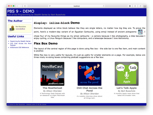
The demo for this instalment looks very similar to the one for the previous instalment, but the big difference is that the overall layout is now implemented using flex box instead of positioning. The <div> surrounding the main content and the sidebar has been set to display: flex, the main content has been set to flex: 1, and the sidebar has been set to a width of 200px and flex: none.
The demo also contains an example of display: inline-block in the form of the cartouche made of four emoji icons. Finally, it also contains an example of a flex box being used to create three even width boxes which scale nicely as the page is resized.
Conclusion
We’ve now touched on the three CSS properties that together allow us to control the layout of an HTML document – float, position, and display. Think of these three properties as the atoms from which all modern web layouts are built. On the bad old days before CSS, layouts were done using HTML tables – I can’t stress how important it is not to build pages in that way. It should also be noted that another new CSS feature is currently under development that will make layouts even easier in future – CSS Grids, but that feature is a few years away from main stream use yet. At the moment only one browser has proper support for the feature – Microsoft’s new Edge browser.
In the next instalment or two we’ll learn how to style lists with CSS. We’ll also discover some more CSS selectors. After that, we’ll backtrack a little and learn some more HTML tags – ones that I’ve intentionally skipped until after we learned about CSS. Then, we’ll be ready for the next big leap – an introduction to our first real programming language of the series – JavaScript.