PBS 8 of X: CSS Positioning (CSS)
In the previous instalment we learned about the CSS box model. Each HTML tag is represented as a box within the browser. Those boxes stack down the page and inside each other to build up the web pages we see. We also learned how to use FireFox’s developer tools to actually see and inspect the boxes. In this instalment we’ll learn how to take one or more boxes out of the normal flow of the page, and position them elsewhere on the page.
Matching Podcast Episode 424
Listen Along: Chit Chat Across the Pond Episode 424
You can also Download the MP3
Grouping HTML Tags
So far, we have looked at HTML tags for defining individual components of a page – headings, paragraphs, lists, images, etc. We have not yet looked at grouping them into related chunks of any kind.
HTML 5 has really changed how we define regions within our HTML documents. There are two big advantages to using the new HTML 5 tags – they help screen readers better understand your page, and they make it easier to style your page with CSS, allowing you to use more human-friendly selectors.
HTML5 has introduced the concept of sectioning tags. These tags have no visible effect on the page without CSS, but they can be used to group chunks of related content within a page.
Sections & Articles
If you have a regular page with multiple logical sections, you can use the <section> tag to surround each section. You can also nest <section> tags inside other <section> tags if your content has logical subsections.
For pages that contain multiple independent pieces of content like blogs or new sites, the <article> tag should be used instead of the <section> tag. Think of an article is a piece of content that could be syndicated, like a blog post or a news story. If something only makes sense in context, it is probably a section. If it can stand alone, it is probably an article.
Figures and Asides
The <aside> tag can be used to contain content that’s tangentially related to the content of a section or article. Something is an aside only if the main content still makes sense without it.
Similar, but a little different, are figures. A figure can be a collection of images, a code sample, or something like that, whose position within the document does not have to be fixed, but without which the main content does not make sense.
The <figure> tag is used to encapsulate figures. Figures can optionally contain a single caption within a <figcaption> tag.
Navigation Areas
A region containing navigation links, like you’ll often find in a page header or side bar, should be contained within a <nav> tag.
Headers, Footers, and Main Content Regions
As well as the sectioning tags above, HTML 5 also introduced three tags for defining regions that are not sections as such. The first two are <header> and <footer>, which can be used to group a number of tags together to define page and article header and footer regions.
HTML 5 also introduced the <main> tag. This tag can be used to markup the unique content on a page. Imagine a typical page on a typical website – the core content of any page does not make up the entire page. There will be ‘fluff’ like headers, footers, sidebars, menu bars, and so on that surround the core content. The <main> tag is used to mark the part of the page where the core content is located. This tag is particularly useful for screen readers, making life much easier for the vision impaired visiting your site.
A web page can only contain a single <main> tag. That single <main> tag cannot be contained within any of the sectioning tags, that is to say, it cannot be contained within any of following tags: <article>, <aside>, <figure>, <footer>, <header>, or <nav>.
Generic Grouping Tags
Finally, even before HTML 5, there were two generic tags for grouping content – <div> is the generic block-level grouping tag, and <span> is the generic inline grouping tag.
Sizing Boxes
Before we move on to positioning boxes, it’s worth noting that we can control the size of the box for each tag with CSS. The width and height properties specify the dimensions of the content region of a box. The default value is auto, which means the box will expand and contract based on its content, and the type of box that it is. The boxes for inline tags will be as tall and wide as their content, while the boxes for regular block-level tags will be the full width of the containing box, and the height of their content. Widths and heights can be set to specific values using any of the CSS dimensions (e.g. 500px, or 4em), or to a percentage of the width or height of the containing box.
As well as specifying exact sizes, it is also possible to leave the width and/or height set to auto, and constrain the size of the box within a range using the min-width, max-width, min-height, and max-height properties.
Finally, for block-level elements with a width other than auto, it’s possible to set the left and right margins or padding to auto, which will effectively centre the content region of the box.
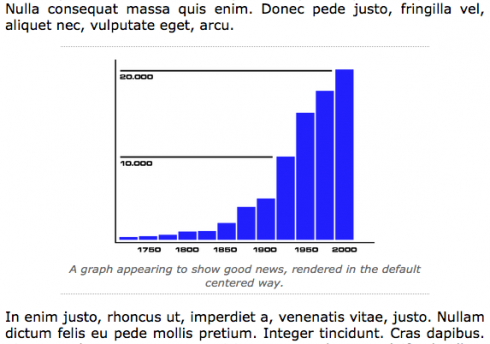
You can see an example of this approach in the demo at the bottom of this instalment. The <figure> tag is given a width of 75%, a padding of 5px, a top and bottom margin of 10px, and a left an right margin of auto:
figure{
  text-align: center;
  width: 75%;
  margin: 10px auto;
  padding: 5px;
  border-top: 1px dotted DarkGrey;
  border-bottom: 1px dotted DarkGrey;
}
As you can see in the screenshot below, this results in figures being centred regions 75% the width of the main content region of the page:
Overflowing boxes
When constraining the dimensions of boxes, or when including very long unbreakable content (big images, or text with really long ‘words’ like giant URLs), it is possible for the content not to fit inside its box. When this happens the browser has a few options: it can simply overflow the box, showing the content poking out of whatever side of the box it does not fit within, or it can truncate the content, hiding whatever does not fit in the box, or, it can add scroll bars to the box.
The behaviour in case of overflow is controlled by the overflow-x and overflow-y properties. overflow-x tells the browser what to do when content overflows out of the left or right edge of a box, and overflow-y what to do when content overflows out of the top or bottom of a box. There is also a shorthand property overflow which sets both overflows to the same value.
The following values are valid for overflows:
visible- The overflowed content is shown beyond the edges of the box – this is the default.
hidden- The overflowing content is hidden, that is to say, the overflow is clipped.
scroll- Scroll bars are always added to the box.
auto- Scrollbars are added only when needed.
CSS Positioning
By default, the block-level tags that make up a web page are stacked one below the other, reaching out to the full width of the container. Nested tags are stacked within the content region of the box for the block-level tag they are contained within. I like to think of them as little helium balloons – floating up, and spreading out to the full available width.
The helium analogy does break down when you consider the z-axis though – the way it works with nested boxes is that the parent box is behind the boxes it contains. This makes sense if you think about it, because otherwise you couldn’t put backgrounds on boxes that contain other boxes.
This is the normal flow of a page. CSS positioning is about taking individual tags, and pulling them out of the normal flow of the page, and placing them somewhere else within the page.
Floats
The simplest form of positioning is floating. Any block-level tag can be floated left or right using the float attribute. Because it makes no sense to float an inline tag, inline tags get converted to block-level tag when floated.
The float property can have three values – none, left, or right, with none being the default. When a tag has its float property set to either left or right, it is removed from the normal flow of the page, so the block elements above and below come together. The floated box then floats over the boxes of the unfloated tags moving left or right until it hits either the edge of another floating box, or the edge of the content region of the box containing the floated box.
While floated boxes sit in front of the boxes in the normal flow of the document, the content within those underlying boxes flows around the edges of the floated box. Think of it like floating an image in a word document, the text flows around the image.
Floated boxes can overflow the bottom of the box they are contained by.
Every box in the normal flow of the document can decide whether or not to allow a float from a box above it to penetrate into it or not. If it is set not to allow penetration, a gap will be left in the normal flow of the document. This behaviour is referred to as clearing floats, and the CSS property that controls this behaviour is clear.
The clear property can have one of four values, none, left, right, and both, with none being the default. When clear is set to none, all floats are allowed to protrude into the top of the box. When clear is set to left, no left-floated boxes are allowed to protrude into the top of the box, but right-floated boxes are. Similarly, when clear is set to right, no right-floated boxes are allowed to protrude into the top of the box, but left-floated boxes are. And finally, when clear is set to both, no floats are allowed to protrude into the top of the box.
The clear property is about defining what tags should move down below all floats before starting. It is quite normal to set clear to both on heading tags like <h1>, and on sectioning tags like <section> and <article>. Paragraphs on the other hand, would almost always be left at the default value of none.
Normally, floats will poke out of the bottom of boxes, and the clear property will not prevent that. If you have a box with a background and/or border, you really don’t want floats poking out the bottom, it will look terrible! In that situation you really want the box to extend downward to encapsulate the floats it contains. There is no official way of doing this in CSS, but there are two hacks commonly used to work around this shortcoming.
The first is particularly unpleasant because it breaks the separation between content and presentation – a completely empty <div> can be added at the end of the box to be extended around the floats, and the clear property can be set to none on that <div>.
The second, preferable but still suboptimal, solution is to set the overflow property on the box containing the floats to auto. This will cause the box to extend around the floats. If, however, the box contains overly long unbreakable content, scroll bars will appear, and that may not be what you want or expect.
You can see an example of this technique in use in the demo at the bottom of this instalment. The little business card in the top of the side bar is a box with a border and background, and it contains a floated image. Without setting the overflow to auto, it would look like this:
Notice how the image is poking slightly outside the border, and how the padding has been completely lost around the bottom of the image. It just does not look right!
However, by simply setting the overflow property of the yellow box to auto, we get the following, much more pleasing result:

Positioned Boxes
Another way to remove boxes from the normal flow of the page and move them elsewhere is by setting the position property.
The default value for this property is static – that is to say, the tag is either rendered in the normal flow of the page or floated. A box with a position of static is said to be unpositioned, and conversely, a box with a position other than static is said to be positioned.
Tags with their position set to fixed are taken out of the normal flow of the document, and placed above the boxes that remain within the normal flow, and positioned relative to the browser window.
The attributes that control the position of boxes with a position of fixed are top, right, bottom, and left, and they specify the distance between the relevant side of the screen, and relevant edge of the positioned box. So, if top is set to 10px, and left to 10px, then the box will be positioned 10 pixels down from the top of the screen, and 10 pixels in from the left. The size of the box can then be controlled using the width and height properties, or if the width and/or height are set to auto, by specifying the offset on two opposite sides.
For example, to position a <div> with the ID top_banner as a 10-pixel high banner across the whole top of the screen you would set:
div#top_banner{
  position: fixed;
  top: 0px;
  left: 0px;
  right: 0px;
  height: 10px;
}
As you scroll, an element with position set to fixed will not move with the page.
Similar to setting the position to fixed, when you set the position to absolute, the box is taken out of the normal flow of the document, and its position controlled by top, right, bottom, and left, but in this case, relative to nearest containing positioned box. If there is no containing positioned box, the position is relative to the body tag.
The big difference is that, with position set to absolute, the box does scroll with the page.
Finally, position can be set to relative. In this case, a placeholder for the box is left in place within the normal flow of the document, but the actual box is rendered offset from its normal position by the values set in top, right, bottom, and/or left.
Offsetting a position is not something you need to do often, but, setting position to relative without specifying an offset has a very useful side effect – it turns the box into a positioned box, so boxes within that box with a position of absolute now use it as the base for their top, right, bottom, and left offsets.
Finally – the vertical stacking of positioned boxes can be controlled with the z-index property. Remember, the vertical stacking of unpositioned boxes is controlled by the nesting of the tags within the normal flow of the document, so the z-index property has no effect on unpositioned boxes.
The z-index property can either be set to auto, where its z-index is the same as that of its containing box, or, to a positive or negative whole number. Boxes with bigger z-index values are in front of those with smaller z-index values.
Worked Example
All this sounds very complicated, so let’s tie it together with an example.
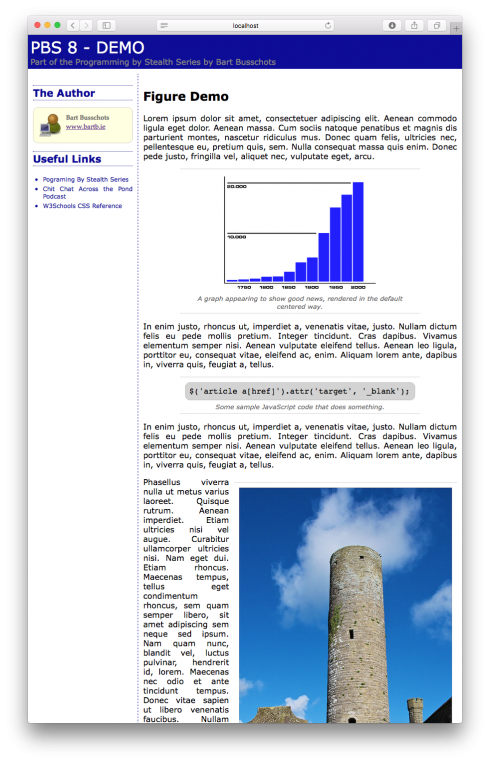
In this example we have a page with four main components – the main content region, a header, a footer, and a side bar. The header and footer are contained within <header> and <footer> tags, and between those two tags there is a <div> with the ID central_region which contains the middle section of the page. The central region <div> contains the main content wrapped in a <main> tag, and then the side bar as a <div> with the ID sidebar. The main content is broken into two articles, one with demo figures, and one with demo asides.
The header and footer are unpositioned, as is the main content region. The div containing the entire central region is positioned relative, so it is shown in its normal position, but it acts as the base of the coordinate system for absolutely positioned boxes within it. The main content is positioned normally, but with a 220px left margin. This wide margin creates an empty space into which the side bar is then placed by positioning it absolutely.
As usual, you can download a zip file with all the files needed for the example here or here on GitHub. Extract these files and place them in a folder called pbs8 in the document root of your web server, and of course, remember to start your web server. You should now be able to browse to the example at http://localhost/pbs8/.
Below is the content of the HTML and CSS files:
<!DOCTYPE HTML>
<html>
<head>
  <meta http-equiv="Content-Type" content="text/html; charset=utf-8" />
  <link rel="stylesheet" type="text/css" href="style.css">
  <title>PBS 8 - Demo</title>
</head>
<body>
<header>
<h1>PBS 8 - Demo</h1>
<h2>Part of the Programming by Stealth Series by Bart Busschots</h2>
</header>
<div id="central_region">
<main>
  <article>
    <h1>Figure Demo</h1>
    <p>Lorem ipsum dolor sit amet, consectetuer adipiscing elit. Aenean commodo
    ligula eget dolor. Aenean massa. Cum sociis natoque penatibus et magnis
    dis parturient montes, nascetur ridiculus mus. Donec quam felis, ultricies
    nec, pellentesque eu, pretium quis, sem. Nulla consequat massa quis enim.
    Donec pede justo, fringilla vel, aliquet nec, vulputate eget, arcu.</p>

    <figure>
      <img src="fig2.png" alt="Some Random Graph that Goes up" />
      <figcaption>A graph appearing to show good news, rendered in the default
      centered way.</figcaption>
    </figure>

    <p>In enim justo, rhoncus ut, imperdiet a, venenatis vitae, justo. Nullam
    dictum felis eu pede mollis pretium. Integer tincidunt. Cras dapibus.
    Vivamus elementum semper nisi. Aenean vulputate eleifend tellus. Aenean
    leo ligula, porttitor eu, consequat vitae, eleifend ac, enim. Aliquam
    lorem ante, dapibus in, viverra quis, feugiat a, tellus.</p>

    <figure>
<pre>
$('article a[href]').attr('target', '_blank');
</pre>
      <figcaption>Some sample JavaScript code that does something.</figcaption>
    </figure>

    <p>In enim justo, rhoncus ut, imperdiet a, venenatis vitae, justo. Nullam
    dictum felis eu pede mollis pretium. Integer tincidunt. Cras dapibus.
    Vivamus elementum semper nisi. Aenean vulputate eleifend tellus. Aenean
    leo ligula, porttitor eu, consequat vitae, eleifend ac, enim. Aliquam
    lorem ante, dapibus in, viverra quis, feugiat a, tellus.</p>

    <figure class="floated">
      <img src="photo.jpg" alt="Taghadoe Round Tower on a sunny day" />
      <figcaption>A photo of Taghadoe Round Tower near Maynooth.<br />(rendered as
      a floated figure)</figcaption>
    </figure>

    <p>Phasellus viverra nulla ut metus varius laoreet. Quisque rutrum. Aenean
    imperdiet. Etiam ultricies nisi vel augue. Curabitur ullamcorper ultricies
    nisi. Nam eget dui. Etiam rhoncus. Maecenas tempus, tellus eget condimentum
    rhoncus, sem quam semper libero, sit amet adipiscing sem neque sed ipsum.
    Nam quam nunc, blandit vel, luctus pulvinar, hendrerit id, lorem. Maecenas
    nec odio et ante tincidunt tempus. Donec vitae sapien ut libero venenatis
    faucibus. Nullam quis ante. Etiam sit amet orci eget eros faucibus
    tincidunt. Duis leo. Sed fringilla mauris sit amet nibh. Donec sodales
    sagittis magna. Sed consequat, leo eget bibendum sodales, augue velit cursus
    nunc.</p>
  </article>

  <article>
    <h1>Aside Demo</h1>
    <p>Lorem ipsum dolor sit amet, consectetuer adipiscing elit. Aenean commodo
    ligula eget dolor. Aenean massa. Cum sociis natoque penatibus et magnis
    dis parturient montes, nascetur ridiculus mus. Donec quam felis, ultricies
    nec, pellentesque eu, pretium quis, sem. Nulla consequat massa quis enim.
    Donec pede justo, fringilla vel, aliquet nec, vulputate eget, arcu.</p>

    <aside>
      <h1>Note About Something</h1>
      <p>In enim justo, rhoncus ut, imperdiet a, venenatis vitae, justo. Nullam
      dictum felis eu pede mollis pretium. Integer tincidunt. Cras dapibus.
      Vivamus elementum semper nisi. Aenean vulputate eleifend tellus. Aenean
      leo ligula, porttitor eu, consequat vitae, eleifend ac, enim. Aliquam
      lorem ante, dapibus in, viverra quis, feugiat a, tellus.</p>
    </aside>

    <p>Phasellus viverra nulla ut metus varius laoreet. Quisque rutrum. Aenean
    imperdiet. Etiam ultricies nisi vel augue. Curabitur ullamcorper ultricies
    nisi. Nam eget dui. Etiam rhoncus. Maecenas tempus, tellus eget condimentum
    rhoncus, sem quam semper libero, sit amet adipiscing sem neque sed ipsum.
    Nam quam nunc, blandit vel, luctus pulvinar, hendrerit id, lorem. Maecenas
    nec odio et ante tincidunt tempus. Donec vitae sapien ut libero venenatis
    faucibus. Nullam quis ante. Etiam sit amet orci eget eros faucibus
    tincidunt. Duis leo. Sed fringilla mauris sit amet nibh. Donec sodales
    sagittis magna. Sed consequat, leo eget bibendum sodales, augue velit cursus
    nunc,</p>
  </article>
</main>
<div id="sidebar">
  <!-- The About the Author box -->
  <div id="about_author">
    <h1>The Author</h1>
    <div id="author_card">
      <img src="avatar.png" alt="Avatar" />
      <span id="author_name">Bart Busschots</span><br />
      <a href="http://www.bartb.ie/">www.bartb.ie</a>
    </div>
  </div>

  <!-- The useful links navigation area -->
  <nav>
    <h1>Useful Links</h1>
    <ul>
      <li>Pograming By Stealth Series</li>
      <li>Chit Chat Across the Pond Podcast</li>
      <li>W3Schools CSS Reference</li>
    </ul>
  </nav>
</div> <!-- End of side bar -->
</div> <!-- End of central section of page -->
<footer>
All Content by Bart Busschots - released under CC-NC-By License
</footer>
</body>
</html>
/*
Styles for PBS7 Demo
*/

/* Set the default text style for the whole page */
body{
  font-family: Verdana, Geneva, sans-serif;
  text-align: justify;
  padding: 0px;
  margin: 0px;
  font-size: 12pt;
}

/* Style the header and footer */
header, footer{
  margin: 0px;
  padding: 5px;
  background-color: #000099;
  color: grey;
  font-size: 10px;
}
header{
  margin-bottom: 10px;
}
footer{
  margin-top: 10px;
  clear: both;
}
header h1, header h2{
  margin: 0px;
  font-weight: normal;
}
header h1{
  text-transform: uppercase;
  color: white;
  font-size: 32px;
}
header h2{
  font-size: 16px;
}
footer{
  font-style: italic;
}

/* lay out the central region of the page*/
div#central_region{
  position: relative;
}
main{
  margin-left: 220px;
  padding: 10px;
  border-left: 1px dashed #000099;
  overflow: auto;
}
div#sidebar{
  position: absolute;
  top: 10px;
  left: 10px;
  width: 200px;
  color: #000099;
  font-size: 12px;
}
div#sidebar h1{
  font-size: 20px;
  border-top: 1px dotted #000099;
  border-bottom: 1px dotted #000099;
  padding: 2px 0px;
}
div#sidebar ul{
  padding-left: 20px;
}
div#sidebar li{
  padding: 2px 0px;
}

/* style the main content */
article{
  clear: both; /* Clear all floats before starting a new article */
}
article h1{
  font-size: 18pt;
}

/* Style figures */
figure{
  text-align: center;
  width: 75%;
  margin: 10px auto;
  padding: 5px;
  border-top: 1px dotted DarkGrey;
  border-bottom: 1px dotted DarkGrey;
}
figcaption{
  font-style: italic;
  font-size: 10pt;
  color: #666666;
}
figure pre{
  margin: 5px;
  text-align: left;
  background-color: LightGrey;
  padding: 0.5em;
  border: 1px dotted DarkGrey;
  border-radius: 10px;
  font-size: 12pt;
}
figure img{
  margin: 5px;
}
figure.floated{
  width: auto;
  float: right;
  margin: 10px;
  margin-right: 0px;
}

/* style asides */
aside{
  float: right;
  width: 33%;
  margin: 10px;
  border: 1px dotted DarkGrey;
  border-radius: 10px;
  background-color: LightYellow;
  padding: 10px;
  font-size: 10pt;
  font-family: "Palatino Linotype", "Book Antiqua", Palatino, serif;
  color: #666666;
}
aside h1, aside p{
  margin: 0.5em 0px;
}
aside h1{
  margin-top: 0px;
  font-size: 14pt;
  font-weight: normal;
}

/* style the about the author box */
div#author_card{
  border: 1px dotted DarkGrey;
  border-radius: 10px;
  background-color: LightYellow;
  padding: 10px;
  font-size: 10pt;
  font-family: "Palatino Linotype", "Book Antiqua", Palatino, serif;
  color: #666666;
  overflow: auto; /* make sure the box expands to surround the floaded avatar */
}
div#author_card img{
  width: 50px;
  float: left;
  margin-right: 5px;
}
span#author_name{
  font-weight: bold;
}
The page should look something like:
Conclusions
Now that we have learned about positioning, we have covered most of the CSS fundamentals – we’re not quite done with CSS though – there are still a few loose ends to tie up, which we’ll do in the next instalment.