PBS 10 of X: Yet More CSS (CSS)
Continuing our look at CSS, in this instalment we’ll start by looking at how to style lists, then we’ll move on to look at some more CSS selectors, and we’ll finish with an introduction to a new CSS concept – pseudo-classes.
Matching Podcast Episode 428
Listen Along: Chit Chat Across the Pond Episode 428
You can also Download the MP3
Styling Lists
Back in the third instalment we learned about three kinds of list in HTML: ordered lists, unordered lists, and definition lists. We’ll now revisit the first two of these from a CSS point of view, looking at some CSS properties that can be used to alter the appearance of ordered and unordered lists.
The HTML for lists creates an outer box, the <ol> or <ul> tag, containing a series of inner boxes, the <li> tags. By default, the <ol> and <ul> tags have a wide left padding. By default, the bullets or numbers are placed outside the content region of the <li> tags, and hence, over the wide left padding of the list they are contained within.
The positioning of the bullet or number outside the content region is a default, but it is not set in stone. The CSS property list-style-position controls the positioning. Valid values are inside and outside. If you position the bullets or numbers outside, be aware that, if there is insufficient space for them, they will cover up whatever is to the left of the list, or perhaps even vanish off the left edge of the page!
Once you’ve decided where the bullets or numbers should go, and how much left padding there should be, the next question is what the bullets or numbers should look like – this is controlled by the list-style-type CSS property, which is a property of the list, not the list item.
For numbered lists, the following commonly use styles are available:
decimal- Decimal numbers like 1, 2, 3, 4 etc.
decimal-leading-zero- Decimal numbers with a leading zero like 01, 02, 03, 04 etc.
lower-alphaorlower-latin- Lower-case letters like a, b, c, d, etc.
lower-roman- Lower-case roman numerals like i, ii, iii, iv, etc.
upper-alphaorupper-latin- Upper-case letters like A, B, C, D, etc.
upper-roman- Upper-case roman numerals like I, II, III, IV, etc.
There are also non-western numbering systems available including hebrew, armenian, and a number of Chinese numbering styles.
For bulleted lists there are just three built-in styles to choose from:
disc- A filled circle
circle- An empty circle
square- A filled square
However, for bulleted lists you can also use an image of your choosing as the bullet using the list-style-image style property. This property’s default value is none, but if a URL to an image is set instead, it will take precedence over the bullet style specified with list-style-type.
Finally, it is possible to remove the bullets and numbers altogether by setting list-style-type to none (and leaving list-style-image at its default value of none too).
To make the styling of lists easier, there is also a shorthand CSS property list-style. This property expects three space-separated values in the order list-style-type, list-style-position, and list-style-image. All three are optional. You often don’t want to set list-style-image, which is why it’s at the end of the list. Below are two examples, one with all three values, and one with just two:
ul{
  list-style: square outside url(bullet.png);
}
ol{
  list-style: decimal inside;
}
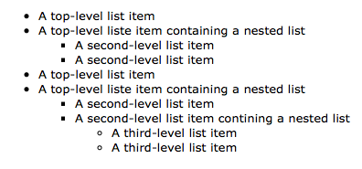
You can use the CSS containment selector to control how nested lists will appear. For example, to set the appearance of nested numbered lists up to three levels deep, you could use CSS something like this:
ul{ /* top-level elements */
  list-style-type: disc;
}
ul ul{ /* nested bulleted lists */
  list-style-type: square;
}
ul ul ul{ /* doubly-nested lists */
  list-style-type: circle;
}
With that CSS in place, and the following HTML, the result will look like the screenshot below:
<ul>
  <li>A top-level list item</li>
  <li>A top-level liste item containing a nested list
    <ul>
      <li>A second-level list item</li>
      <li>A second-level list item</li>
    </ul>
  </li>
  <li>A top-level list item</li>
  <li>A top-level liste item containing a nested list
    <ul>
      <li>A second-level list item</li>
      <li>A second-level list item contining a nested list
        <ul>
          <li>A third-level list item</li>
          <li>A third-level list item</li>
        </ul>
      </li>
    </ul>
  </li>
</ul>
The same technique can be used on numbered lists, and also on lists that use images for bullets.
The Directly Contained Selector
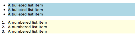
We know that we can specify that a style should apply to all tags contained within another tag by separating the tag names with a space in our selector – i.e. by using the contained selector. The selector for all list items within ordered lists is ol li. Similarly, the selector for all list items within unordered lists is ul li. If we wanted to change the background colour of list items depending on whether they were in ordered or unordered lists, you might imagine the following would work just fine:
ol li{ /* list items in ordered lists */
    background-color: LightYellow;
}
ul li{ /* list items in unordered lists */
    background-color: LightBlue;
}
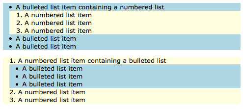
And indeed, in the simple case where there is no mixed nesting, it does:
But what happens if we nest ordered lists inside unordered lists, or vica-versa? Well, we get unexpected behaviour:
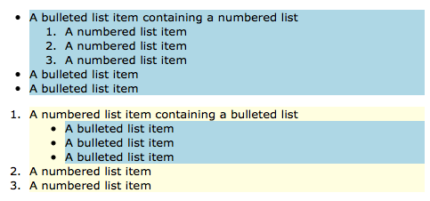
What’s going on here? Well, the key is that the inner list items are both list items within ordered lists, and list items within unordered lists! Or, to be more technical, the inner list items match both the ol li and ul li selectors. More than that, the two selectors contain the identical numbers of IDs (zero), classes (zero), and tag names (two), so they have identical specificities – that means that the last rule defined wins. The last of the two matched rules defined is the one with the selector ul li. Hence, the inner list items are always light blue.
How can we solve this kind of problem?
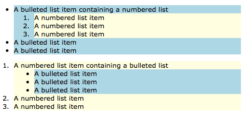
The true cause of this undesired behaviour is that the contained selector is too generic. The solution is the directly contained selector >. To select only list items that are directly contained within ordered lists, the selector is ol > li.
Using this selector, we can rewrite our rules above like so:
ol > li{ /* list items directly contained within ordered lists */
    background-color: LightYellow;
}
ul > li{ /* list items directly contained within unordered lists */
    background-color: LightBlue;
}
We now get the colouring we were expecting all along:
This list still looks pretty silly though, because we are using the default positioning of the bullets and numbers, outside. The background colours really highlight what it means for the bullets and numbers to be outside of the list items. We can make the whole thing look a lot more sane by switching to inside positioning:
li{
    list-style-position: inside;
    padding-left: 1em;
}
ul, ol{
    padding-left: 0px;
}
ol > li{
    background-color: LightYellow;
}
ul > li{
    background-color: LightBlue;
}
The Following and Precedes Selectors
As you start to build up more advanced documents, you may want to alter how you style an element depending on what comes directly before or after it in the document. You can do this using the following (+) and precedes (~) selectors.
To select all paragraphs that come directly after second level headers, you would use the selector h2 + p.
If you wanted to make paragraphs that come directly after every second level headings bold, you could do something like this:
h2 + p{
  font-weight: bold;
}
Note that the + selector applies the style to the tag just before the curly brace: the <p> tag in the example above.
If you need to style a tag based on what comes after it rather than what came before it, you would use the precedes selector. So to style second level headers that are placed directly before paragraphs in the document, you would use the selector p ~ h2. Note that the order in the selector is the opposite of the order in the document. You may find this confusing, but remember the golden rule – the element that gets styled is always the one at the end of the selector.
CSS Pseudo-classes
We’ve already come across classes in HTML/CSS – they are identifiers of your choosing that you can add to HTML tags as hooks for styles using the class selector (.). Pseudo-classes are similar, but they are not identifiers of your choosing, they are identifiers provided for your use by the browser. Each version of CSS has added more pseudo-classes, so there are a lot of them at this stage. We’re not going to go through a definitive list. Instead, we’ll look at just a few useful ones to help get you started.
The selectors for pseudo-classes start with either : or ::, depending on the pseudo-class in question. Like the class selector, they can be added to tag names, and they can be combined with the selectors we already know about like the ID selector (#), and the class selector (.).
A rather over-the-top example would be the following declaration which would turn all visited links with the class vip red:
a.vip:visited{
  color: Red;
}
Pseudo-Classes for Links
As our contrived example above illustrates, one of the most common uses of pseudo-classes is to style links depending on whether or not they have been visited before.
When rendering a link in a web page, your browser will automatically add one of the following pseudo-classes to it:
:link- All unvisited links get this pseudo-class
:visited- All visited links get this pseudo-class
There is also the pseudo-class :active, which is applied when a link is clicked. In the early days of the web, loading a page could take a long time, so getting some feedback that a click has been registered was useful. Today, with our modern internet speeds, the time between clicking a link and the page you were on disappearing is just fractions of a second; so this pseudo-class is now a lot less important than it used to be.
The :hover Pseudo-Class
As you move your mouse around a web page, the :hover pseudo class is added and then removed from each element as the mouse moves over it.
This pseudo-class is most often used on links, but it can be used to alter the style of any HTML element as the mouse hovers over it. This is one of those features that can be terribly abused to make really ugly web pages – please use it sparingly!
Child-Number Pseudo-Classes
Any tag that contains other tags, like say an ordered list, is said to contain child tags. Note that only direct descendants are considered child tags.
To illustrate this critical point – consider the follow code:
<main>
  <section>
    <h1>A Title</h1>
    <p>...</p>
  </section>
  <section>
    <h1>A Title</h1>
    <p>...</p>
  </section>
</main>
The <section> tags are children of the <main> tag, but the <h1> and <p>p tags are not.
The position of each child tag within its parent is represented by a number of related pseudo-classes. Let’s start with the easiest ones – the first and last children.
The first child within any tag is given the pseudo-class :first-child, and the last child is given the pseudo-class :last-child. Similarly, the first instance of any particular tag is given the pseudo-class :first-of-type, and the last, :last-of-type.
If you had a <div> that contained a heading, then a paragraph, then a heading, then a paragraph, then the first heading would have both the pseudo-classes :first-child (because it’s the first tag continued within the <div>), and the psedudo-class :first-of-type (because it’s the first heading tag contained within the <div>). The first paragraph would not get the pseudo-class :first-child, because it’s not the first tag within the <div> – the heading came before it, but it would get the pseudo-class :first-of-type, because it is the first paragraph within the <div>.
You could identify only children by the fact that they would have both the pseudo-classes :first-child, and :last-child, but that would look very messy, so there is also a pseudo-class :only-child. Similarly, the pseudo-class :only-of-type gets applied to any tag of which there is only one of its type within its parent.
Finally, I want to mention two of the most powerful child-order-related pseudo-classes, :nth-child(n), and :nth-of-type(n). These are the first CSS selectors we have come across that take arguments, in this case, we must replace n with an appropriate value. The first child has the pseudo-class :nth-child(1), the second :nth-child(2), and so on. Similarly, the first paragraph within another tag will get the pseudo-class :nth-of-type(1), while the second paragraph will get the pseudo-class :nth-of-type(2).
As powerful as it is to be able to add specific numbers to these selectors, n can also be one of the two special values odd or even. This is how zebra stripes are added to things like lists and tables.
There also exist similar pseudo-classes that work from the last child back, specifically :nth-last-child(n), and :nth-last-of-type(n).
Text-related Pseudo-Classes
Regions of text within a tag can also be styled using pseudo-classes. These pseudo-classes are unusual in that they do not apply to an entire HTML element, just regions within one. You can instantly recognise these odd tags because they start with :: instead of just :.
The first letter within an HTML element can be addressed using the pseudo-class ::first-letter. Similarly, the first line of text within a tag can be addressed using the pseudo-class ::first-line.
Finally, when ever a region of text is selected by the user, it’s given the pseudo-class ::selection.
Worked Example
You can download a zip file of the code for the demo here or here on GitHub. Extract its contents to a folder called pbs10 and place it in your local web server’s document root. Once you start your server you should be able to access the demo at http://localhost/pbs10/. The two most important files are the HTML and CSS files, so their contents are shown below:
<!DOCTYPE HTML>
<html>
<head>
  <meta http-equiv="Content-Type" content="text/html; charset=utf-8" />
  <title>PBS 10 - Demo</title>
  <link rel="stylesheet" type="text/css" href="style.css" />
</head>
<body>

<!-- The page header -->
<header>
  <h1>PBS 10 - Demo</h1>
  <h2>Part of the <a href="http://www.bartb.ie/pbs">Programming by Stealth</a>
  Series by <a href="http://www.bartb.ie/">Bart Busschots</a></h2>
</header>

<!-- the main content of the page -->
<main>
  <h2>Styled Lists</h2>

  <p>The first example is of a nested ordered list list with the CSS containment
  opperator used to change the numbering style as the nesting gets deeper.</p>

  <ol>
      <li>A top-level list item</li>
      <li>A top-level liste item containing a nested list
          <ol>
              <li>A second-level list item</li>
              <li>A second-level list item</li>
          </ol>
      </li>
      <li>A top-level list item</li>
      <li>A top-level liste item containing a nested list
          <ol>
              <li>A second-level list item</li>
              <li>A second-level list item contining a nested list
                  <ol>
                      <li>A third-level list item</li>
                      <li>A third-level list item</li>
                  </ol>
              </li>
          </ol>
      </li>
  </ol>

  <p>An example of a nested bulleted list with images for bullets:</p>

  <ul class="arrows">
      <li>A bulleted list item containing a nested list
          <ul class="arrows">
              <li>A numbered list item</li>
              <li>A numbered list item</li>
              <li>A numbered list item</li>
          </ul>
      </li>
      <li>A bulleted list item</li>
      <li>A bulleted list item</li>
  </ul>

  <h2>Text-related Pseudo-Classes</h2>

  <p>In the text below, the first letter of any paragraph directly after a
  heading is bolded.</p>

  <h3>A header</h3>

  <p>Lorem ipsum dolor sit amet, qui stet mundi ad, prima elaboraret an his.
  Partem necessitatibus mea ne, id usu viris alterum, vix an modus solet nullam.
  Habemus dissentias ad pri. Eum no corpora sensibus assentior, ei iisque
  vidisse qui. Qui magna consul no.</p>

  <p>Perfecto nominati definiebas sit in, pri fabellas facilisis an. Autem facer
  est at. Sed at vitae possit saperet, ei vim iudico delicata. Omnium facilisis
  theophrastus ea has, agam maiorum ei vix.</p>

  <h3>Another Header</h3>

  <p>Ius no iisque utroque, scripta aliquando consectetuer in mel. Vix cu iisque
  fastidii, ea nisl illum corrumpit usu, cu vel ludus tibique. Choro senserit
  voluptaria quo ad, nec te illud inani. Eam augue ignota te, eu pri agam
  nusquam posidonium, cu usu nominati expetenda repudiandae. Ex mel adhuc
  ignota. Nullam ignota ocurreret ei mea, id est utroque voluptaria.</p>

  <p>Duis mutat ornatus ne mei, sanctus patrioque scripserit pro te. Gubergren
  consectetuer eum eu. Aeque delicata per eu, in viderer percipitur sea, wisi
  dolores adipisci per at. Ut vis labores inimicus. Eu commune adolescens
  signiferumque mea, vix ad illum iuvaret.</p>

  <h2>Child-Order Related Pseudo-Classes</h2>

  <p>Below is a list styled to have no bullets, with each alternate item
  coloured differently, and a border added top and bottom for clarity. Finally,
  to issustrate a valid use of the :hover pseudo-class outside of links, the
  item being hovered over is highlighted by making the text bold and bigger.</p>

  <h3>Tech Wish-List</h3>
  <ul class="zebra">
      <li>An iPad Pro with the new Touch ID sensor, and the rounded screen edges
      from the iPhone 6</li>
      <li>A MacBook with thunderbolt and and display port over USB-C, and a
        second USB-C port</li>
      <li>An affordable 27" iMac - the starting price for the screen size I love
        is just too high now IMO</li>
      <li>A smaller iPhone with all the features of the iPhone 6S, and without
        a camera bump</li>
  </ul>
</main>
</body>
</html>
/*
Styles for PBS 10 Demo
*/

/* Set the default text style for the whole page */
body{
  font-family: Verdana, Geneva, sans-serif;
  text-align: justify;
  padding: 0px;
  margin: 0px;
  font-size: 10pt;
}
main{
  margin: 10px;
}

/* Style the header */
header{
  margin: 0px;
  margin-bottom: 10px;
  padding: 5px;
  background-color: DimGrey;
  color: LightGrey;
  font-size: 10px;
}
header a:visited, header a:link, header a:active{
  color: LightGrey;
}
header a:hover{
  color: white;
}

/*
  Regular lists
 */

/* set up the list basics */
ul, ol{
    padding-left: 1em;
    margin: 0em 1em;
}

/* nested ordered lists */
ol{ /* top-level elements */
  list-style-type: decimal;
}
ol ol{ /* nested bulleted lists */
  list-style-type: lower-alpha;
}
ol ol ol{ /* doubly-nested lists */
  list-style-type: lower-roman;
}

/* nested unordered lists with images */
ul.arrows{
    list-style-image: url(contrib/fugue-icons-3.5.6/icons-shadowless/arrow-000-medium.png);
}
ul.arrows ul.arrows{
    list-style-image: url(contrib/fugue-icons-3.5.6/icons-shadowless/arrow-000-small.png);
}

/* make the first letter of paragraphs that come directly after third-level headers bold */
h3 + p::first-letter{
    font-weight: bold;
}

/*
The zebra-patterned list
*/

/* style the contianing list */
ul.zebra{
    /* remove the left indentation */
    padding: 0px;
    margin: 0px;
}

/* style the list items */
ul.zebra li{
    list-style-type: none; /* remove the numbers */
    border-top: 1px dashed LightGrey; /* add a border to the top of each item */
    padding: 2px; /* add some padding for clarity */
    background-color: #ffffe6; /* set the default background colour */
}

/* add a bottom border to only the last item */
ul.zebra li:last-child{
    border-bottom: 1px dashed LightGrey;
}

/* change the background colour for the odd-numbered items */
ul.zebra li:nth-of-type(even){
    background-color: #eafaea;
}

/* add the hover zoom */
ul.zebra li:hover{
    font-weight: bold;
    font-size: bigger;
}
I want to draw your attention to a few key points in the demo code.
The styled lists show examples of how different levels of nesting can use different numbering styles, and how different images can be used at different levels of nesting of unordered lists.
The links within the header are styled such that they look the same no matter what the state of the link is. By default, the browser will make visited links purple and unvisited links blue. If you want your links to always look the same, you have to style both the :link and :visited pseudo-classes the same. In this case I also styled :active the same, and only applied the styling to links within the header, hence the rather lengthy selector list: header a:visited, header a:link, header a:active. Something I do like to do is to make links stand out when you hover over them, so I like to set a different style on :hover than on :link and :visited.
Notice how the capitalisation of the first letter of paragraphs after headers combines the child-order-related pseudo-classes with the text-related pseudo-claseses in a single selector: h3 + p::first-letter. You should read this selector as the first letter of every paragraph directly following a level-3 header.
The list at the end shows how lists can be styled without any bullets or numbers at all, and how the child-order-related pseudo-classes can be used to make lists easier to read by colouring each consecutive item differently. The list also makes use of the child-order-related pseudo-classes to add the final bottom border to the list – all list items have a top border, but only the last one gets a bottom border as well.
Finally – notice the use of the :hover pseudo-class to highlight items in the list.
Conclusions
We’ve nearly covered all the HTML and CSS we need to cover before we introduce JavaScript into the mix – there is just one more loose end to tie up – tables. We’ll deal with both the HTML and CSS aspects of tables in the next instalment, and then we’ll make a start on learning JavaScript.