PBS 78 of X: is.js & Bootstrap Popovers
For boring real-life reasons this instalment is a bit of an intermission. In the previous instalment we learned about so-called call-back hell, and were all set to learn how Javascript Promises would be our liberation, but that’s going to have to wait until next time. Promises are a very important concept, and I don’t want to rush them.
What we’re going to do in this instalment is focus entirely on my sample solution to the challenge set at the end of the previous instalment, which I’ve used as an opportunity to demonstrate two new tools to add to our programming tool belt — the micro-checking library is.js, and Bootstrap Popovers.
You can download this instalment’s ZIP file here or here on GitHub.
Matching Podcast Episode 593
Listen along to this instalment on episode 593 of the Chit Chat Across the Pond Podcast
You can also Download the MP3
PBS 77 Challenge Solution
The challenge set at the end of the previous instalment was to develop a number-guessing game. The random number was to be fetched from a web service running on bartb.ie, but all UI and UX details were left open-ended.
It’s always been true that there are an infinity of possible correct solutions to any programming challenge, but that’s even more true when the challenge is this open-ended! This really is just a sample solution. You should not expect your solution to necessarily resemble mine in any significant way.
You’ll find the full code for my sample solution in this instalment’s ZIP file. There is a lot of code, so I don’t think there would be much value in going through it line-by-line. What I’d like to do instead is look at it from a more architectural point of view.
Building Blocks
A point I hoped this very open-ended challenge would highlight is just how many virtual building blocks we’ve amassed in the past 77 instalments. My first step in developing a solution was to decide on the building blocks I’d deploy. It was a given that I’d use jQuery and Bootstrap, but which of the many Bootstrap components we’ve met to date would I use?
After quite a bit of experimentation, I ended up using all of the following to build my game:
- I used the Bootstrap grid to lay everything out.
- I used a Bootstrap Navbar for the banner at the top of the game.
- I used Bootstrap buttons grouped into Bootstrap Button Groups for taking user input.
- I used Bootstrap alerts for the non-modal messages to the user.
- I used a Bootstrap Modal for the messages that needed to take focus and prevent the user interacting with anything but the dialogue. Specifically, I used the modal to tell players when they’ve won, and to ask for confirmation when a player gives up.
- My initial design relied entirely on Bootstrap Alerts and Modals for communicating with the user, but I ran into problems with that approach. On phone screens the alerts scrolled off screen and were not visible. My solution was to add a new component to the mix, one we’ve not seen before, Bootstrap Popovers. We’ll look at them in detail later in this instalment.
- Although not really visible when running on a local server, I do use a Bootstrap Spinner to show that the page is loading while the random number is fetched form the server.
- The core game UI and all messages to players were generated from Mustache templates.
- To simplify my code, I chose to use the free and open source is.js lightweight type-checking library.
Note that, with the exception of two small enhancements, Popovers and is.js, we’ve learned about all these building blocks in detail in earlier instalments.
Play Along on the Console
To make the operation of my sample solution more transparent, I chose to store a lot of my variables in the global scope so they can be accessed from the Javascript console. To help avoid confusion between local and global variables, I stuck with the time-honoured convention of naming global variables in all caps.
As an Example, you can see the current random number to be guessed by entering RANDOM_NUMBER into the console. You can also see all the guesses made during the current game by entering GUESSES. There’s also a globally scoped lookup table to map valid guesses to buttons in the game UI. So to simulate clicking on the button for 42, you can enter the following into the console:
$GUESS_BUTTONS_BY_NUMBER[42].click()
Finally, I’ll mention that you can see all the icons by entering ICONS, and all the templates used by entering TEMPLATES.
Utility Functions
You’ll notice a collection of what the comments in my code call utility functions near the bottom of the file. These are functions for performing common tasks such as displaying modal and non-modal messages to the user.
I chose to break these tasks out into separate functions for three reasons:
- Avoid code duplication — it’s better to call a function multiple times than to copy and paste the same lines of code into multiple functions and/or event handlers!
- Divide the task into manageable chunks — functions that do one thing allow you to focus on a single task that’s nowhere near as daunting as the problem as a whole.
- Separate presentation from logic — by encapsulating common tasks into well named utility functions, the code in your primary functions can be a lot neater and easier to understand. There can be no doubt what the function
showGameMessage()is for! The separation has another important advantage — it allows you to change your mind on the presentation without having to rewrite any of the game-play functionality.
As an example, run the following in the JavaScript console:
showGameMessage('Cake is nice, but nothing beats a great cookie!', 'fas fa-cookie-bite', 'success');
Game Play Functions
Rather than coding my game logic directly into the various event handlers that power the UI, I chose to write separate functions for all the game actions, specifically: resetGame(), guessNumber(), & quitGame().
You can see all these functions in action by entering the following in the Javascript console:
guessNumber(80);
resetGame();
guessNumber(42);
quitGame();
This approach has two significant advantages: firstly, it makes debugging easier because you can use the console to trigger the action you are developing on demand, and secondly, it really simplifies the code for the event handlers.
Templates
I chose to use Mustache templates for all dynamic content. Specifically, that means I used a template for the game play interface, and for the different game-play messages the player can receive.
Using a template for messages probably seems quite obvious — the text of the message will vary, but the structure will remain the same. A template seems like a good fit.
Using a template for the main gameplay interface may seem less intuitive. I chose to do so for two reasons. Firstly, there are 100 buttons in that grid. Templates allowed me to create those buttons in a loop rather than hard-coding all 100 of them into the page’s source. Secondly, the interface needs to be reset after every game. While it might seem like static content at first blush, it actually isn’t.
Event Handlers
With the functionality broken up into utility and game play functions, there is very little that needs to be done within the event handlers. They simply call the pre-existing functions, making them easy to read and understand.
As a general guideline, if your event handlers start to become very complicated, it’s probably time to break your code down into smaller functions.
Bootstrap Popovers
Popovers are small little callouts that can appear attached to an element on a page. You can see them in action in my sample solution when you guess a number. Note that the Popovers in my sample solution only contain a body, but they can also contain a title.
Popovers are Bootstrap components. They behave in similar ways to other Bootstrap components we’ve already encountered like Modals and Toasts (see instalment 70). That is to say, they are powered by a Bootstrap jQuery plugin which supports a number of options, and they can be configured directly via JavaScript, or via HTML data attributes. Like Toasts, Popovers are optional components. You always have to initialise them using the jQuery plugin. Simply adding the appropriate HTML attributes into your markup won’t create any popovers.
Popovers don’t exist independently in a page. Instead, they are attached to some visible element within your page. In my sample solution they are attached to buttons. You should think of them as an extension of the element they are attached to, and they are controlled via that element.
Basic Example
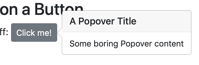
That all sounds very complicated. So let’s stop thinking about this in the abstract and look at a practical example (from pbs78a.html in this instalment’s ZIP file). Let’s start with the HTML markup. In this case we’ll attach the popover to a button:
<button type="button" class="btn btn-secondary btn-sm" data-toggle="popover" title="A Popover Title" data-content="Some boring Popover content">
  Click me!
</button>
The data-toggle="popover" attribute will enable the default toggling behaviour for the popover. That is to say, each time a user clicks the button, the popover’s visibility will toggle on or off. The title for the popover is read from the title attribute, and the body for the popover from the data-content attribute.
Just adding this markup won’t do anything though. We need to explicitly enable the popover using the matching Bootstrap jQuery plugin. We do that by calling the .popover() function on the button with an empty object as the only argument. We can do this for all popovers on the page by simply adding the following to our document ready handler:
$('[data-toggle="popover"]').popover({});
This uses the CSS attribute selector to select all items on the page that have the attribute data-toggle with the value popover.
Note that you may not always want to use such a broad brush. You may want to treat some of your popovers differently from others. So you may want to use a more narrowly-focused CSS selector.
Triggers
How a popover is activated is controlled by the trigger option. The default is click. When a popover is set to trigger on click, then clicking the element it’s attached to will show the popover. Clicking it again will hide it. I think of these kinds of popovers as being sticky, because I have to click again to make them go away.
An alternative to this default behaviour is to set the trigger to hover. You can do this in HTML with the data attribute data-trigger="hover". This behaviour may not make sense on a button, but it can be useful for other things. For example, the following link shows the meaning of the acronym as a popover triggered by hovering:
<span class="mark" data-toggle="popover" data-trigger="hover" data-content="Programming by Stealth">PBS</span>
Note that the Bootstrap CSS class .mark gives the highlighter-pen look to the acronym.
Yet another way to trigger popovers is on focus. This only works on elements within a page that can have focus, mainly form elements, links, and anything with an explicit tabindex attribute.
A good example would be a popover explaining a text box that’s only visible while the text box has focus:
<input type="text" class="form-control" data-toggle="popover" data-trigger="focus" data-content="Enter Some Text!">
One of the annoying things about the default click trigger is that you have to click on the element that the popover belongs to, to get rid of it. It would be much more convenient to be able to click anywhere on the page to dismiss it! With a little trickery you can achieve this by using an <a> tag (the docs insist it will not work reliably with <button> tags) without an href attribute and with a tabindex attribute combined with the focus trigger and the Bootstrap button classes (.btn plus .btn-primary or similar):
<a class="btn btn-secondary btn-sm" data-toggle="popover" data-trigger="focus" title="A Dismissable Popover" data-content="Click anywhere on the page to make me go away!" tabindex="0">
  Click me!
</a>
There are situations where you don’t want any automated triggering at all. Instead you want to control the popover entirely via JavaScript. You can achieve this by setting the trigger to manual. We’ll describe this in more detail later.
Finally, you can set multiple triggers on the same element, with one exception. The manual trigger can’t be combined with any other triggers.
This might sound like a strange thing to do, but combining hover and click can be quite useful. Since hovering is neither accessible nor usable on touch devices, nothing mission-critical should ever be triggered solely on hover. It’s fine to use pure hovers for optional extras, but your page/web app has to be able to function without their use. When you add both the hover and click triggers to a popover, it will behave in a non-sticky way until you click it once, and then it will become sticky until you click again:
<button type="button" class="btn btn-secondary btn-sm" data-toggle="popover" data-trigger="hover click" title="A Hoverable Pin-able Popover" data-content="Click to make me stick on, click again to un-stick me!">
  Hover over or Click me!
</button>
Popover Options
So far, when initialising Popovers, we’ve been passing an empty object as the first argument. This object does not have to be empty. We can use it to specify any supported option. Remember that, as with other Bootstrap jQuery plugins, you can specify these options either in the object or as data attributes in the HTML.
You’ll find a full list of all available options in the relevant section of the Bootstrap documentation, but here are some of the most useful ones:
title- The title for the popover, or an empty string to remove the title area completely. Note that this option is the exception to the rule. The HTML equivalent is not the data attribute
data-title, but the regular HTMLtitleattribute. content- The text for the popover’s body. Normally interpreted as plain text, but, if the html option is set to a truthy value, it will be interpreted as HTML.
html- Specify a truthy value if the
contentoption should be interpreted as HTML. trigger- The trigger(s) to use, one or more of
click,hover, orfocusseparated by spaces, or the single valuemanual. placement- The direction the popover should 'pop'. One of
top,bottom,left,right, orauto. The default isauto. sanitize- By default, Bootstrap sanitises the title and content of popovers. This strips out all HTML tags and attributes within those tags except those that are explicitly white-listed (see the docs for the list of allowed tags). This is a nice security feature for popovers that contain user-supplied data, but may not always be desirable. Set this option to a falsy value to disable sanitation.
Controlling Popovers via JavaScript
Like with all jQuery plugins, you can trigger various actions by calling the .popover() function with a string as the first argument. You can get a full list of all available actions in the relevant section of the Bootstrap documentation, but the three most important ones are .popover('show'), .popover('hide'), and .popover('toggle').
There are also event handlers available. Again, see the relevant section of the Bootstrap docs.
All the popovers in my sample solution are entirely controlled via JavaScript. I chose to separate the code for initialising a popover on a button within the game grid out into a separate function, namely .attachPopover(). This function gets called once for each button in the game grid by my resetGameUI() function. I use a Mustache template to generate the content for the popover.
The .attachPopover() function first does some sanity checking on the arguments. Then it uses Mustache to generate the content for the popover. Finally it initialises the popover using an options object. The relevant lines are:
// try render the template
let bodyHTML = '';
try{
  bodyHTML = Mustache.render(bt, bv);
}catch(err){
  bodyHTML = '<p class="text-danger">Template Error</p>'
}

// initialise the popover plugin on the element
$e.popover({
  trigger: 'manual',
  placement: 'bottom',
  sanitize: false,
  html: true,
  title: '', // make sure the popover has no title
  content: bodyHTML
});
Notice that I use the various options to disable all automatic triggers (trigger: 'manual'), force the popover to appear below the button (placement: 'bottom'), disable sanitisation, allow HTML in the content, set a blank title, and set the body to the HTML returned by Mustache.render().
Because I set the trigger to manual, all hiding and showing is now up to my code. I show the appropriate popover in my guessNumber() function, and use a timeout to have it automatically disappear after a number of seconds. This is the relevant code snippet:
$guessBtn.popover('show');
window.setTimeout(
  function(){
    $guessBtn.popover('hide');
  },
  GUESS_POPOVER_DURATION * 1000
);
FYI — Bootstrap Also has Tooltips
As well as providing popovers, Bootstrap also provides a simplified version intended for replacing HTML’s default tooltip for elements with a title attribute with a more human-friendly alternative, and for giving extra information on form inputs. The API is extremely similar to that for Popovers, just less feature rich. If you want to use them, this is the relevant section of the Bootstrap documentation.
Introducing is.js
Data variation is something you have to do a lot. It is often extremely repetitive and the code is often nowhere near as clean and easy to read as you would like.
Rather than having to check if something is a integer between 1 and 20 inclusive with code like this:
const val = 4;
if(String(val).match(//^\d+$) && val >= 1 && val <=20 ){
  window.alert('yay!');
}else{
  window.alert('poop!');
}
Wouldn’t it be much nicer to be able to use well-named functions instead? Perhaps something like:
const val = 4;
if(is.integer(val) && is.within(val, 1, 20){
  window.alert('yay!');
}else{
  window.alert('poop!');
}
Well, that’s where is.js comes in!
This small lightweight open source JavaScript library describes itself as a ‘micro check library’. Basically, it’s a collection of commonly needed type checking functions with three so-called interfaces to make your code even more readable.
You’ll find the full list of available checks on their website: http://is.js.org.
Basic checks can be performed in following way (replacing NAME_OF_CHECK with the actual name of the check, and VALUE_TO_TEST with the value to be validated):
is.NAME_OF_CHECK(VALUE_TO_TEST)
For example, to check if the variable boogers contains a valid URL, you would use:
is.url(boogers)
Some checks take arguments, and you pass those after the value to be tested. For example, the within() check expects two parameters, a minimum permitted value, and a maximum permitted value, hence, to check if the variable snot contains a number between 1 and 100 you would use:
is.within(snot, 1, 100)
The .not Interface
To make your code even easier to read by minimising the need for the ! operator, is.js includes what it refers to as the not interface for inverting the result of a check.
Interfaces get inserted between the is and the check name. So when using interfaces your checks will take the following form (replacing NAME_OF_INTERFACE with the actual name of the interface, NAME_OF_CHECK with the actual name of the check, and VALUE_TO_TEST with the value to be validated):
is.NAME_OF_INTERFACE.CHECK_NAME(VALUE_TO_TEST)
For example, to check if the variable puke does not contain an email address you would use:
is.not.email(puke)
The .all and .any Interfaces
The .all and .any interfaces allow a check to be applied to all the elements in an array instead of to single values.
To test if all the values in the array vomArray are IPv4 IP addresses you would use:
is.all.ipv4(vomArray)
Similarly, to test if any value in the array barfArray is empty (string with no characters, array with no elements, or object with no keys) you would use:
is.any.empty(barfArray)
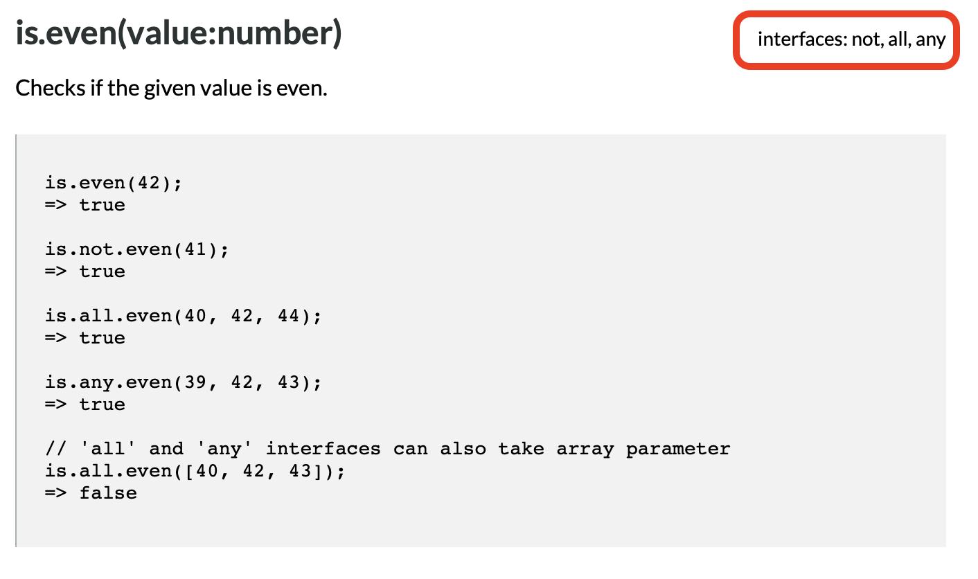
Note that not all checks support .all and .any. The entry in the documentation for each check lists the supported interfaces, e.g. the check .even() supports all three interfaces:
Getting is.js
The entire library is contained in one relatively small file. So you can download it, copy it into the same directory as your HTML document, and then load it with a script tag something like:
<script type="text/javascript" src="is.js"></script>
Alternatively, you can load it from a CDN. There is no officially supported CDN, but many of the public JavaScript CDNs host the file. In my sample solution, I loaded is.js from the Cloudflare-powered free CDNJS with:
<script src="https://cdnjs.cloudflare.com/ajax/libs/is_js/0.9.0/is.min.js" integrity="sha256-lnJeulOa3e5IO2EzHr8jKJ3CbT80MBwkS5a+n2ooIr4=" crossorigin="anonymous"></script>
(You can search for any JavaScript library/module/API you want to download from their CDN using the search box on the CDNJS home page.)
A Challenge
Using either our solution to the previous challenge or mine as your starting point, alter the game to turn it into a tool for teaching players about searching.
Since the game tells users whether each guess is too low or too high, they can use it to intelligently search the range of possible numbers. Each time they guess, a whole bunch of numbers will cease to be possible answers. So choosing wisely will whittle down the possibilities more quickly than choosing foolishly or randomly.
Update your UI so that it becomes obvious to the user that they are eliminating a large swath of possibilities with each guess. To further drive home the point, update your feedback to the user when they correctly guess the number to include the number of guesses it would have taken if they had used the binary search method.
If you’re not familiar with the binary search algorithm, you might find these resources useful:
Again, I’ll leave it to you to decide on your UI (User Interface) and UX (User Experience).
Final Thoughts
I hope you found Bootstrap Popovers and perhaps Bootstrap Tooltips useful. They’re not critical components, but they can be a nice addition to your web apps. Similarly, I hope you find is.js as useful and delightful as I do. It doesn’t do anything you couldn’t do yourself from first principles, but it saves you a lot of time writing repetitive code, and it makes your code much easier to read and maintain.
After having made you wait for an extra two weeks, we’ll finally get to see how Javascript Promises give us a route out of callback hell in the next instalment!