PBS 67 of X: Introducing Drop-downs (Bootstrap)
In this instalment we’ll start a two-part look at the Bootstrap Drop-down component. This component can be used to add pretty drop-down menus to both web app UIs and website navigation bars. In this instalment we’ll look at the first of those uses, and then in the next instalment we’ll look at navigation bars in general, which we’ve not seen before, and then Drop-downs within navigation bars.
You can download this instalment’s ZIP file here or here on GitHub.
Matching Podcast Episode 573
Listen along to this instalment on episode 573 of the Chit Chat Across the Pond Podcast
You can also Download the MP3
PBS 66 Challenge Solution
The challenge was to continue updating the recipe we have worked on for many recent challenges by adding form validation.
The first step was to add the HTML markup for HTML5 form validation features. For now, that meant ensuring the email address fields were <input> tags with type="email", and adding the required attribute to all required fields.
To facilitate Bootstrap validation, I updated both forms to give them an ID, changed the buttons to have type="submit", and changed the click handlers on those buttons to submit handlers on their relevant forms.
With the HTML5 markup in place on both forms, I moved on to adding bootstrap validation to each form in turn.
For the sharing form I opted to use HTML5 form validation on first submit. To enable this, I added the following to the document ready handler:
// add on-first-submit form validation to the sharing form
const $shareForm = $('#share_fm');
const enableShareValidation = function(){
   $shareForm.addClass('was-validated');
};
$shareForm.submit(enableShareValidation);
$('input, textarea', $shareForm).on('invalid', enableShareValidation);
For the login form, I decided to use full custom Bootstrap validation with popover notifications in order to earn the offered extra credit. The documentation for validation tooltips can be found here.
The fist step in accomplishing this is disabling the standard HTML5 form validation messages by adding the novalidate attribute to the relevant <form> tag.
Next, I added a <div> that will serve as a tooltip with a validation message whenever the form is validated and found to be invalid. This <div> needs to be added inside the input group but not as the first or last element. I added it after the inputs but before the input-group-append.
The documentation clearly states that the tooltip must be contained within an HTML element with CSS position property relative. I achieved this by adding an inline style to the input group itself to set its position to relative.
This is what the completed form looks like:
<form id="login_fm" class="form-inline" action="javascript:void(0);" novalidate>
<span class="input-group input-group-sm" style="position: relative">
  <span class="input-group-prepend">
    <span class="input-group-text"><i class="fas fa-sign-in-alt" aria-hidden="true"></i></span>
  </span>
  <input type="text" class="form-control" placeholder="Username" aria-label="Admin Username" required>
  <input type="password" class="form-control" placeholder="Password" aria-label="Password" required>
  <div class="invalid-tooltip" id="login_invalid">Both username and password are required</div>
  <span class="input-group-append">
    <button type="submit" class="btn btn-secondary form-control" id="login_btn">Login</button>
  </span>
</span>
</form>
With the markup in place, the next step was to replace the simple submit handler for the login form with the following JavaScript code:
// add custom validation to login form
const $loginForm = $('#login_fm');
const validateLoginForm = function(){
  // always enable validation UI
  $loginForm.addClass('was-validated');

  // figure out if both inputs are valid or not
  const allOK = $('input:valid', $loginForm).length === 2;

  // update the UI as appropriate
  if(allOK){
    $('#login_invalid').hide();
    $('button[type=submit]', $loginForm).prop('disabled', false);
  }else{
    $('#login_invalid').show();
    $('button[type=submit]', $loginForm).prop('disabled', true);
  }

  // return whether or not all is well
  return allOK;
};
$loginForm.submit(function(e){
  if(validateLoginForm()){
    window.alert("Sorry, this is just a dummy form, there's nothing to actually log in to here!");
  }else{
    e.stopPropagation();
    $('input:invalid', $loginForm).first().focus();
  }
});
$('input', $loginForm).on('input', validateLoginForm);
The first thing the above code does is define a validation function which checks whether or not both of the inputs in the form are valid, and then shows or hides the validation tooltip and enables or disables the login button. The validity check is done in one simple line:
const allOK = $('input:valid', $loginForm).length === 2;
The first thing to remember is that the result of a comparison operator is a boolean. So allOK will have a value of true or false, depending on whether or not the statement to the left of the === evaluates to exactly 2.
So, what about the thing to the left of the ===? It is a call to the jQuery $() function with two arguments, a CSS selector, and a jQuery object. When passed these two arguments, jQuery searches for all elements matching the CSS selector contained within the elements represented by the jQuery object. In this case, we are looking for all <input> tags with the pseudo-class :valid contained within the login form. Since there are only two <input> tags within this form, the $() function will return a jQuery object representing zero, one, or two valid inputs. Remember that a jQuery object’s .length property reveals the number of elements the object represents. So, since there are two inputs in total, then if there are two valid inputs, the form is valid.
The other line within the validation function I want draw attention to is this one:
$('button[type=submit]', $loginForm).prop('disabled', false);
Again, this is a call to jQuery’s $() function with two arguments, a CSS selector and a jQuery object. However in this case, the selector uses the CSS Attribute selector which we’ve not seen in quite some time. Within a CSS selector, square brackets are used to match on an HTML attribute. The CSS selector button[type=submit] queries for <button> tags with their type attribute set to submit. So the call to the $() function will return a jQuery object representing the submit button within the login form. We then use jQuery’s .prop() function to set the value of the button’s disabled property.
With the validation function declared, the code then goes on to add a new submit handler for the login form. Since we have taken full control of validation, we need to either do whatever we want to do on submission, or detect validation errors and prevent submission. The submit handler uses the validation function to determine whether or not to proceed, and then either pops up a message to tell the user their form would have been submitted if it were real, or it blocks the submit.
Finally, I added an event handler to all inputs within the login form to validate the form each time data is input.
With all that done we can now see what our validation tooltip looks like:
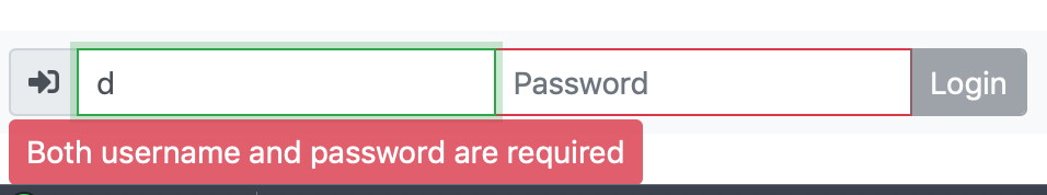
At first glance this looks OK, but there actually is a problem. Bootstrap validation tooltips appear directly below form inputs. Since this form is at the very bottom of the page within the footer, it’s adding extra scrolling and a white bar below the subtle grey footer. We really want the tooltip above the inputs. Unfortunately, while control of the positioning has been requested as an open issue on Bootstrap’s GitHub page, it hasn’t been implemented yet. We can fix it ourselves though with a little CSS.
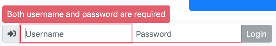
Using the developer tools I was able to determine that the tooltip is positioned absolute with top set to 31px. This means we can alter the position of the tooltip by setting a different value for the tooltip’s top CSS property. With a little experimentation I found that -2.5em worked well. So I added the following inline CSS attribute to the tooltip’s <div> tag: style="top: -2.5em". With that subtle change made, things look much better!
Introducing Bootstrap Drop-downs
Let’s nip something in the bud straight away — a Bootstrap Drop-down is not an HTML <select> tag. It’s not trying to replace the <select> tag, and without some serious bodging, you can’t use it as one. The reason this is confusing is that we often refer to <select>s as drop-downs.
So if a Bootstrap Drop-down is not a form drop-down, what is it? It’s a drop-down menu. I’ve taught myself to imagine a silent Menu after Bootstrap Drop-down.
Bootstrap drop-downs are useful in two distinct contexts, and they come in two distinct variants — one based around <a> tags, and one based around <button> tags. The first variant is intended to be used in navigation menus, and the second in web app UIs.
In this instalment we’ll focus on the web app UI variant, i.e. Bootstrap Drop-downs built with <button> tags. We’ll look at Bootstrap Navigation bars in general and navigation bars with Drop-downs in the next instalment.
The Anatomy of a Bootstrap Drop-down
Before we narrow our focus to button-based Bootstrap Drop-downs, let’s look at the big-picture design, because that remains consistent between variants.
Firstly, Bootstrap Drop-down components require the Bootstrap JavaScript libraries be loaded.
Drop-downs consist of two related parts; a toggle, and a menu containing menu items. The entire drop-down (toggle and menu) must be contained within another Bootstrap component that supports drop-downs, and as we’ll see, quite a few of them do!
For accessibility reasons, the element being used as the toggle should define the ARIA attributes aria-haspopup="true" and aria-expanded="false".
The simplest form of a drop-down is the stand-alone form. In this case, the container is simply a tag (usually a <div>) with the class .dropdown.
Bootstrap Drop-down Menus as Web App UI
Note that all the examples below can be found in the file pbs67a.html in this instalment’s ZIP file or here on GitHub.
A Basic Drop-down Menu
To create a basic button-based Bootstrap Drop-down, start with a container tag of your choosing, usually a <div>, and give it the class .dropdown.
Within the container, add the button that will act as the trigger for the menu. This button will be the only visible part of the menu when it is not expanded. Bootstrap will automatically add a triangular icon to this button to indicate that it’s a drop-down. To make the button act as the trigger for the drop-down, we need to do a number of things:
- Opt the
<button>into the opinionated Bootstrap types for buttons in the usual way, i.e. give it the class.btnand one of the standard Bootstrap styles like.btn-secondary. - Give the
<button>the class.dropdown-toggle. - Make sure the button is not set to be a submit button by being sure it has
type="button". - Give the
<button>the data attributedata-toggle="dropdown" - Give the
<button>the ARIA attributesaria-haspopup="true" aria-expanded="false". - Give the button an ID so we can use it as the ARIA label for the menu.
With the trigger added, the next thing we need is the menu. This will consist of a container tag, again, usually a <div> with the class .dropdown-menu. To make the menu accessible, it should use the aria-labelledby attribute to connect it to the trigger.
Within this new container, we then add the buttons that will make up the menu’s contents. Each of these buttons should have the class .dropdown-item and type="button".
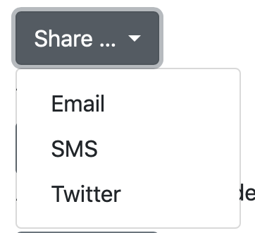
Putting all that together, we get the following simple example:
<div class="dropdown">
  <button class="btn btn-secondary dropdown-toggle" id="basicDropdownBtn" data-toggle="dropdown" aria-haspopup="true" aria-expanded="false" type="button">
    Share …
  </button>
  <div class="dropdown-menu" aria-labelledby="basicDropdownBtn">
    <button class="dropdown-item" type="button">Email</button>
    <button class="dropdown-item" type="button">SMS</button>
    <button class="dropdown-item" type="button">Twitter</button>
  </div>
</div>
Controlling Direction
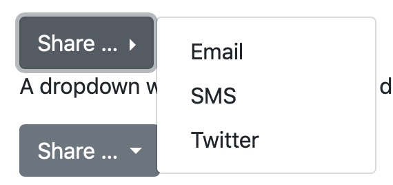
By default the Drop-down will prefer to drop downwards, but, if it’s at the bottom of the page it will ‘drop’ upwards. If you want to force a particular direction, you can do so by replacing the .dropdown class on the container with one of .dropup, .dropright, or .dropleft.
The following shows a menu set to drop right:
<div class="dropright">
  <button class="btn btn-secondary dropdown-toggle" id="basicDroprightBtn" data-toggle="dropdown" aria-haspopup="true" aria-expanded="false" type="button">
    Share …
  </button>
  <div class="dropdown-menu" aria-labelledby="basicDroprightBtn">
    <button class="dropdown-item" type="button">Email</button>
    <button class="dropdown-item" type="button">SMS</button>
    <button class="dropdown-item" type="button">Twitter</button>
  </div>
</div>
Adding Headings, Help Text, & Dividers
When you look at menus in the apps you use, you’ll see they contain more than just menu items. They also contain additional unclickable items that add context like dividers, section headings, and help text.
To add a divider in a menu, simply add an empty tag of your choice (usually a <div>) as a sibling to the buttons with the class .dropdown-divider.
To add a heading, add a tag of your choice (again, usually a <div>) which contains the heading text and has the class .dropdown-header.
Finally, to add some help text, add a tag of your choice (usually a <p>) containing the text. You don’t need to add any classes, but you can use the usual utility classes if you want to add some padding or things like that.
Here’s a sample menu using all three of the above:
<div class="dropdown">
  <button class="btn btn-secondary dropdown-toggle" id="fancyDropdownBtn" data-toggle="dropdown" aria-haspopup="true" aria-expanded="false" type="button">
    Share …
  </button>
  <div class="dropdown-menu" aria-labelledby="fancyDropdownBtn">
    <p class="text-muted p-2">We support modern and legacy sharing options</p>
    <div class="dropdown-divider"></div>
    <div class="dropdown-header">Modern</div>
    <button class="dropdown-item" type="button">Twitter</button>
    <button class="dropdown-item" type="button">Instagram</button>
    <button class="dropdown-item" type="button" disabled>Facebook</button>
    <div class="dropdown-header">Legacy</div>
    <button class="dropdown-item" type="button">Email</button>
    <button class="dropdown-item" type="button">SMS</button>
  </div>
</div>
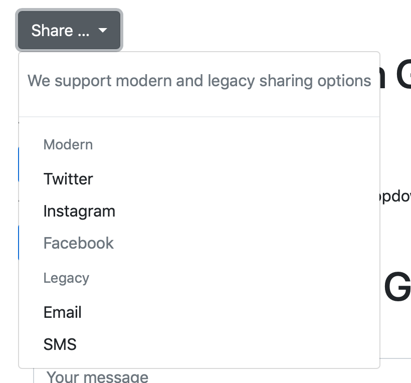
Disabled Drop-down Menu Items
Note that, if you set a button in a drop-down menu to be disabled, Bootstrap will style it appropriately (see the Facebook option in the menu above).
Drop-down in Button Groups
Normally, the only thing visible on a collapsed drop-down is the trigger, and the only thing that happens when you click the trigger is that the menu expands.
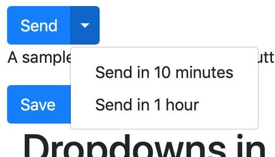
You’ll often see a subtly different design in UIs, the so-called split button where the main body of the toggle is a separate button that performs a default action, and next to it is a triangle icon which expands the drop-down which shows related actions.
With Bootstrap, you can achieve this using a button group as the container for the default button, the trigger button, and the drop-down menu. The button group does not get the class .dropdown, but if you want to drop in a different direction, you do need give the button group the class .dropup, .dropleft, or .dropright.
When creating a split button, the button to toggle the drop-down should not contain any visible text. It should be left apparently empty and Bootstrap will insert a triangle icon. However, to support screen readers, we should add some text wrapped inside a <span> with the class .sr-only stating that button expands the drop-down. To allow Bootstrap to lay out the icon correctly, we also need to give the toggle button the classes .dropdown-toggle and .dropdown-toggle-split.
You can see all this in action in the following example:
<div class="btn-group">
  <button type="button" class="btn btn-primary">Send</button>
  <button type="button" class="btn btn-primary dropdown-toggle dropdown-toggle-split" data-toggle="dropdown" aria-haspopup="true" aria-expanded="false" type="button" id="splitDropdownBtn">
    <span class="sr-only">Toggle Dropdown</span>
  </button>
  <div class="dropdown-menu" aria-labelledby="splitDropdownBtn">
    <button class="dropdown-item" type="button">Send in 10 minutes</button>
    <button class="dropdown-item" type="button">Send in 1 hour</button>
  </div>
</div>
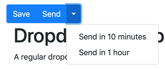
While you can only have one drop-down per button group, you can have more than one regular button in the button group along with the drop-down:
<div class="btn-group">
  <button type="button" class="btn btn-primary">Save</button>
  <button type="button" class="btn btn-primary">Send</button>
  <button type="button" class="btn btn-primary dropdown-toggle dropdown-toggle-split" data-toggle="dropdown" aria-haspopup="true" aria-expanded="false" type="button" id="splitDropdownBtn">
    <span class="sr-only">Toggle Dropdown</span>
  </button>
  <div class="dropdown-menu" aria-labelledby="splitDropdownBtn">
    <button class="dropdown-item" type="button">Send in 10 minutes</button>
    <button class="dropdown-item" type="button">Send in 1 hour</button>
  </div>
</div>
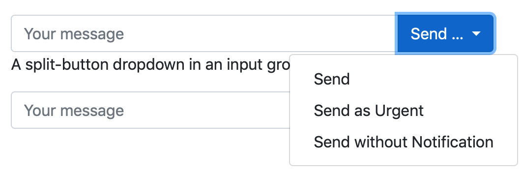
Drop-downs in Input Groups
You can’t add a drop-down just anywhere in an input group, but you can add a regular drop-down or a split button as either an input group’s append or prepend element.
You do this by using the .input-group-prepend or .input-group-append in the same way we used a button group in the previous section.
An example using a regular drop-down:
<div class="input-group">
  <input type="text" class="form-control" aria-label="message" placeholder="Your message">
  <div class="input-group-append">
    <button class="btn btn-primary dropdown-toggle" id="inputGroupBtn" data-toggle="dropdown" aria-haspopup="true" aria-expanded="false" type="button">
      Send …
    </button>
    <div class="dropdown-menu" aria-labelledby="inputGroupBtn">
      <button class="dropdown-item" type="button">Send</button>
      <button class="dropdown-item" type="button">Send as Urgent</button>
      <button class="dropdown-item" type="button">Send without Notification</button>
    </div>
  </div>
</div>
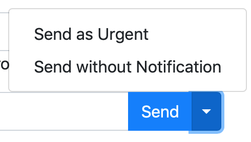
An example using a split button:
<div class="input-group">
  <input type="text" class="form-control" aria-label="message" placeholder="Your message">
  <div class="input-group-append">
    <button class="btn btn-primary">Send</button>
    <button class="btn btn-primary dropdown-toggle dropdown-toggle-split" id="inputGroupSplitBtn" data-toggle="dropdown" aria-haspopup="true" aria-expanded="false" type="button">
      <span class="sr-only">Toggle Dropdown</span>
    </button>
    <div class="dropdown-menu" aria-labelledby="inputGroupSplitBtn">
      <button class="dropdown-item" type="button">Send as Urgent</button>
      <button class="dropdown-item" type="button">Send without Notification</button>
    </div>
  </div>
</div>
A Challenge
Continuing on with our recipe, update the login form so it uses a split button to offer three login options; a default simply labeled “Admin Login”, and two additional options in the drop-down labeled “Login for 5 minutes” and “Login for 1 hour”.
Final Thoughts
We’ve now seen how we can add drop-down menus to our web app UIs. We’ve not actually covered everything you use a Bootstrap Drop-down menu for in this context — you can actually add form elements inside drop-downs, but I’ll leave that advanced topic as some optional additional reading for those interested. You’ll find the relevant documentation here.
In the next instalment we’ll look at navigation menus in Bootstrap in general, and then at adding drop-downs into navigation menus.