PBS 66 of X: Form Validation (Bootstrap)
Over the past few instalments we’ve been making our way though the various form-related features Bootstrap offers. We’ll round out that tour in this instalment with a look at how Bootstrap can help with form validation.
You can download this instalment’s ZIP file here or here on GitHub.
Matching Podcast Episode 570
Listen along to this instalment on episode 570 of the Chit Chat Across the Pond Podcast
You can also Download the MP3
PBS 65 Challenge Solution
The challenge was quite simple — improve the two forms added to the recipe page we have been building up over the past many instalments by making use of input groups.
Let’s start with the small admin login form in the footer.
My starting point was a simple inline form with a label for the overall form, two inputs, each with a hidden label, and a button. I chose to combine all three form elements into a single input group, and to give that input group an appropriate icon as a prefix.
I started by simplifying the form and removing all the labels and replacing them with aria-label attributes on the form’s container and each of the inputs. This simplified the markup without compromising accessibility.
With the <label> tags removed, I then wrapped all three elements in <span> with the classes input-group & input-group-sm and removed the spacing utility classes and form-control-sm/btn-sm classes from the individual inputs and the button.
At this point I had three equal-width elements in my group, the username field, the password field, and the login button. To demote the button from a full member of the input group requiring an equal share of the width to an append, I wrapped the button in a <span> with the class input-group-append.
Finally I added an icon to the front of the input group by inserting a <span> with the class input-group-prepend as the first element within the input group. Next I added another <span> with the class input-group-text within the prepend, and finally a Font Awesome icon within that.
After all that, I was left with the following simple markup:
<footer class="mt-3 p-2 bg-light" role="form" aria-label="Admin Login">
  <form class="form-inline" action="javascript:void(0);">
    <span class="input-group input-group-sm">
      <span class="input-group-prepend">
        <span class="input-group-text"><i class="fas fa-sign-in-alt" aria-hidden="true"></i></span>
      </span>
      <input type="text" class="form-control" placeholder="Username" aria-label="Admin Username">
      <input type="password" class="form-control" placeholder="Password" aria-label="Password">
      <span class="input-group-append">
        <button class="btn btn-secondary form-control" id="login_btn">Login</button>
      </span>
    </span>
  </form>
</footer>
Which looks like:

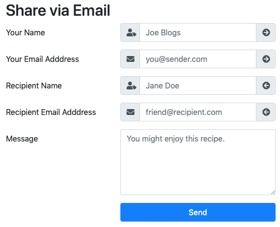
The second form needed much less work. I simply converted the four text boxes to input groups with single text add-ons front and back, and a single Font Awesome icon in each. I used the appends to signify whether or not the field applied to the sender or the receiver with the use of arrow icons, and the prepend to signify the expected value in the field with an icon for name, and another for email.
The only mildly interesting thing I did was to force all the prepends and appends to be the exact same width by explicitly setting it to 2.5em with an inline style attribute on the <span> with the class input-group-text.
As an example, here’s the code for just the sender’s name field:
<div class="form-group form-row">
  <label for="sender_name_tb" class="col-sm-5 col-md-4 col-lg-3 col-xl-2 col-form-label">Your Name</label>
  <div class="col">
    <div class="input-group">
      <span class="input-group-prepend">
        <span class="input-group-text" style="width: 2.5em"><i class="fas fa-user-tag"></i></span>
      </span>
      <input type="text" class="form-control" id="sender_name_tb" placeholder="Joe Blogs">
      <span class="input-group-append">
        <span class="input-group-text" style="width: 2.5em"><i class="fas fa-arrow-circle-right"></i></span>
      </span>
    </div>
  </div>
</div>
The updated form now looks like this:
You can find my full sample solution in the pbs65-challenge-solution folder in this instalment’s ZIP file.
Bootstrap Form Validation
We learned about HTML5’s built-in form validation features back in instalments 39 & 40. Given that previous versions of HTML had no form validation at all, these new built-in features are a great leap forward, but they are far from perfect. Each browser implements the built-in validation messages differently, and they can’t be styled with CSS.
Bootstrap offers us a spectrum of choices when it comes to showing validation information to users. The least Bootstrap can do is literally nothing! This is also what Bootstrap does by default. At the other end of the spectrum Bootstrap provides you with all the styles you need to take total control of the presentation of validation information from the browser. Doing nothing involves very little work (obviously), and taking full control involves writing a little HTML and a lot of JavaScript. The in-between options involve just a little JavaScript and no HTML.
We’ll work our way from one end of the spectrum to the other with a worked example.
Pure HTML5 Form Validation
We’ll use an updated version of the sample donation form from the previous instalment as our starting point. You’ll find this file in this instalment’s ZIP as pbs66a.html.
The key points to note about this file are that I have added the relevant HTML5 form validation attributes to the form elements. Specifically I’ve added the flag attribute required to the required fields, and min=1 to the amount field. Note that the text boxes already had the appropriate HTML5 type attributes. If not, I would have had to update the amount text box to type="number" and URL text box to type="url".
I also added an event handler to show a standard browser alert box when the form successfully submits:
// a document ready handler
$(function(){
  // add a submit handler to the form
  $('#support_fm').submit(function(){
    window.alert("Your donation was not submitted because this is a dummy form, but thanks all the same, it's the thought that counts :)");
  });
});
If you load this page in a browser, you can remind yourself how standard HTML5 form validation presents itself.
Always-on Bootstrap Validation Styles
Back in instalment 39, we learned that HTML5 provides us with two CSS pseudo-classes that we can use to style form elements depending on their validity, i.e. invalid form elements have the pseudo-class :invalid, and valid ones get :valid.
Unsurprisingly, Bootstrap has built-in styling for form validation states. Like with other opinionated Bootstrap styling, you have to opt into these styles by adding the class .was-validated to the form.
Now, every valid form element gets a green border, and every invalid one a red border.
You can see this in action in pbs66b.html in this instalment’s ZIP.
On-First-Interaction Bootstrap Validation Styles
Having a form you haven’t even touched already be visually cranky at you with lots of red borders is suboptimal. A nice improvement would be to have the Bootstrap validation states only show up when the form is first submitted. We can do this by not adding the class .was-validated into the form in our markup, but adding it via appropriate event handlers later.
The two relevant event handlers are the forms submit handler, and each validated form element’s invalid handler. You might imagine just the form’s submit handler might be enough, but you’d soon find that doesn’t work, because that handler only fires when the form passes validation. The invalid event is fired whenever validation fails on a given element. We need to catch that event too.
We can see this in action in pbs66c.html from this instalment’s ZIP.
The relevant changes from pbs66b.html are the removal of class="was-validated" from the <form>, and the addition of the needed event handlers inside the document ready handler:
// a document ready handler
$(function(){
  // get a reference to the form for quick access
  const $form = $('#support_fm');

  // add event handlers to activate the Bootstrap validation styles
  // when the form is first interacted with
  const enableBootstrapValiationStyles = function(){
    $form.addClass('was-validated');
  };
  $form.submit(enableBootstrapValiationStyles);
  $('input', $form).on('invalid', enableBootstrapValiationStyles);

  // add a submit handler to the form
  $form.submit(function(){
  window.alert("Your donation was not submitted because this is a dummy form, but thanks all the same, it's the thought that counts :)");
  });
});
The additional code first saves a reference to a jQuery object representing the form to a variable named $form.
Next the code defines a function named enableBootstrapValiationStyles() which simply adds the class .was-validated to the form.
Finally, the additional code adds this function as a handler for the form’s submit event, and as a handler to each input within the form’s invalid event.
Remember, when you pass the $() function a CSS selector as the first argument and a jQuery object as the second, it returns a jQuery object representing all elements matching the selector contained within the elements represented by the second argument. In this case $('input', $form) means all input tags within our form.
Fully Custom Form Validation with Bootstrap Styles
The final step is to take full control and remove the standard HTML5 UI completely, and replace it with custom Bootstrap UI. The first thing we have to do to enable this is tell HTML5 not to show its built-in validation messages by adding the flag attribute novalidate to the <form>. Doing this will not prevent the browser from doing the validation, so the :valid and :invalid pseudo-classes will continue to exist and be updated, but it will prevent the browser from showing validation feedback, and even invalid forms will now submit.
Before we look at what Bootstrap has to offer us, we need to remind ourselves of some jQuery, because we’ve now taken responsibility for preventing form submission when there are validation errors. The jQuery way of achieving that goal is to call the .stopPropagation() function on the jQuery event object representing the submit event. The first argument passed to an event handler in JavaScript is always the relevant jQuery event object. So we simply need to name the first argument to our submit handler and then call .stopPropagation() on that name. For clarity I’ll be using the name event in my example, but you really could choose anything.
The other thing we need to remind ourselves of is how to tell if an input is in a valid or invalid state using jQuery. We can do this by combining jQuery’s .is() function with the HTML5 :valid or :invalid CSS pseudo-classes. As an example, if you load pbs66d.html into your favourite browser and enable the JavaScript console, you can use that to query the validation state of the first name text box with: $('#name_first_tb').is(':valid').
With those two piece of jQuery knowledge fresh in our minds again, let’s now look at the tools Bootstrap provides us.
Because Bootstrap’s default behaviour is to only show form validity styling when the form has the class .was-validated, by default either all the fields within a form get styled, or none. That’s not always the desired behaviour, so Bootstrap also provides the classes .is-valid & .is-invalid which can be applied to individual form elements to cause them to show their styling, regardless of the presence or absence of .was-validated on their containing <form>.
Bootstrap also gives us pre-made styles for showing validation success and failure messages. Specifically, it provides .valid-feedback & .invalid-feedback. Both of these classes are hidden by default.
For simple forms that have the .was-validated class, you can have these messages automatically show and hide themselves by placing a <div> with the relevant class either directly after a regular form element, or as the last children within an input group.
Alternatively, you can manually show and hide these messages using jQuery’s .show() and .hide() functions.
To see all this in action, let’s look at a final version of our form with fully custom validation using Bootstrap’s styles.
I’ve chosen to enable validation on each field in the form one-by-one as it’s interacted with, and not to enable form-wide validation until the first time the form is submitted. I think this approach gives the most pleasing user experience. You can try it for yourself with pbs66d.html in the ZIP.
My solution relies on using Bootstrap’s .was-validated, .is-valid, .is-invalid, .valid-feedback & .invalid-feedback CSS classes, and the submit, invalid, input, & change JavaScript events, and jQuery’s .is(), .val(), .prop(), .text(), .empty(), .addClass(), .removeClass(), .show(), .hide(), .focus(), .on(), .submit(), & .first() functions. All the relevant JavaScript code is contained within the jQuery document ready handler.
Big-picture-wise, the code is architected as follows:
- A
<div>with an ID has been added after each input that needs validation. This<div>will be used to display any needed feedback. - There is a validation function for each text box that sets the
.is-validor.is-invalidclass as appropriate, updates any matching validation messages, and returnstrueif the value was found to be valid, andfalseotherwise - The validation functions are configured as handlers for the
inputevent on their relevant text boxes. - The checkbox related to the URL field has the URL field’s validation function attached to its
changehandler. - The form as a whole has a submit handler that calls each validation function and enables form-wide validation by adding
.was-validatedto the form as a whole. - As a courtesy to the user, the submit handler also focuses the first invalid element in the form.
You can see the full source in pbs66d.html, but I want to draw your attention to some specific examples.
Before we begin, note that the document ready handler starts by creating some utility variables for providing quick access to the relevant form elements, and these variable are scoped such that they are available within all the validation functions and all the event handlers:
// a document ready handler
$(function(){
  // get a reference to the form and its elements for quick access
  const $form = $('#support_fm');
  const $fname = $('#name_first_tb');
  const $lname = $('#name_last_tb');
  const $amount = $('#amount_tb');
  const $twitter = $('#twitter_tb');
  const $url = $('#url_tb');
  const $plug = $('#plug_cb');

  // validation functions defined here ...

  // validation function attached to input events here ...

  // submit handler added here ...
}
Let’s start with a relatively simple case, the name fields. What makes this relatively simple is that we only want to give one kind of feedback: an error message as needed. This simplicity means we can write the message straight into the markup and only use JavaScript to apply the appropriate style to the text boxes themselves, and to show or hide the error message.
In terms of markup I simply added the following div below the input group that contains the two name fields:
<div id="name_vf" class="invalid-feedback">Please enter both a first and last name</div>
The JavaScript code for updating the styling and showing or hiding the error message is all contained within the validation function for the names (one function used as an input handler on both text boxes):
const validateNames = function(){
  // update per-element validation styling on both names
  if($fname.is(':valid')){
    $fname.removeClass('is-invalid').addClass('is-valid');
  }else{
    $fname.removeClass('is-valid').addClass('is-invalid');
  }
  if($lname.is(':valid')){
    $lname.removeClass('is-invalid').addClass('is-valid');
  }else{
    $lname.removeClass('is-valid').addClass('is-invalid');
  }

  // show or hide the error message as appropriate
  if($fname.is(':valid') && $lname.is(':valid')){
    $('#name_vf').hide();
    return true;
  }
  $('#name_vf').show();
  return false;
};
Note the use of .is(':valid') to test for validity, the use of .addClass() and .removeClass() for alternating between the .is-valid and .is-invalid classes on the two text boxes, and the use of .hide() and .show() on the error message.
This get marginally more complicated on fields where we want to show both success and error messages, but not much. Let’s look at the amount field as an example.
In this case we have just a single text box, but we want to thank people when they enter a valid amount, and give them an error message when they enter an invalid amount.
Rather than hard-coding the message into the <div>, I chose to create a single completely empty div with just an ID to act as both the success and error message as needed:
<div id="amount_vf"></div>
In this case the validation function needs to update the validity class on the single text box much like we did for both text boxes in the previous example, and then insert text into the feedback <div>, give it the appropriate class, and show it. Again, all the work is done inside the relevant validation function:
const validateAmount = function(){
  // deal with the valid case
  if($amount.is(':valid')){
    // update the per-element validation styling
    $amount.removeClass('is-invalid').addClass('is-valid');

    // update the validation message
    let msg = `Thank you for your ${$amount.val() > 5 ? 'generous' : 'kind'} support 🙂`;
    $('#amount_vf').removeClass('invalid-feedback').addClass('valid-feedback').text(msg).show();
    return true;
  }

  // default to the invalid case
  $amount.removeClass('is-valid').addClass('is-invalid');
  $('#amount_vf').removeClass('valid-feedback').addClass('invalid-feedback').text('Please enter a positive whole number').show();
  return false;
};
As in our previous example, .is(':valid') is used to check the validity, .addClass() & .removeClass() are used to update the classes. and .show() is used to show the message. In addition to this, we’re now using .val() to read the text box’s value, and .text() to update the feedback text.
One additional complication is optional fields. In this case there are three scenarios, an invalid value, and two possible valid conditions, no value, and a valid value. When there is no value, the input is in a valid state, but we don’t want to display our success message. Instead, we want to display no message at all.
We’ll use the Twitter field as an example. Again, the markup is an empty <div> with an ID:
<div id="twitter_vf"></div>
The work is again done within the validation function:
const validateTwitter = function(){
  // deal with the valid case
  if($twitter.is(':valid')){
    $twitter.removeClass('is-invalid').addClass('is-valid');
    if($twitter.val()){
      // not empty, so show valid message
      $('#twitter_vf').removeClass('invalid-feedback').addClass('valid-feedback').text('OK - keep an eye out for our Tweet!').show();
    }else{
      // empty - show no message
      $('#twitter_vf').hide().empty().removeClass('invalid-feedback').removeClass('valid-feedback');
    }
    return true;
  }

  // default to the invalid case
  $twitter.removeClass('is-valid').addClass('is-invalid');
  $('#twitter_vf').removeClass('valid-feedback').addClass('invalid-feedback').text("Please enter your Twitter handle without the leading @, or lever this field blank").show();
  return false;
};
Notice the use of .empty() to empty the feedback <div> as needed.
Having declared these validation functions, we now need to attach them as handlers to the relevant events. Each time a user inputs some text into a text box, we need to call the relevant validation function. Each time a user checks or unchecks a radio button, we need to respond as well. We use jQuery’s .on() function to bind the validation functions to the relevant events:
// add input handlers to the text boxes etc
$fname.on('input', validateNames);
$lname.on('input', validateNames);
$amount.on('input', validateAmount);
$twitter.on('input', validateTwitter);
$url.on('input', validateURL);
$plug.on('change', validateURL);
Finally, there is the form submission event handler. This handler first enables validation feedback on the entire form. Next it calls all the validation functions to determine whether or not the form as a whole should be considered valid, and then it either blocks form submission, or pretend-submits the form (since it’s a dummy form). As a courtesy to users, the handler also focuses the first invalid field when there is one.
The code is quite short and straightforward:
// add a submit handler to the form
$form.submit(function(event){
  // always enable bootstrap validation styles
  $form.addClass('was-validated');

  // validate the fields
  let allOK = true;
  if(!validateNames()) allOK = false;
  if(!validateAmount()) allOK = false;
  if(!validateTwitter()) allOK = false;
  if(!validateURL()) allOK = false;

  // if all was OK, pretend submit, otherwise focus the first invalid element and stop the submit
  if(allOK){
    window.alert("Your donation was not submitted because this is a dummy form, but thanks all the same, it's the thought that counts :)");
  }else{
    $('input:invalid', $form).first().focus();
    event.stopPropagation();
  }
});
Notice the use of .first() and .focus() in conjunction with the $() function to focus the first invalid input within the form. We are calling the $() function with two arguments, a CSS selector and jQuery object. The result of that call will be a jQuery object representing all elements matching the selector within the elements represented by the second argument. In this case, all <input> tags with the pseudo-class :invalid contained within our form. This will result in a jQuery object representing all invalid text boxes, but we can only focus one, so the call to .first() returns a new jQuery object representing only the first invalid text box. Finally, .focus() focuses that single text box.
Challenge
We’ll be building yet again on the output from the previous challenge for this one. You can use your own solution as your starting point, or my sample solution.
Update the two forms on the page to add form validations of your choice.
For bonus credit, find the documentation for Bootstrap form validation tooltips and use those for the login form.
Final Thoughts
We’ve now completed our first look at Bootstrap’s form-related features. We’re now ready to move on to a related but subtly different set of Bootstrap features — web app UI elements.