PBS 52 of X: Introducing Bootstrap 4 (Bootstrap)
In this first instalment back after our month-long hiatus we change tack completely, moving away from JavaScript altogether, and diving right back into HTML and CSS.
One of the golden rules of programming is not to waste your time needlessly reinventing the wheel. This is the driving motivation behind the development of many open source libraries. The aim is to give programmers a leg up by providing prebuilt foundations for them to build on. The best example of this approach we’ve seen so far in this series is jQuery. Today, I’m going to introduce you to another one, Bootstrap.
Out of the box, all versions of HTML, even HTML 5, have some significant shortcomings:
- The default style is just plain ugly!
- There are no simple tags for creating complex page layouts.
- There are no simple tags for facilitating responsive design (same page displayed differently depending on screen resolution).
- Some basic elements and behaviours common to many web pages are not provided.
Bootstrap aims to solve all these shortcomings using a combination of mostly CSS combined with a little JavaScript.
Matching Podcast Episode 531
Listen along to this instalment on episode 531 of the Chit Chat Across the Pond Podcast
You can also Download the MP3
Getting Started with Bootstrap 4
We’ll be using the fourth incarnation of the Bootstrap API, Bootstrap 4. Bootstrap’s full feature set depends on two additional open source JavaScript libraries — one we’ve had plenty of experience with, jQuery, and one we’ve not encountered before, popper.js.
While the full Bootstrap 4 feature set requires JavaScript, the basic Bootstrap 4 features don’t. We’ll start simple, and completely ignore Bootstrap’s JavaScript functionality for now.
For now, this is all we have to do to start using Bootstrap 4:
-
Use the HTML 5 doctype
Bootstrap won’t behave consistently across browsers if the page doesn’t use the HTML 5 doctype. Since that’s the only doctype we’ve learned about in this series, that’s not going to be a problem for us 🙂
-
Set the Responsive Viewport Meta Tag
Again, for cross-browser consistency, the Bootstrap documentation makes it clear that the following tag should be added to the
headsection of any HTML page that uses Bootstrap:<meta name="viewport" content="width=device-width, initial-scale=1, shrink-to-fit=no"> -
Include the Bootstrap 4 CSS
You could download the Bootstrap CSS and include your own copy, but by far the easiest thing to do is to load it from the officially supported content distribution network (CDN) by adding the following into the
headsection of the HTML page:<link rel="stylesheet" href="https://maxcdn.bootstrapcdn.com/bootstrap/4.0.0/css/bootstrap.min.css" integrity="sha384-Gn5384xqQ1aoWXA+058RXPxPg6fy4IWvTNh0E263XmFcJlSAwiGgFAW/dAiS6JXm" crossorigin="anonymous">
A Basic Bootstrap Template
For now, you can use this as a template for HTML pages that use Bootstrap:
<!DOCTYPE HTML>
<html>
<head>
    <meta charset="utf-8" />

    <!-- Include Bootstrap 4 CSS -->
    <meta name="viewport" content="width=device-width, initial-scale=1, shrink-to-fit=no">
    <link rel="stylesheet" href="https://maxcdn.bootstrapcdn.com/bootstrap/4.0.0/css/bootstrap.min.css" integrity="sha384-Gn5384xqQ1aoWXA+058RXPxPg6fy4IWvTNh0E263XmFcJlSAwiGgFAW/dAiS6JXm" crossorigin="anonymous">

    <title></title>
</head>
<body>

</body>
</html>
The CSS Box Model Revisited
We met what we called the CSS box model way back in instalment 7, but we really should have called it the default CSS box model.
To understand why there is more than one box model, let’s go back in time to the very earliest days of CSS. Back then there was no W3C facilitating web standards. Each browser manufacturer did their own thing and tried to convert their way of doing things into a de-facto standard through ubiquity. In the grand scheme of things the manufacturers agreed on far more than they disagreed on, but when it comes to CSS, there was a fundamental disagreement that caused no end of pain for developers — Microsoft’s box model was different to everyone else’s!
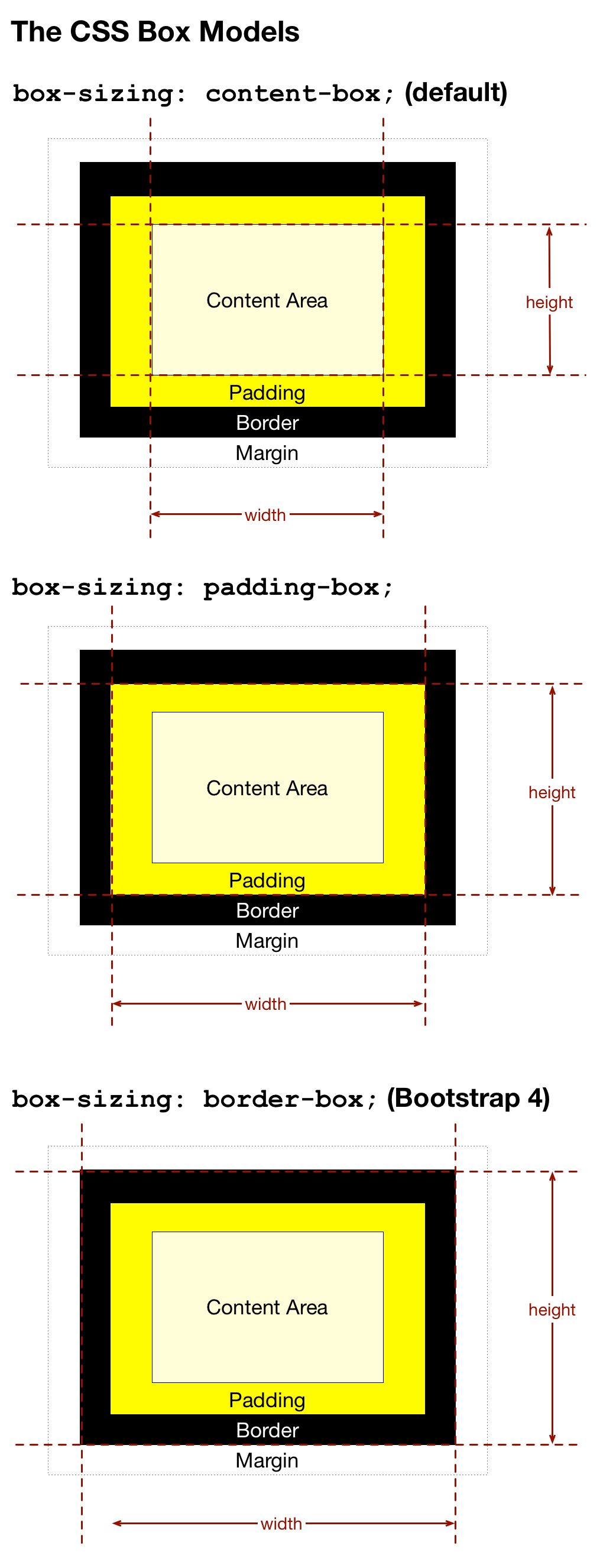
Mozilla and the other smaller players in the market used what has now become the default box model — the padding, border, and margin are external to the width (and height) of an HTML element. That is to say, the CSS width property refers to the width of the content area, not including any of the blank space around it. When you think about it, this is not logical! For example, a paragraph with a width of 300px, a padding of 10px and a border-width of 1px would appear on screen as a box that’s 322px wide (from outside border edge to outside border edge)!
Microsoft did things differently. In older versions of IE, the border and padding were internal to the width. So regardless of the padding or border thickness, a paragraph with a width of 300px would always be rendered as a 300px wide box. The content area would simply shrink and grow as you altered the padding and border widths.
Initially, the W3C threw away the old IE-style box model completely, but in CSS 3 they added it back in as an alternative to the default box model. CSS 3 introduced the box-sizing CSS property for selecting the box model to be used for each element on a page. Rather than allowing users to choose between just the Netscape and IE approaches, they also added a third option where the padding is internal to the width, but the border is external to it.
The three valid values for the box-sizing CSS property are:
content-box– thewidthandheightproperties are interpreted as referring to the content width, with thepadding,border-width, andmarginexternal to it (the old Netscape approach, and the current default).padding-box— thewidthandheightproperties are interpreted as referring to the content width plus any padding.border-box— thewidthandheightproperties are interpreted as referring to the content width plus any padding plus the border width (the old IE approach).

Why am I telling you all this? Simple, because Bootstrap changes the default box-sizing for all elements from content-box to border-box. In other words, Bootstrap changes your page from the counterintuitive Netscape box model to the much more sensible IE box model.
Links
Bootstrap’s Big-Picture Design & Documentation
For the most part, you should think of Bootstrap as a prewritten collection of CSS classes. Philosophically, Bootstrap separates these classes into four distinct categories. These categories define the structure of the official Bootstrap documentation:
- Layout — the CSS classes for defining page structure. These CSS classes are built to be responsive, that is to say, they allow the layouts you construct with them to behave differently depending on screen size.
- Content – the CSS classes for enhancing the standard HTML components, for example nice tables, nice block quotes, nice headers etc.
- Components — the CSS classes for creating page elements that are not part of the HTML spec, but are nonetheless the kind of standard component that many web pages need, for example nice alert boxes, carousels, modal dialogues, badges, and so on.
- Utilities — the CSS classes for controlling very generic CSS properties in a concise, consistent, and simple way. Examples include quickly setting consistent borders, padding, alignment, and so on.
At this stage of our coding journey I expect you not to be intimidated by links to official documentation. I’m not going to be spending countless hours recreating the excellent Bootstrap docs. Instead, I’ll be linking to the relevant sections of the official docs.
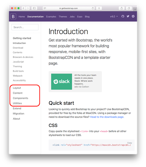
You can find the documentation at https://getbootstrap.com/docs/4.0/.
The most important four buttons for navigating the documentation are the ones matching the four main categories of CSS classes listed above. This is where you’ll find them:

A New Playground
In the early days of our JavaScript journey, it was great to have somewhere to just enter some code snippets and run them without needing to set up a full web page. The same basic premise holds true here — we want to be able to quickly test out snippets of HTML with Bootstrap 4 classes without needing to create entire pages. For JavaScript I created a custom playground so there would be no extraneous features to add confusion. We’re much further into the series now. So this time I’m recommending a commonly used existing playground — www.bootply.com/new.
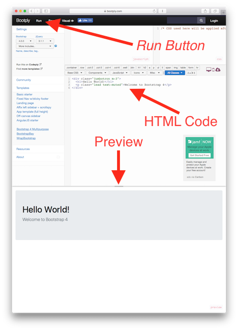
This playground provides three text areas, two small ones for JavaScript and CSS, and a big one for HTML. For now, we’ll only be using the HTML one. When you’ve entered your HTML with Bootstrap CSS classes, you can see what it looks like by pressing the run button in the upper left and looking at the preview at the bottom of the page.
I know Bootstrap is an API rather than a language, but still, I think it’s time for the traditional Hello World! 🙂
Enter the following into the HTML area in the playground:
<div class="jumbotron m-3">
  <h1>Hello World!</h1>
  <p class="lead text-muted">Welcome to Bootstrap 4</p>
</div>
To see what this looks like, press the Run button in the upper left:

Initially, until we learn about Bootstrap’s layout functionality, we’ll need to wrap our code snippets with the following:
<div class="container-fluid mt-3">
  <div class="row">
    <div class="col-12">
      <!-- Your Code Here -->
    </div>
  </div>
</div>
To make things simple, I’ve saved this template to Bootly.com at www.bootply.com/JcxTTJWslw.
A Challenge
Start by creating a regular HTML 5 web page that does not include Bootstrap and add a recipe for the dish or drink of your choice to it. Your recipe must have the following:
- A top-level heading with the name of the dish/drink
- A second level heading “Description”
- One or more paragraphs describing the dish/drink
- A table of ingredients
- A second level heading reading “Instructions”
- A numbered list of instructions
- An image of your dish (doesn’t have to be your own, some clip art will do fine)
Feel free to add more elements to your recipe, but do not add any CSS or JavaScript, keep this as a plain HTML 5 page. Load it in a browser and note how ugly it looks by default.
Now include Bootstrap 4 into the page by adding the needed <link> and <meta> tags to the page’s <head> section and notice how much better your recipe looks already!
Final Thoughts
All we’ve done today is set the scene. Bootstrap is a very big API, so it’s going to take us quite some time to explore. Next time we’ll start out exploration with a look at some of the utility classes Bootstrap offers.
