PBS 139 of X: Bundling a Web App/Site (Part 2) (Webpack)
Our Webpack journey started with a look at how to use the tool to bundle a JavaScript library in instalment 137. Then, in the previous instalment we introduced the concepts for using Webpack to bundle a web app or website, and made a good start on a worked example that already successfully bundled our own HTML, CSS & JavaScript, jQuery, Luxon, and the Bootstrap 5 CSS. In this instalment we’ll pick up where we left off and add Mustache templates, Bootstrap 5 JavaScript, an icon font (Bootstrap Icons), and a web font (from Fontsource) to our example app. That will give us a good broad sampling of the kinds of dependencies you’re likely to need to bundle into your own projects.
Since we last used Bootstrap in the series it’s gone from major version 4 to 5, so we’ll take a pause to look at how JavaScript has changed in Bootstrap 5 as we bundle it into our example.
Matching Podcast Episode
Listen along to this instalment on episode 742 of the Chit Chat Across the Pond Podcast.
You can also Download the MP3
Episode Resources
- The instalment ZIP file — pbs139.zip
Continuing our Worked Example
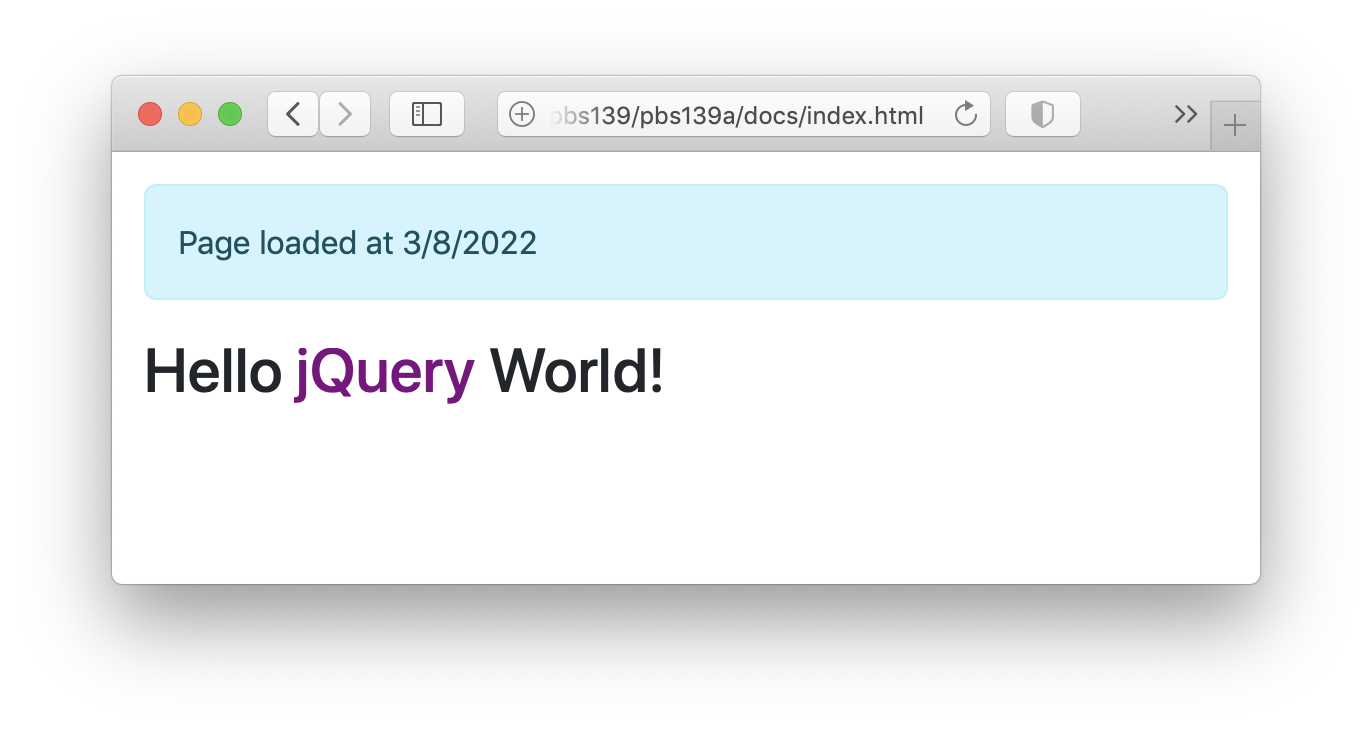
At the end of the previous instalment our worked example had just had a Bootstrap Alert added that showed the time the page was loaded. This alert was generated with jQuery, and used Luxon to generate the date information.
That code will form the starting point for this instalment, but with the instalment numbers incremented appropriately. You’ll find this version of the app in the pbs139a-startingPoint folder in the instalment ZIP. To see the app in action open a terminal in the folder and run npm ci && npm run build, then open docs/index.html in your browser.
You’ll find the finished final version of the code for this worked example in the folder pbs139a in this instalment’s ZIP. You can see it in action by opening that folder in the terminal, running the same command as above, and opening the generated docs/index.html in your browser.
Step 6 — Refactor the Alert to use a Mustache Template (as a Webpack Asset)
Our alert is currently quite intrusive, it really should be dismissible! Bootstrap 5 supports dismissible alerts, but the functionality depends on the alert containing the markup for a close button. We could add more jQuery code to our existing document loader handler to add the content into the Alert, but it would be much easier if we could edit the markup for the alert in a separate file. This is literally what templates are for, so let’s use this as a reason to learn how to use Mustache templates in a Webpack world.
The first step is to install Mustache as a regular dependency:
npm install --save mustache
This is an overly simplified example, so we’ll just be using one template file, but in a real-world project you’ll be using many templates, so it makes sense to save the templates into a dedicated folder. To make our example realistic we’ll save our template in the folder src/templates, and we’ll use the file extension .mustache to make the Webpack config easier to write and understand.
Copy the pbs139a-2/src/templates folder from the instalment ZIP into your folder as src/templates. It contains just one file, alert.html.mustache, which is the template for our Alert:
<p class="alert alert-info alert-dismissible">
    Page loaded at  on
    <button type="button" class="btn-close" data-bs-dismiss="alert" aria-label="Close"></button>
</p>
Note that we’ve added the alert-dismissable class as well as a close button and that we have two placeholders for data, localTime and localDate. Also, note the use of a double-file extension, the final .mustache facilitates the Webpack config, and the preceding .html is to tell me how the template’s contents will be interpreted. I.e. this template will be rendered to HTML for injection into the DOM, so I can use HTML tags, and should use double ‘mustaches’ so that special characters get replaced with their HTML-escaped equivalents.
Remember that to use Mustache’s Mustache.render() function we need two things, some template text, and the data that will be used to populate the fields in the template. Up until this point in the series, we have been using <script> tags with IDs in our HTML markup to load our templates into our pages (for a detailed description see instalment 73). With Webpack 5’s new Asset modules we can greatly simplify that import process.
You’ll find an updated version of the Webpack config file (webpack.config.js) in the pbs139a-2 folder in the instalment ZIP, copy this file into the root of your folder.
The only change in the file is the addition of a new rule in the rules array:
{
  test: /\.mustache$/,
  type: 'asset/source'
}
This tells Webpack that any file ending in .mustache should be available for import into JavaScript as a source asset, i.e. the contents of the file should be read as a string.
With this config in place any Mustache template can be imported into a JavaScript file with an ES6 import statement of the form:
const myTemplateString = import('./templates/myTemplate.type.moustache');
Note that the path is relative to the entry file configured in the Webpack config, i.e. relative to src/index.js.
You’ll find an updated index.js file in the pbs139a-2/src folder, copy it into your src folder.
There are two changes in this file from the previous version. Firstly, we import both the Moustache module and our template near the top of the file:
// import Mustache library & template
import Mustache from 'mustache';
import alertTpl from './templates/alert.html.mustache';
Again, note that the file path is relative to the entry point, i.e. . maps to src.
Secondly, the document ready event handler has been re-written to use Mustache to create the Alert:
// a jQuery document ready handler
$(()=>{
    // update the greeting to show jQuery ran
    $('#world-modifier').text('jQuery');

    // build and add an alert with the loaded time
    const now = DateTime.now();
    const alertView = {
        localTime: now.toLocaleString(DateTime.TIME_SIMPLE),
        localDate: now.toLocaleString(DateTime.DATE_FULL)
    };
    const alertHTML = Mustache.render(alertTpl, alertView);
    $('.container').prepend(alertHTML);
});
If we now re-build our app by running npm run build we can now see our beautiful new alert:
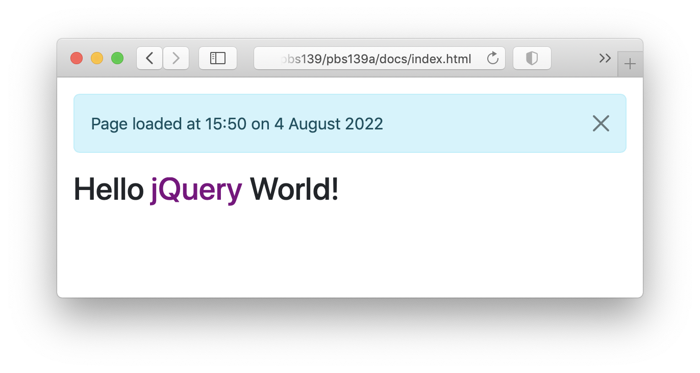
Looks great, but what happens when you click the close button? Nothing 🙁 Why? Because we’ve not bundled Bootstrap’s JavaScript yet!
Step 7 — Import Bootstrap 5 JavaScript (& Bootstrap 5 JS Primer)
In previous instalments we’ve used Bootstrap 4, but as this instalment is being written (summer 2022), Bootstrap 5 is now the current stable release, so we’ll be using that version in this worked example, and indeed in future instalments too. To understand the simple Bootstrap 5 code we’ll be using to make our alert dismissible, let’s take a brief pause to discuss Bootstrap 5’s complete re-design of its JavaScript functionality.
Aside — JavaScript in Bootstrap 5
In terms of CSS, there is not that much change between Bootstrap 4 and Bootstrap 5, but in terms of JavaScript, the change is fundamental — Bootstrap 4’s JavaScript was implemented as a series of jQuery plugins while Bootstrap 5 doesn’t use jQuery at all, and delivers all its JavaScript functionality as a collection of ES6 classes.
It is possible to import all of Bootstrap’s classes into a single dictionary, but this is very inefficient, and not advisable for anything beyond quick and dirty prototyping. Don’t ever do this in production code, but here’s how you import all of Bootstrap 5’s classes into a dictionary named BS:
// for prototyping only, NEVER DO THIS IN PRODUCTION
import * as BS from 'bootstrap';
If you do this, you then access the individual classes as keys in the BS dictionary, so the Alert class would be BS.Alert, and so on.
The right way to import Bootstrap 5 classes is to specify the list of classes you will be using within the import statement, so you only get what you need, e.g. to get just Alert and Toast classes use:
import { Alert, Toast } from 'bootstrap';
As a general rule, the way you apply Bootstrap 5 JavaScript functionality to an HTML element is to call the constructor for the appropriate Bootstrap class with the native JavaScript DOM object as the first argument.
E.g. if you have a variable named alertDOM that contains a reference to a native JavaScript DOM object, then you can enable Bootstrap Alert functionality like a dismiss button by calling the Alert constructor like so:
new Alert(alertDOM);
While Bootstrap no longer uses jQuery, we will be, so how do we use jQuery objects with Bootstrap 5? The key is to remember that jQuery objects are simply wrappers around zero or more native JavaScript DOM objects. To make the wrapping easy to remove when needed, jQuery objects are implemented as array-like objects where the array elements are the native DOM objects, so if the jQuery object $alerts represents three DIVs, the native DOM objects for those three DIVs will be $alert[0], $alert[1] & $alert[2].
Making our Alert Dismissible
With that explanation out of the way, let’s update our JavaScript code to name our alert dismissible.
You’ll find the updated index.js file in the folder pbs139a-3/src, copy that file over your existing src/index.js.
Now, let’s look at the changes that were made to this file. Firstly, we added an import for just the Bootstrap 5 Alert class:
// import specific Bootstrap JavaScript Modules (just Alert)
import { Alert } from 'bootstrap';
The only other change needed was to update the document ready handler to apply the Bootstrap functionality to our alert, this is the relevant section of code:
// build and add an alert with the loaded time
const now = DateTime.now();
const alertView = {
    localTime: now.toLocaleString(DateTime.TIME_SIMPLE),
    localDate: now.toLocaleString(DateTime.DATE_FULL)
};
const alertHTML = Mustache.render(alertTpl, alertView); // generate the alert HTML
const $alert = $(alertHTML); // build a JQuery object from the HTML string
const alertDOM = $alert[0]; // extract the underlying native DOM object from the jQuery object
new Alert(alertDOM); // Apply the Bootstrap 5 Alert functionality to the DOM object
$('.container').prepend($alert); // inject the alert into the top of the container
I’ve added more variables with more explicit names and more comments than I normally would to make the entire process as clear as possible.
We use Mustache to generate the HTML for the alert as a string, then we build a jQuery object from that HTML string. Because jQuery objects are just wrappers around DOM objects, the $() function will create a DOM object for us. We can then access that DOM object as array index zero, i.e. the DOM object representing the array is $alert[0]. We use the DOM object to apply the Bootstrap functionality, then we inject the alert into the page using jQuery as we normally would.
To see our alert working as intended simply re-build with npm run build, refresh your browser window, and click the close button!
Step 8 — Import a Glyphicon Font (Bootstrap Icons)
To bring any web app to life, it really helps to include icons in the controls and alerts. By far the easiest way to do that is with an icon font. In past instalments we’ve used Font Awesome for this, but their business model has changed, so as of the summer 2022, they are no longer my preferred free icon font. (FWIW they are still my preferred commercial icon font, and I retain my paid subscription for my own projects.)
While they maintain it as a separate project, the good folks at Bootstrap have released a free icon font they’ve branded as Bootstrap Icons, and that’s my current recommendation for easy-to-use free icons on the web.
To get started, first install Bootstrap Icons with NPM:
npm install --save bootstrap-icons
Before we can import these icons successfully we need to configure Webpack to bundle the relevant file extensions as data URLs, that way we don’t end up with a sea of files cluttering our docs folder.
You’ll find the updated webpack.config.js file in the pbs139a-4 folder, copy it over your webpack.config.js.
The only meaningful change is the addition of a new rule for the file extensions used by the Bootstrap Icons, but I did also take the opportunity to add more comments to the file as it was starting to get quite long.
This is the relevant new rule:
{
    test: /\.(woff|woff2|eot|ttf|otf)$/i,
    type: 'asset/inline'
}
The CSS for the icon font references files of various types, and this rule tells Webpack that when it meets those files, it should convert them to an inline asset, which is Webpack jargon for a data URL (see instalment 23 for more on data URLs).
With that configuration in place we simply need to update our entry point to import the CSS for the icon font.
You’ll find an updated version of index.js in the pbs139a-4/src folder, copy that over your src/index.js.
The only change in this new version of the file is an import statement to import the icon font:
import 'bootstrap-icons/font/bootstrap-icons.css';
Note that in this case, the official docs for the icon font did not tell me the path to the CSS file, so I had to resort to Google to get the correct import path.
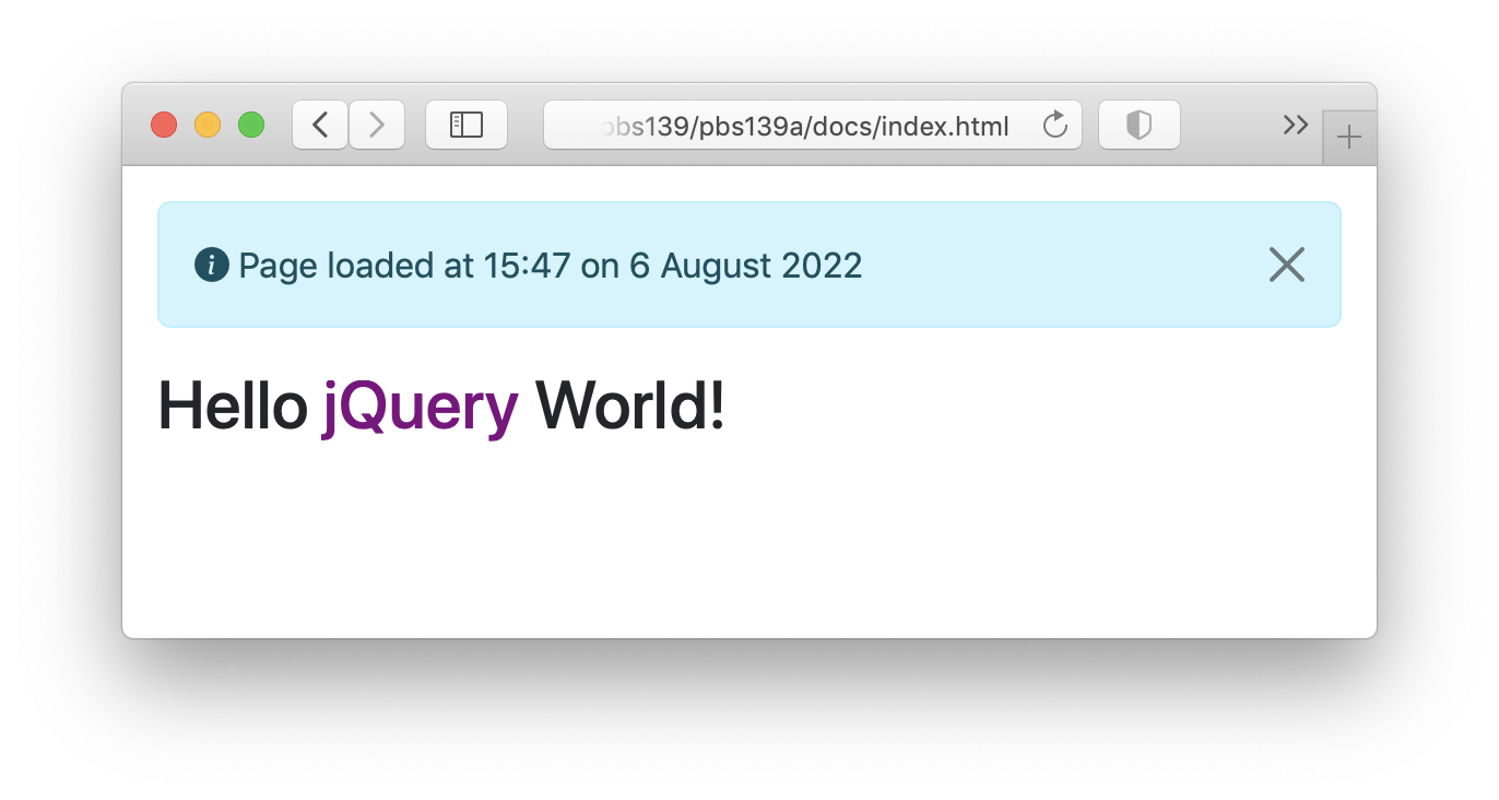
With that done we can now use any of the icons listed on the Bootstrap Icons page. Let’s update our alert template to include a traditional info icon.
You’ll find an updated version of alert.html.mustache in the pbs139a-4/src/templates folder, replace your src/templates/alert.html.mustache with this file.
This is the new markup for the alert:
<p class="alert alert-info alert-dismissible fade show">
    <i class="bi bi-info-circle-fill"></i>
    Page loaded at  on
    <button type="button" class="btn-close" data-bs-dismiss="alert" aria-label="Close"></button>
</p>
The relevant part is the inclusion of the <i> tag as copied-and-pasted from the Bootstrap Icons page describing our desired icon.
With all these changes in place we can re-build our app with npm run build, and then re-fresh our browser to see the updated alert:
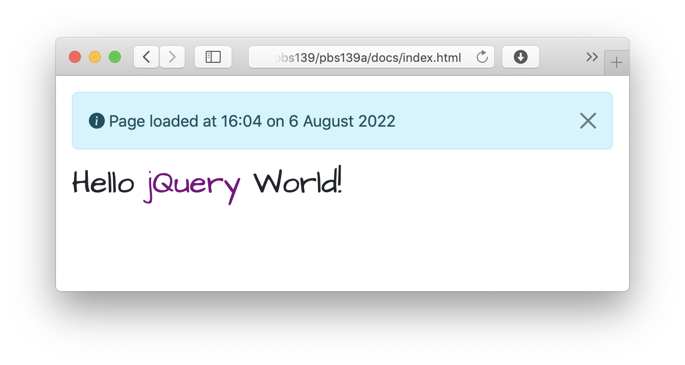
Step 9 — Import a Web Font
One way to give your site a little character is to use a font that’s not one of the small set that are guaranteed to be installed everywhere. The way to do that is with a web font. Rather than manually installing fonts and managing them as assets ourselves, we can use NPM and Webpack to take care of all that for us.
The best resource I have found for getting nice free fonts via NPM is Fontsource. They have a very large library of free fonts, with each font distributed as a separate NPM package. For our example let’s use the very pretty cursive font Architects Daughter.
The first step is to install the font via NPM:
npm install --save @fontsource/architects-daughter
Next, we need to import this module into our entry point.
You’ll find an updated version of index.js in the pbs139a-5/src folder in the instalment ZIP, replace your src/index.js with this file.
The only change is importing the module:
// import a nice handwriting web font
import "@fontsource/architects-daughter"
Next, we need to use this new font on our CSS. Let’s use it for top-level headings.
You’ll find an updated version of index.css in the pbs139a-5/src folder in the instalment ZIP, replace your src/index.css with this file.
The only change is the addition of a rule to apply the web font to all <h1> tags:
h1{
    font-family: "Architects Daughter", cursive;
}
We can now re-built our app one last time with npm run build, then refresh our browser to see a very pretty hand-written greeting 🙂
Final Thoughts
While this worked example doesn’t do anything of value, it does use all the important parts of our programming toolkit, and it does so without overcomplicating things, making the Webpack functionality as obvious as possible. Webpack is an extremely powerful tool, and while we’ve covered the basics, it can do so much more. Hopefully, you feel inspired to start using it in your own coding projects, and when you inevitably run into scenarios we’ve not covered, you should be armed with enough knowledge to search for a solution and understand the results. But don’t forget that Allison has built an excellent community in the Podfeet Slack with a channel dedicated to this series, so you can always share your questions there.
One More Thing…
Update — Added in February 2025 — nearly two-and-a-half years after this instalment was delivered, PBS 176 closes the circle on bundling web apps by demonstrating how such a web app can be hosted online for free using GitHub Pages. Not only can it be hosted for free, but the build and deployment steps can be automated using GitHub Actions!